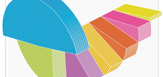
Doing data visualizations correctly takes careful consideration. Incorrectly visualizing something can be misleading, embarassing, and even damaging to reputations. In order to do it correctly, it can often be useful to think about the visualization from several different angles before settling on the final version. Looking at good examples of data visualization is certainly a great way to learn, but equal value can be found in examining visualizations that didn’t work so well. I recently started a Tumblr for collecting examples of bad visualizations. The examples are often funny, but #WTFViz is not intended solely to be humorous. The examples are also there as educational material, showing what not to do. The data going into the visualization is the best place to start when selecting what visualization to use. There are subtle but complex concepts contained in data, and those need to be reflected accurately in the end visualization. For example, sometimes percentage data has part to whole relationships, and other times it represents overlapping sets. Sometimes people get this wrong, though, and create things like the man who is 243% Baby Boomer. 


Learning From Mistakes in Visualization


Subscribe to our blog
Sign up to receive Rock Content blog posts
Related Posts
From Meta to Cara: Where Artists Reclaim Their Creative Freedom

Order badass content with WriterAccess. Just as we do.
Find +15,000 skilled freelance writers, editors, content strategists, translators, designers and more for hire.
Want to receive more brilliant content like this for free?
Sign up to receive our content by email and be a member of the Rock Content Community!
Talk to an expert and enhance your company’s marketing results.
Rock Content offers solutions for producing high-quality content, increasing organic traffic, building interactive experiences, and improving conversions that will transform the outcomes of your company or agency. Let’s talk.


