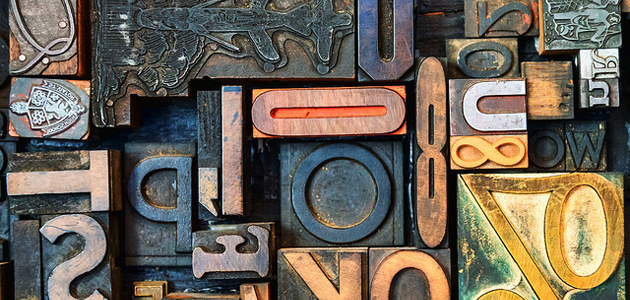
The fonts you choose for both your logo and your content can say a lot about your brand. Because of this, big brands are extremely particular about their typography choices and smaller brands can learn a lot from studying their visual decision making. After looking at the corporate styling guides for many of the companies on Forbes’ list of the world’s most powerful brands, several trends became apparent.
For better or for worse, everyone still loves Helvetica
This should come as no surprise. The ubiquity of Helvetica in graphic design is well known and understandable; as a clean, simple and enduring typeface, it’s always a safe choice. Helvetica has a straight, even and machined look to it, an aesthetic that makes it neutral and adaptable for many different purposes. This is reflected by the type of influential companies that use it: Toyota, Target, BMW, General Motors and American Apparel. 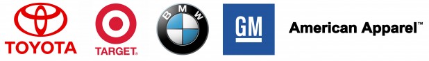 Even without using Helvetica specifically, many top companies use closely related typefaces like Arial and Univers, though typically only as secondary typefaces. But while Helvetica was used to create a fresh and modern look for brands in the 1950s, its overuse today means it contributes little distinct personality to any brand.
Tech giants go “humanist”
Many tech companies may have simple and sparse logos, but choose a less machined aesthetic for the bulk of their website text. These typefaces may appear similar to Helvetica at first glance, but they incorporate greater variability in their angles, shapes and line widths. Among the most popular of these type families is Myriad, which is used in varying capacities by Apple, Walmart, LinkedIn and Mashable. Other popular humanist typefaces include Segoe, used by Microsoft, Open Sans (Google) and Lucida Grande (Facebook). 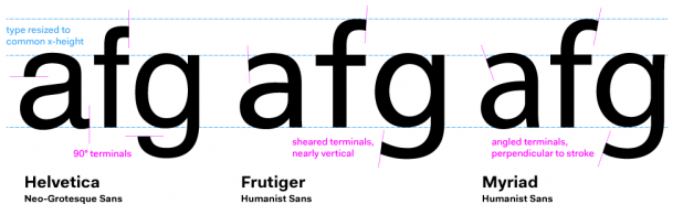
Luxury brands and banks choose serifs
Luxury brands, who rely mostly on selling physical goods like handbags and cars, rely on serif fonts more frequently than web-based brands. This is in part because serifs appear elegant and more easily readable in printed form, while sans serif fonts are better for reading on computer screens. Serifs also evoke the history of typography. Luxury brands use this to demonstrate their pedigree, and some banks incorporate serifs to prove their longevity and trustworthiness to consumers.
Consider investing in a custom typeface
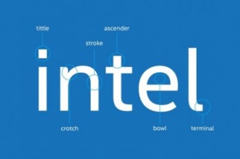 Other top brands decide to create a custom typeface specific to their brand. A custom typeface can help take branding to the next level, finishing out a visual style and language unique from any others. Intel, for one, recently unveiled its first ever proprietary typeface, known as Neo Sans Intel, which, according to Design Week, it plans to use “across all script systems, media and devices as an extension of its brand.” The typeface was designed to evoke the Intel logo, and is even adaptable to foreign writing systems.
It’s okay to be different
Despite the proliferation of sans-serif type, a few standout brands show you don’t have to follow the trend to be successful. Take Google’s logo for example, which uses Catull and is perhaps the only major web-based company to use an old style serif typeface in its primary branding. ![]() And in a world of Helvetica, using script in a logo can help provide instant differentiation from your peers, just ask Coca Cola or Budweiser. However, when choosing the font that is right for you, be sure to consult an expert in type and graphic design about the values, mood and aesthetic you want to portray in your brand. Allison is a former editor at the PBS NewsHour, a 2014 AP-Google Journalism and Technology scholar and a soon-to-be graduate student in journalism at Stanford University. You can follow her on Twitter @anmccartney.
And in a world of Helvetica, using script in a logo can help provide instant differentiation from your peers, just ask Coca Cola or Budweiser. However, when choosing the font that is right for you, be sure to consult an expert in type and graphic design about the values, mood and aesthetic you want to portray in your brand. Allison is a former editor at the PBS NewsHour, a 2014 AP-Google Journalism and Technology scholar and a soon-to-be graduate student in journalism at Stanford University. You can follow her on Twitter @anmccartney.