Medical pamphlets or posters have been doctor’s office mainstays for many decades. They promote healthy habits, like good nutrition or exercise; explain the risks of unhealthy habits, like smoking or drinking alcohol to excess; and educate about specific medical conditions, like high cholesterol or diabetes. Most include a call to action (write to this address, call this number, or visit this website for more information); all are intended to help the public understand important scientific data. In recent years, medical infographics have taken up the mantle, delivering similar sorts of information online to a worldwide audience. (While the traditional poster is certainly an example of an infographic, here we’ll distinguish between those you see on the screen and those you find in analog form in a doctor’s office.) So, is the new way (online infographics) better than the old (pamphlets and posters)? What are the strengths and weaknesses of each? Going forward, how might the medical community best educate the public about medical issues?
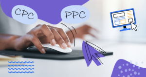
Information Density
There is probably some ratio out there for the optimum number of words per image for a pamphlet and an infographic, respectively. It does seem logical that a pamphlet can get away with more text than a single-page image. Readers expect to flip through a pamphlet, digesting each page separately. They don’t feel overwhelmed by the total word count because they encounter the words in small packets, bit by bit. This affords the author some freedom to get wordier – to include extra reference information that might otherwise go unread. And then there’s the venue to consider: even if they’re otherwise busy from sun-up to sundown, in a doctor’s waiting room most patients have a few minutes to sit and read. Below are a few pages from a pamphlet created for pregnant women in Nigeria. This is a good example of the wordiness typical of this medium. There is a lot of actionable information included in a relatively small amount of space. (Click on the image to view a larger version).  Source: Spring Nutrition And here is an infographic on nutrition in pregnancy. It’s undoubtedly flashier, but still contains important information and is in a form viewers can easily share online. It lacks minute detail, but provides an overview of the most important elements to be acted upon. For example: unless you’re eating 22 tins of tuna every day, you should probably be taking an iodine supplement during pregnancy. Ask your doctor for advice.

Attractiveness: Making Medical Information Palatable
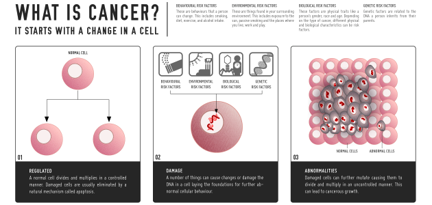
Pamphlets and infographics can both be done well, or done poorly. Both provide an opportunity for graphic flair – that artful balance of text and image – so design is clearly important in both mediums. But it’s the infographic that benefits most from clever, decisive, crisp graphics. When your goal is to catch the attention of an Internet user – that busy, distractable multitasker – aesthetics are often just as important as content. But beautiful graphics do more than hold interest and encourage sharing online. They can also help to make a difficult subject matter a little bit less daunting. For example, the infographic below “Cancer Anyone?” provides a scientific explanation of the disease, something any cancer patient should understand, without too much doom and gloom. It’s simple, attractive, easy to read, and ends on a hopeful note about prevention. Compare this with the lengthy 12-page pamphlet on cancer from the American Institute for Cancer Research. This pamphlet is packed with information but it’s visually lackluster. Without some pizazz, all that heavy text could easily overwhelm a preoccupied patient.

Legitimacy: Taking Information Seriously
The doctor’s office pamphlet or poster may have a leg-up on infographics in this category. When it comes to medical information, where you read is just as important as what you’re reading. A doctor’s office carries a palpable gravitas while the Internet is notorious for bad information. So, pamphlets and posters can afford to be less clinical, though they don’t often capitalize on this fact. When they do, they pack a powerful punch: less clinical means more accessible, and accessibility is the name of the game in medical information literacy. Here is an example of a light, readable pamphlet on headaches with casual visuals. (Click on the image to view a larger version).  But medical infographics can compensate with good design, excellent writing, and a comprehensive source list. A logo stamp from a recognizable hospital or research institution doesn’t hurt either. The infographic below on headaches is from Mount Sinai Hospital in New York City. It’s well laid-out, informative, and full of information. This is an example of an effective infographic with medical legitimacy that doesn’t skimp on words.

Accessibility: Sharing Online
Patients are encouraged to take pamphlets home and use them as reference, but keeping track of loose papers isn’t everyone’s forté. Online infographics, on the other hand, are available anytime, and circulate widely among connected friends and acquaintances. But this all raises a much larger issue, namely: how do people learn best? Perhaps it is more useful to look at the larger issue of medical information literacy. There is clearly a need for the hand-held reference, and for the widely shared, informative infographic. Infographics aren’t going to replace the doctor’s office literature any time soon, and they shouldn’t. These two mediums, along with many others, contribute to a culture of medical information sharing. Anni Murray is a writer, editor, multimedia artist, amateur mycologist, and biology student. She is currently working on Prism, a speculative science fiction story cycle. All opinions expressed in this article are her own. Follow her on Twitter.