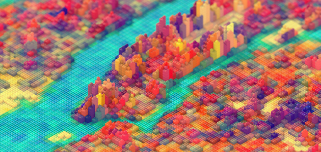
 J.R. Schmidt is a 23-year-old senior motion designer and 3-D artist at Firstborn, a digital ad agency in New York City. Schmidt started out as a traditional artist but when he went to college he took a chance by majoring in New Media Design at the Rochester Institute of Technology. There, Schmidt was exposed to web-design, illustration, interactive design, scripting, object-oriented programming, programmatic art and many other new media. “I started out with Legos, and moved to pixels and polygons.” Schmidt is known for his polygon style; data visualizers might recognize that he hasn’t veered far from his Lego phase with a Lego reconstruction of New York City. These days, Schmidt says he’s moving away from what he sees as the main styles of graphic artists — realism and “Pixar” — by trying to “flatten out” his work. “When people can’t tell if I’m using 3-D software or if I do it all by hand in Photoshop, I know I’m doing something right,” he said. Schmidt discusses his art and the field of motion graphics in a Q&A with Visual.ly. JR Schmidt – Show Reel from J.R. Schmidt on Vimeo. What is motion graphics? For me, it’s the application of animation to any design: 2-D, 3-D, interface, broadcast, character or otherwise. The principles of good design apply here, just as they do with graphic design, industrial design and so on. Any given frame of a motion graphics sequence should be able to work on its own. Any trends in motion graphics that you particularly like/hate? I have noticed a move away from 3-D motion graphics, or at least motion graphics that obviously appear to have been rendered in 3-D. This is a trend with which I’m very pleased. Another popular trend (and one that I’m especially guilty of beating to death) is that artists are letting the structure of their work show through the final product. For example, “The Low-Poly Look,” where objects appear fragmented, faceted, and obviously composed of their base components: vertices, edges, and polygons. Where is the field going? Picking up where I left off, I believe the reason artists are becoming less concerned with rendering things photo-realistically is that there are just too many people that have already mastered it. Technology has made that aesthetic too accessible, and now I believe many artists are searching for a way to craft something more compelling than what one might find in a photo. I know I am. What does the day-to-day life of a motion graphics artist look like? When I do have something to animate, it’s great. I could spend a whole day in After Effects. A big part of the job, however, is preparing to animate: verifying that everyone is on the same page about what the end product will be, and assuring the client that their money isn’t being wasted. In order to do that, we make sketches, style frames, storyboards and animatics, and that all takes a lot of patience. Working at an agency, one doesn’t usually get to pick the projects. One of the most important day-to-day things I’ve learned is how to be passionate about something unquestionably uninteresting. I’ll choose not to elaborate too much here, except to say that the nice thing about motion graphics is that you can make something look cool, solely by the way you animate it. Any advice for people who want to become motion graphics artists? My advice to the aspiring motion-graphics artist would be to master the software (Photoshop, After Effects and Cinema 4D) but don’t rely on it. Be a designer, not a Photoshop technician. Be nerdy. Count pixels. Geek out about show titles. And never stop learning.
  What was your process for the Lego project? I started by collecting maps of New York. I primarily used this map created by Columbia University: It depicts energy usage in New York on a block by block basis. I wanted this data to correspond to the height of each stack of Lego’s, because I imagined that energy usage was a reasonably accurate indication of building height. This map from Columbia uses green for low energy use and red for high energy. I needed the map to be black and white so I used a gradient map in Photoshop to interpret the green-to-red gradient as a black-to-white gradient. This made it easier to read the map in the 3-D software I was using – Cinema 4D. Once I had the black and white map, I made a big grid of Lego stacks in Cinema 4D. The grid was maybe 100 by 100 Lego stacks, and each stack was maybe 10 blocks high. On top of this I created a plane that covered the entire grid, hiding everything but the topmost brick. Using certain operations within that 3-D software, I was able to use the black and white map I created to control the height of the Lego stacks on the grid. For example, areas on the map that were 100% black (the water) caused the bricks to remain in where they were, with only the topmost brick showing. Areas that were slightly lighter than black caused the stacks to rise vertically the height of one brick (one story buildings) and so on all the way up to 100% white (for the tallest buildings). Along the way, I took a few liberties painting black or white on to the map in areas where I wanted the blocks to be higher or lower. Topographically however, the map is an accurate representation of New York. The Lego blocks were colored using the same process, with a new 2D map based on the same proportions as the energy usage map, however the colors were not informed by any particular set of data. I had originally tried using the colors from satellite imagery, but I found these to be aesthetically unappealing. I also tried coloring chunks of the map based on different neighborhoods in the city, but again I was unhappy with the result. The final coloring of the bricks was based on trial and error, painting different colors directly on to the map, and then applying it to the 3D Lego grid to see how it looked. My intent was always simply to make an attractive image of New York, however I like to use data to inform my decisions and automate parts of the process as a way to add randomness, which I find beautiful. And the Chromotive project? I’ll be honest – I fudged a lot of the numbers on that project, but my intent was never to make something accurately data-driven, only something that appeared that way and happened to (hopefully) look cool at the same time. Having said that, I spent a lot of time reading color surveys, poring over infographics and data-visualizations related to color, and generally just getting inspired by how artists choose to illustrate that type of information. A lot of this research did inform the end product. When it came time to create the animation, I made styles frames illustrating how I wanted different scenes to look, then I started building some of the elements in 3D. I was careful to flatten everything out visually. I didn’t want the 3D elements to stand out since the rest of the piece was 2D. I created a system similar to the one I made for the Lego New York image, but with a few more controls for making the blocks appear and disappear over time. The rest was done in After Effects. If you were to divide your data visualizations into, say, a pie chart, what percentage would be taken up by artistry and what by technical knowledge? Let’s say 50% artistry; I take a lot of liberties with my work, unless it’s absolutely necessary for the data to be accurate. Then it’s a quarter technical knowledge and a quarter inspiration.
  What kind of data visualizations do you take inspiration from? I get a lot of inspiration from maps – I think this probably stemmed from playing video games, which I’m also inspired by. So I like data visualizations that present information that is mapped geographically. It’s often difficult to see the big picture when dealing with a lot of information, I think maps create a wonderful sense of perspective. What are you working on? I like to work on posters in my free time. Right now I’m working on a map, inspired by video game nostalgia. What do you wish you were working on? I’ve always wondered what it would be like to work in game development. I can’t say that I would definitely rather be doing that, but it’s definitely piqued my interest. Apart from that I would love to animate the show titles for a major film sometime.
  Rani Molla has a digital media master’s degree from Columbia Journalism School. She’s a journalism reader, writer, photographer, videographer, data visualizer and general doer. Follow her on Twitter.