Visualizations can be very good at helping us spot patterns in data. Often, these patterns are periodic; most often repeating in time (although periodic patterns can also appear in spatial and other data dimensions). On the day of the year that messes with our calendar’s periodicity, it seems appropriate to go over four visualization techniques that can show periodicity.
Mendeleev’s Periodic Table of the Elements
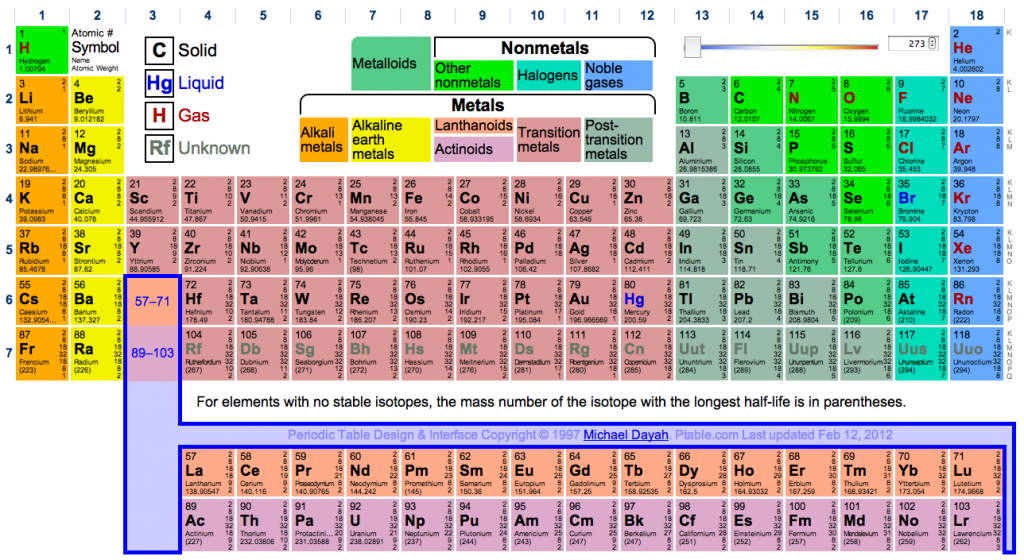
 Perhaps the most famous of all periodic visualizations is the Periodic Table of the Elements. Published in its (mostly) current form by Dmitri Mendeleev in 1869, the table was the first arrangement of the elements to provide predictive capabilities. The periodicity of the table predicts the chemical behavior of elements based on their atomic number. When the table was first created, several naturally occurring elements had not been discovered yet, and Mendeleev recognized they were missing based on how the properties of their neighbors would line up. Even today, extremely heavy and unstable elements that have never been observed are still possible to predict using the structure made visible in the table.
Lately, we’ve been seeing lots of “clever” visualizations that replicate the form of the Periodic Table of the Elements, but they are hardly ever “periodic”. (Case in point: the Periodic Table of Lady Gaga.) Sometimes, there is a pattern that helps arrange them in their spatial configurations, but this pattern rarely comes from a periodic repetition within a sequence. When you see these visualizations, keep in mind that other than being mildly entertaining, they actually represent a misunderstanding of how the Periodic Table of the Elements works.
Calendars
We use calendars every single day, without even thinking about it — and yes, they are periodic visualizations. The spatial location of the days shows how they line up with our “work week”. There are many different styles of calendars coming from different cultures, because the week-long period that we impose on time is mostly arbitrary. Days and years are connected to our position relative to the sun, however weeks and months are connected mostly to cultural norms. These periods are loosely based on the cycles of the moon, however they don’t line up exactly. Since different cultures place more emphasis on different events, their calendars have different periods to reflect this emphasis. The Mayan calendar is one of the more famous examples, with three different cycle lengths making up three different calendars. Today, some versions of calendars are more data-driven. One common visualization method is to encode data in the color of the boxes representing a day. This creates something called a heat map. 
Heat Maps
Heat maps are very good for showing periodicity because location – the easiest visual feature to see – can be made to correlate with the periodic pattern. Since they are arranged in a grid, each segment gets an equal amount of space on the screen. They also can be very compact visualizations, with each pixel representing a single data point. This makes them good for displaying patterns over a whole year with very high data resolutions, even down to the hour. The example below is flickr uploads over three years, with the same day each year overlapping. The top is uploads from the northern hemisphere, the bottom is uploads from the southern hemisphere. This distinction was made so that the differing summers do not cancel out. The bottom has a less distinct pattern due to a much smaller number of uploads. There are actually several different periods that can be seen in the top image. The seasonal day/night length fluctuation is visible across the width of the entire image. There are far more images taken during daylight hours than while the sun is down. Layered on top of that is the waking/sleeping hours that people keep. Even though the sun isn’t up, some people are still taking pictures late into the evening during winter months. There is still another cycle that is visible, the work week. The dark/light striping occurs every 7 days, with the weekends being the bright stripes and the weekdays being darker. Another interesting thing that this type of visualization calls out is breaks in the pattern. There is a bright stripe on July 4th and October 31st, marking extra pictures at night of fireworks and trick-or-treaters. There is also a dark stripe on the left side where February 29th is. Since it only happens once every 4 years, this day is only represented once in the three years shown in this visualization.
Spirals
Spirals are another way of showing periodicity, although their usefulness has been under debate recently. They obviously can show periodicity, however a standard heat map may be more effective. Spirals have the downside of the center segments taking less screen space than the outer segments, giving unfair weight to the outside. They also make the periodic pattern harder to spot when the period of the spiral is off by a few as compared to the period of a grid being off by a few. Despite these issues, they are fun to play with and are undeniably beautiful.
Drew Skau is a PhD Computer Science Visualization student at UNCC, with an undergraduate degree in Architecture.