Vizify pulls data from your social media accounts to build you a personal website, featuring great visualizations and visual storytelling elements. Here, they share their thoughts on telling personal stories – bios, if you will – with infographics.
Streams of personal data + algorithmic analysis + visualization = the ultimate feedback loop
With the proliferation of objects, sites and services capable of collecting information about us, we’re quickly approaching a time when data will be available on nearly every part of of our lives. We’re already creating huge amounts online by sharing, tweeting, friending, checking in, and every other action we take at the click of a mouse. Paradoxically, the more data we generate, the more difficult it becomes to derive meaning from it. What’s important? What isn’t? How do you decide? There’s a gulf between information gathering and comprehension. Our data remains unusable until it can be understood and actionable. One particular challenge is our personal narrative. What is the story we tell about ourselves that engenders a deeper connection and understanding with others? Online, our identities and actions are spread across multiple sites and services, without much focus or guidance. Because our first encounters with people are increasingly happening online, the critical first impression gets lost. Data visualization, of course, is an efficient method for comprehension. Once we collect and analyze our personal data, patterns and outliers emerge that begin revealing our story. Our most liked photos; most tweeted topics; who we interact with online and when; where we work or get coffee. These and many other available data points add up to a richer picture of who we are. What we find may be surprising or even enlightening. And it’s ever-changing. It may even drive us to alter our behavior for the better. But first, we need to understand what our data means. This is a challenge that our company, Vizify, is hard at work finding solutions for. We analyze data from sites and services that people use with proprietary algorithms, detecting those patterns and important moments, then we display them visually in an online Bio. People can then see for themselves – and share – what this data says about them.
Understand what you talk about
 People tweet a lot! 58 million times a day. What do people tweet about? When do they tweet about it? The ‘Words’ infographic shows what topics a person tweets about most often. Using Natural Language Processing to weed irrelevant topics, we display the most relevant results as bubble graphs on a timeline. In this way, we can show both the frequency with which a person uses a word, and the volume. The bigger the bubble appears, the more the topic was tweeted about in the given week. By plotting the bubble graphs on a timeline, people can associate topics with events in their lives, as a way to further understand context. As with all of our visualizations, people may hide any topics they don’t wish to show off, insuring people are able to present the best possible narrative for their needs.
  A slider at the top of the infographic allows a viewer to slide through time, highlighting bubble graphs and revealing the tweets containing the topics displayed. These tweets can provide context and help the viewer fill in relationships between topics and life.
Understanding the shape of your career
 A person’s work history has long been represented by line items on a resume. Visual resumes have been around for a long time, and many services (such as Re.Vu, Visulize.me and ResumUP) have tackled the question of how to create infographics out of work history. The infographic approach for the ‘Career’ graphic is a bit different. Using existing information from LinkedIn or Facebook, Vizify creates a timeline of a person’s Work and Education history. Because we read horizontal timelines from left to right, oldest to newest, we decided to orient ours vertically to correctly map the information for the viewer, presenting the newest information first. The career infographic can also help show different career archetypes clearly. The ‘Gadfly,’ hopping from place to place, always seeking the next challenge. The ‘Gun,’ starting in one field, and branching out and starting new adventures along the way. The ‘Multi-tasker,’ who always seems to be doing at least two things at once. And the ‘Long Wave,’ staying one career for long periods, then moving to something new. These career shapes are clearly illustrated, and allow people to help understand each other’s careers and add context to their work history. A person’s work experience and education are presented on the same timeline, easily allowing the viewer to see relationships between employment and education, without having to compare two different sections of a resume. Overlapping work experience shows up nicely as well, sliding to the side and allowing the times of density to shine through.
  Clicking on any of the work or education periods allows the viewer to see details. The fields are fully editable and anything can be added, including skills, accolades, or job descriptions. These details don’t clutter the main story, but are accessible and informative.
Understanding our relationships with others
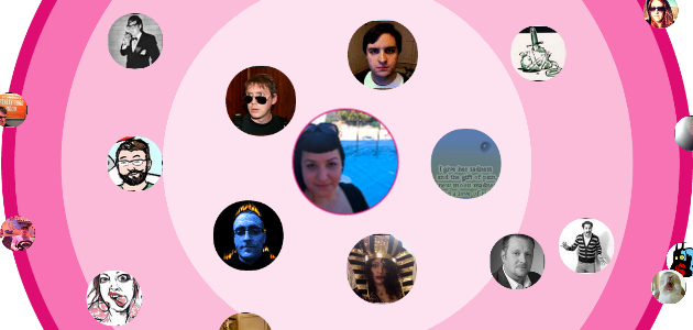
 Twitter’s instantaneous nature can make it difficult to make sense of long term relationships between people. The ‘Connections’ infographic shows a person’s followers on a ‘radar’ mapping the intensity between interactions. The closer someone’s avatar is to the center, the more they interact. In addition to mapping the intensity of interactions between people, this infographic uses an algorithm to sort people’s relationships into six separate categories: Relationships on Twitter often center on topics. By clicking on the topics in the infographic, viewers can see which people on the radar share topics with each other. If someone wants to make the most of their Twitter connections, understanding what they talk about, and with whom, is important. The topics bar allows people to see who they include in discussions and who they’re leaving out!
  By clicking on someone’s avatar, people can bring up a graph of their interactions over time with that user. People can see the ebbs and flows of communication between users, and can see what topics they communicate about. Viewers can also see the “Top Conversation” between anyone on the radar and the person in the center. The “Top Conversation” takes you to the twitter conversation between the two people that had the most activity.
Just scratching the surface
The opportunity to tell our story with infographics is only going to increase. As we create more data in our online interactions, it will become more challenging to to discern meaning from it. And not simply because of the volume of data, but because it’s ever changing. The data evolves, week by week, day by day, even hour by hour. The better we are able to understand ourselves, the more control over our lives we can take, and the more power we have to succeed. Questions, comments, kudos, complaints? Let Vizify know: [email protected]