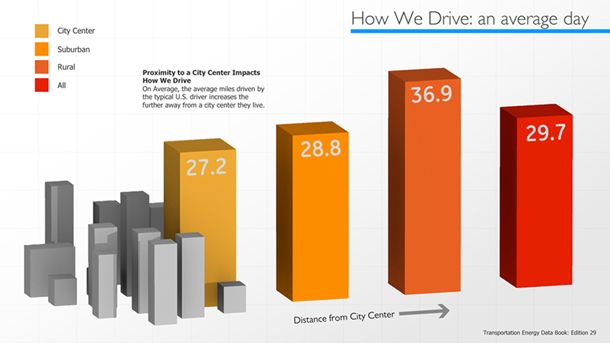
When visualization is done poorly, it often can read as propaganda. There is an important trust relationship between visualizer and viewer, and poorly done visualizations can damage that trust. If you add in obvious financial motivation or conflicts of interest, people lose trust even faster, and the visualizations intended to convey information end up conveying dishonesty and hidden intentions. One example is the Electric Vehicle page from the General Electric blog. To be fair, this page is getting rather old, as is the data used, and it is possible that someone at GE forgot about it. It is also fair to say that as long as the page is up, GE agrees with the message that it conveys. First, let’s examine motivation. GE is a huge corporation that does lots of things across many industries. Like all large companies, GE is constantly looking to expand into new areas, and one of those areas for potential expansion is likely electric vehicles. At Visual.ly, we have no problems with electric vehicles, we are excited about the cleaner future they may bring us. We have no problems with GE, either, or any of the company’s many, many products. What we do have a problem with is companies using poor visualizations to promote their interests.  How We Drive: an average day is broken in several ways. First of all, it is 3D. It is kind of clever to have the 3D buildings representing city center, but that cleverness was not worth the sacrifice of making everything 3D. The angle created by making the bars 3D exaggerates the increase, and diminishes the relative drop of the “all” bar. The second problem is that the distances between the bars are all equal, but the distances between the places they represent are not. In an ordinary bar chart, this would not be an issue, but since the metaphor of the city has been created, displaying accurate distances would be the responsible thing to do.
  How We Drive: the average trip is not even worth looking at if you want to see the data. Just reading the labels gives you a clearer picture. The percentage data here has a part to whole relationship, however the visualization does not show it. Instead the designers chose to visually represent the trip length. This may have been a good decision, but in order to show both distance and percentage, they opted to make the chart 3D. They used concentric cylinders with height tied to data so the area of the outside one will be disproportionately larger than the inside one. A simple bar chart could have communicated both distance and percentages, or they could have opted for a stacked bar chart or pie chart to convey the part to whole relationship. Any of these options could still be made eye-catching and attractive without damaging the conveyance of the information.
  How We Drive: EV usage patterns also has several problems and no redeeming qualities. To start, radial bar charts are very difficult to read. In addition, there are no concentric lines to show how bars line up. There are no radial lines to show time, although midnight and noon are labeled. Worst of all, there is no labeling to show numerical quantity. The bar charts are compared to a blue blob area that it would seem is a radial area chart, however the zero point of the area chart is apparently different from the zero point of the bar charts because there is no central circle on the blue area. In addition to the poor structural decisions and labeling, the chart has been sloppily assembled. The EV Charging bars and the EV Driving bars do not have a common center point. The Excess Grid Capacity area chart has no center point, so for all we know the center of it is very far off.
  Unpacking The Acronyms is unfortunately the best visualization on the page — yet there is no quantity labeling and the shape of the bars means that area increases disproportionately. In addition, the units are unclear: what unit is used to measure “Relative Energy Efficiency”? Ask yourself, how does this page come across? Did it give you an accurate depiction of the data? Do you trust that the data was not distorted to help advertise electric vehicles? Do you trust GE as a whole after seeing this? Visualization is a powerful tool, but it also can be damaging. Poorly done visualizations are often more damaging than no visualization at all. Even if there was no malicious intent, bad visualizations can undermine trust in a company or brand. As viewers’ visualization literacy grows, they will become more adept at spotting bad visualizations. Don’t let those be yours! If you are a designer creating visualizations, keep your client’s best interests in mind. Helping them do well will encourage them to use your services again. If you are a client, make sure your designer is using best practices. You can’t afford to have poor visualization practices damage your image. Drew Skau is a PhD Computer Science Visualization student at UNCC, with an undergraduate degree in Architecture.