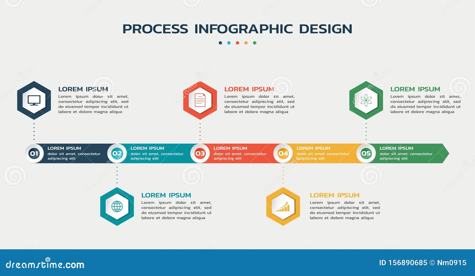
Sometimes, all you need to have people getting in your boat is for them to understand your ideas clearly. When that seems a little bit too hard at first, the best way is to simplify it. But how? By creating a process infographic.
Let’s say you have a concept of a product. You already know everything about it but it can be difficult to present all the details to other people. So you have to come up with a creative way of letting everyone know what is in your head.
Visual information and infographics are the most effective ways of doing that. In fact, data visualization is as old as humanity. Fortunately, we now have a ton of options for creating images, videos, and other visual representations.
The process infographic is especially useful in this aspect. Want to know everything about it? Just keep reading! Here you will find out:
- what is a process infographic;
- what are process infographics most useful for;
- what are the best examples of process infographics;
- how to create a process infographic;
- where you can find professional process infographics.
Download this post by entering your email below
What is a process infographic?
The first step to understanding this is to know what an infographic is. Basically, infographics are a means of communication that became increasingly popular over the years, mostly (but not only) on the internet.
They are meant to inform the public about something in a way that is easier to understand. That can go from simple but long concepts — like a historical timeline — to complex themes involving knowledge that most people don’t master.
In this case, the reason to use them is that not everyone is good with data literacy. Talking to different people means you have to talk their language, not just yours. So a process infographic will make the translation in a visual form.
This specific type of infographic works as a tree or a flow, with each step linked to the next one. It is made for depicting decision-making, whether from an existing process or something that will still happen. If you follow the steps, you will eventually get to a result according to the path you took.

What are process infographics most useful for?
Since this is a tool mostly for decision-making, it is great for showing “how it works” charts. But before we talk about the situations where they are best applied, let’s see the reasons they should be used.
According to a 2017 study, infographics have been considered effective for 84% of the companies that used them — which were 56% of every queried company. The medium is also considered the best at affecting learning and retention of information.
It is fair to notice that, since 2017, there are more people seeing infographics through smartphones than desktop, since most internet accesses are now mobile. So be sure to learn about data visualization for mobile, too!
Now that you know all that, check some practical uses for process infographics:
- detailed instructions;
- directional guidelines;
- software programming;
- process audits;
- project planning.
What are the best examples of process infographics
Just like the tool itself, you can understand how good an infographic is by us showing it to you! See some great examples below and get inspired. Then, you can keep reading to learn some tips on how to make your own.

From Visually.
This image shows the steps that businesses could use to adapt to remote working. It is a current topic and people have too much information floating around, so this was a great way of putting everything into perspective with a clean visual.

From Visually.
This one is an example of the instruction infographic. It is easy to get, fun, and complete since it shows different ways to use the scarf. Notice how the focus is around the illustrations but there’s still some supporting text.
See how you can get a complex process and make it easy to understand? Water treatment is not something that a lot of people know about, let alone comprehend in detail.
How to create a process infographic?
After those examples, you may have some very good ideas in your mind. Keep those images there but you might need to add some elements and change others.
You want your infographic to turn out the best it can be, right? Then pay attention to the following aspects.
Research your topic — and your audience
There are so many subjects we want to talk about. Your company probably has a lot of content that could be turned into infographics but what does your audience actually want to see?
Do some research to find that out. You can also discover the best way to provide that content, visually speaking. If you listen to the people first, you will be closer to reaching their expectations.
Analyze the nature of the process
Providing information mainly depends on what the information is, to begin with. A big topic will require a lot of summarizing but a short one makes space for more illustrations. A cyclical process allows you to use a circular layout, while others don’t. You get the idea.
Pick the right colors
Colors are very important in infographics for various reasons. First, it can be a strong instrument in separating sections or steps. That may happen once or several times, depending on the topic, so the right colors must be picked to keep the viewer comfortable.
Also, as in everything marketing related, colors make a point in your brand and in the audience’s emotional response. If you can, try to use colors that match your branding and add up to your company’s image.
Where can you find professional process infographics?
As you can see, making a good, effective infographic is not very simple, though it sure is worth the effort. However, a bad approach can have the worst results than not using one at all.
Therefore, be sure to get a process infographic designed by professionals. Lucky for you, there’s no need to search the whole internet to find them. Just click here to tell us about your ideas and get a quote from us!


