There are times when mere words are not enough, and an image does the job much better.
That is the basic idea behind the infographic, one of the most versatile content types there are and a strong tool your brand can use to achieve relevance and visibility.
You have probably already seen dozens of infographics online. They usually bring information in an easy to understand way, combine images and charts, and sometimes are even animated. There are several types of infographics, which is something that further corroborates how useful they are as a content format.
Now is the time to learn how to bring the strength of the infographic to your brand. In order to truly enjoy its benefits, you must know the best ways to use them. Otherwise, you risk causing the opposite effect and driving your audience away from your business.
Have you ever wanted to create an infographic for your brand? Check out this article to learn what this kind of content is, how to make your own, and the best design practices you need to know.
What is an infographic?
An infographic is a content format that combines text and visual elements to convey information to the reader in a faster and easier way. This mixture is cohesive since each of those parts is used in the best way to address the main piece of information.
After all, there are times when text alone is not enough to fully explain a subject or piece of information. Employing the help of visual elements can make certain data easier to understand, which might be critical for the brand’s ability to achieve engagement and relevance.
For instance, it is much easier to grasp the impact of a pandemic while looking at a geographical infographic that details the areas of the world that already reported cases and those that did not.
Surely, you can deliver the same information through text, but it would not be as intuitive.

Benefits of creating an infographic for your brand
Strong branding tool
The more you explore different content kinds, the stronger your brand gets. You should always look for ways to attach your company’s name to relevant, interesting pieces.
Since they are highly shareable, infographics can help you with that while keeping your audience satisfied.
Easier to understand
If your brand does not communicate in intuitive ways, it is bound to lose relevance among its target audience.
You should always use the best kind of content to deliver each piece of information, and that includes employing the strengths of infographics within your content marketing strategy.

Viral potential
When your content goes viral, you are able to reach a much bigger audience than you normally would. Your brand might achieve higher recognition and much of that can positively affect your results.
Infographics are highly appealing to be shared on social media and blogs, so they can go viral and carry your brand’s name along with them.
SEO relevance
Since infographics can carry your brand’s name forward, this also applies to your content’s SEO relevance. This piece of content can help get your blog posts and website pages further to the top of Google’s search results.
That is a great way to reach more visibility and obtain visits from people interested in what you have to offer.
What are the main types of infographics?
Now that you know what an infographic is and the main advantages of using this element, the next step involves learning its main types.
This will help you determine which approach you should take when creating your own infographics for your brand. Since it is such a flexible content format, multiple variations completely change its presentation.
Here are some of the main types of infographics to inspire you:
Informational infographic
Whenever most people think of an infographic, they might imagine the informational type.
It is mostly used to give a broad overview of a subject in an easy to understand way. The informational infographic is presented as a short article, but contains plenty of illustrations to make it more appealing and understandable.
The main characteristic of an informational infographic is its conciseness. It is supposed to convey information in a few words and images, allowing the viewer to understand its topic quickly at a glance.
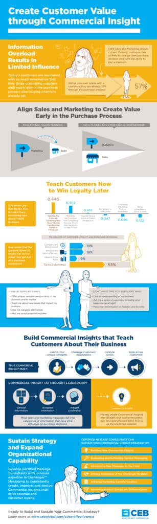
Statistical Infographic
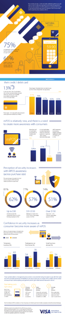
As the name implies, the statistical infographic primarily focuses on numbers, charts, and indicators. It usually utilizes big numbers as a way to capture the viewer’s attention as well as graphs in several different formats and colors.
The statistical infographic is most commonly used to show survey results, market research findings, and to corroborate arguments with raw data. The main idea is to tell a story through the statistical data presented in the infographic, with a coherent beginning and an end.
Comparison infographic
Sometimes, the best way to convey information is to compare two pieces of it. The comparison infographic brings a contrast to the center stage and allows the viewer to draw their own conclusions and make a decision based on the data included.
Typically, this content format does not bring its own opinion forward.
Such contrast is often helped by the design of the infographic, such as allowing for easier comparison by putting equivalent elements side by side. Usually, two sides are presented in an infographic that is split in half.
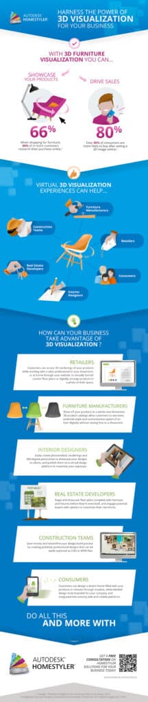
Geographic infographic

You should create a geographic infographic when the main piece of information refers to one or multiple locations. It is usually employed whenever there is data to be displayed in relation to maps.
That is a great way to create comparisons between regions, highlight important information relating to them and others.
There are various ways to help your viewer understand your data under the context of location. You can use heat maps, set pins on certain areas with relevant information, and even draw comparisons between those areas.
List infographic
A list infographic brings a collection of information divided by unordered or ordered lists. If you wish to develop the top 10 choices for something, a step-by-step process, or simply use a list to easily present information in smaller bites, this should be your pick.
You can use your creativity to replace the bullet points with other elements and make your piece stand out as well as arrange the topics in the available space in a way that is easy to read.
It can be consumed quickly because most people will skim through the list topics and, whenever they find something of interest, then they read through.
Check out some infographic examples
The best way to understand how to make an infographic and grasp the versatility of this content format is to look at good examples. Variety is the key, so the best course of action is to look for the most unique infographics in order to draw the appropriate inspiration for your own content strategy.
Below, you will find some infographic examples that will help you see how it can help your brand. Check them out:
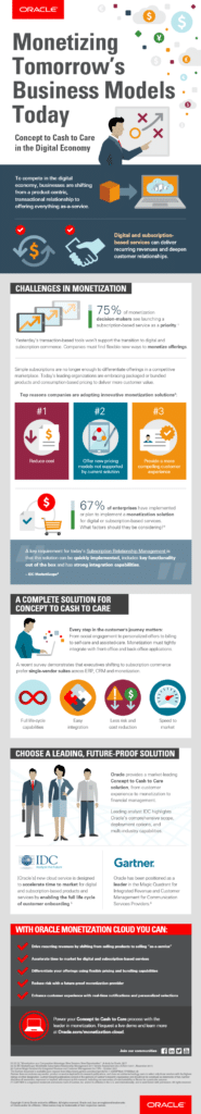
Oracle
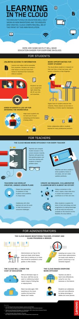
Lenovo
Over-Medicated America
Learn the best design tips for infographics
Now that you have learned what an infographic is and checked some great examples of content, you need to know exactly what it means to create quality pieces.
The only way to count on the advantages an infographic can bring to your brand is to make sure your design choices are solid during your planning and execution phases.
Here are the top tips for creating an infographic for your brand the right way:
Create your infographic for the right audience
There is no truly ideal infographic rule. As with any other kind of content you create for your brand, it must primarily serve your target audience’s particulars.
This means the visual and writing styles must adapt to your audience and make sure they understand your information.
This also applies to the visual elements employed in the infographic. Your target audience must be able to grasp your content in its entirety and draw the appropriate conclusions from your data.
If that does not happen, then your infographic has failed to communicate with them.
Consider the flow
Putting yourself in your audience’s shoes is critical to assessing your content’s ability to properly communicate. However, you must also take a few steps in those shoes to understand if your infographic’s flow is making sense.
The flow is the logical path one follows when consuming information. Check if the beginning of your infographic is intuitive and if it is easy to understand where to go next.
Indicative arrows are not always necessary, as good design can direct your audience’s eyes to where you want them to go.
Use the correct element hierarchy
The way that your infographic elements are laid out says a lot about what is important. At least, that is how this is supposed to work. People are naturally conditioned to; for example, consider the bigger elements to be the most critical information.
In addition, be careful not to include too many elements in your infographic. Minimalism is not just a visual style as it is a best practice. This mistake might distract your reader and harm their ability to grasp your infographic’s main point.
Choose the right colors and shapes
As with any visual piece of content, your infographic must use your brand’s style as well as condense the right elements together to deliver the right piece of information. This means knowing which design choices to make in its planning stages.
Learn about the properties of colors and how shapes can change the meaning of the content inside them. Remember that an infographic is a collection of several different parts that need to work well together.
Remember the shareability
One of the biggest advantages of working with infographics is how easy it is to share them on social media and blogs. People who like your content might help your brand go viral this way, but it only works if your infographic is easy to share.
In order to do that, make sure it is not too big and can adapt to several screen sizes. Also, make sure there are visible share buttons on your page so people can know exactly how to do that.
Use the Best Tools for the Job
While free tools can be appealing, they often come with limitations that can prevent your infographics from achieving their maximum impact. For those looking to truly leverage the power of infographics, premium tools like ION by Rock Content offer a superior alternative.
ION: Elevating Interactive Content Creation
Break through the noise with ION’s interactive content capabilities. This powerful platform allows you to engage audiences across the full buyer’s journey through creative experiences that captivate prospects and capture the essential data you need — all without writing a single line of code.
- Code-Free Application: Quickly build personalized interactive content experiences. Start from a blank canvas, use fully responsive Quick Start templates, or engage Rock Content’s professional services team to plan, create, and launch your own branded content experiences.
- First-Party Data Collection: Launch your interactive infographics, capture valuable lead data, measure engagement, and generate actionable insights with precise accuracy. Utilize ION’s capabilities to run A/B/n tests and find out which variants drive the best conversion results.
- Revenue Acceleration: Leverage captured data for effective lead qualification and sales enablement, improving alignment between sales and marketing and accelerating marketing-to-revenue velocity. Integrate seamlessly with your CRM or marketing automation tool to ensure smooth data flow.
- Enhanced Engagement and Awareness: Interactive content not only increases brand awareness but also keeps your audience engaged longer, providing greater value and enhancing brand perception.
- Boosted Lead Generation: Interactive infographics can dramatically improve lead generation results, often doubling effectiveness compared to static content by offering valuable and meaningful experiences in exchange for user information.
Interactive content like that created with ION can transform how you connect with your audience, making your infographics not just informative but genuinely engaging.
Examples made with ION:
Twilio
NetApp
Enverus
Check our Infographic Best Practices Guide for more!
Ready to Elevate Your Infographics with ION?
Dive into the world of interactive content with ION and discover how easy and impactful your content creation can be. Visit us today and start your 14-day free trial to experience the transformative power of interactive infographics and other content types.