From sports metaphors to catchy slogans, American politicians are always looking for a good way to make arcane policies more digestible to their constituents. With the proliferation of social media and Hill staffers who know how to use basic data visualization tools, charts and graphs have become the new highly sharable and dubiously substantive political propaganda tool (or propagraphics, for short). During the 2012 presidential campaign, both Mitt Romney and President Barack Obama released infographics on the web and social media to reach voters with pretty and easy-to-digest, if rather shady, facts and figures.  But while these types of graphics may only get serious traction in election years, executive and congressional staffs are introducing similar, if more poorly designed, infographics on a regular basis in an effort to turn the tide of public interest in their favor. We decided to look at four of our country’s political leaders, two Republicans and two Democrats, to see what kind of data visualizations they’ve been creating in the service of politics.
Rep. John Boehner (R – Ohio)
Being the Speaker of the House of Representatives and one of the most powerful members of his party, John Boehner is also one of Washington’s most prolific users of infographics as a propagandistic tool. Most of the Speaker’s graphics are beautifully designed and have an edge to their point that doesn’t have a place in the formal political arena. Their target clearly isn’t fellow members of Congress, but rather the average citizen who might be inspired by the graphic to call their congressperson. Most of these infographics are light on numbers, are more concerned with assigning blame than conveying facts and use a questionable premise and debatable comparisons to elicit an emotional response from the viewer instead of making a political argument.


Speaker Boehner also never passes an opportunity to use a graphic to engage an audience over the web, even creating custom hash tags for standard charts in an effort to create discussion.  These attempts to make these charts and graphics go viral with social media represent how important politicians perceive online networks as a way to disseminate information and use people power to further their causes. In general, it seems that with the exception of Obama’s team, Republicans are more willing to use infographics as a tool to propagate their issues. Boehner’s team in particular have created several images for the Speaker’s Flickr page that are built specifically for Facebook use.
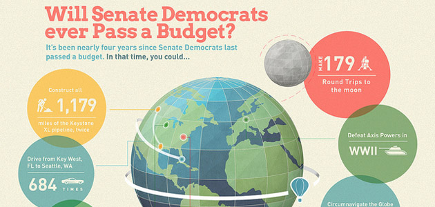
Rep. Kevin Brady (R – Texas)
For being a relatively unknown name in the House, Rep. Kevin Brady and his staff have produced propagraphics that are popular among many higher ups in his party, including Speaker Boehner. However, Brady’s recurring graphic strategy seems to be the opposite of his colleague. Instead of using aesthetic appeal or even readability to make his point, Brady’s graphics are intentionally cluttered and impossible to unravel, emphasizing his point that government programs are overly complicated.


While these graphics certainly are not created with an eye for the principles of design, they are effective as a type of communication tool. That said, while Brady’s team did not attempt to parse the complexities of sequestration, they did leave us with this gem of a propagraphic on the issue. 
President Barack Obama
It certainly isn’t just Republicans in the propagraphics game. The President has an entire category on his website devoted to infographics that his team produced for his 2012 campaign. The president’s graphics are clean and simple, and emphasize a linear narrative far more than Boehner’s or Brady’s. Sometimes, his infographics accompany a larger piece of text, acting as block quotes to pull out the information Obama’s staff most wants the audience to see.  The president’s graphics are also largely devoted to explaining the impact of his policies, not necessarily the nuts and bolts. He has come under fire in the past for using graphics to overly simplify issues and has largely backed off of large graphic endeavors since the campaign.

Rep. Nancy Pelosi (D – Calif.)
Rep. Pelosi is the odd lady out in the grouping in a number of ways. Her graphics are the worst designed of the four, beating out Rep. Brady because of poor and unnecessary chart decorations. Like her congressional colleagues, Pelosi is concerned with showing the bad effects of the oppositions policies, and uses inflammatory imagery in an attempt to hit an emotional chord. However, where the charts fall flat is in execution. Besides an unfortunate affinity for 3-D pie charts, most of Pelosi’s graphics are poorly photoshopped, which serves as a distraction from the point she is trying to make.

Even worse, these graphics tend to obscure the data being presented, and not in an intentional way like Rep. Brady’s. In a graphic meant to show the increase in U.S. domestic oil production, Pelosi’s designer decided to replace bars (too boring) with oil derricks to emphasize the subject matter. The result is confusion. Disregarding the awkward stretching of the derrick image, the viewer can’t be sure where to look for the data: the top of the derrick or the top of the oil squirt? The overall point is made – that oil production is going up – but with unclear data, Pelosi’s team would have been better off leaving the chart out entirely.

While infographics and data visualizations are becoming an ever more present part of news coverage and social media life, Washington’s politicians – on the left and the right alike – haven’t quite figured out a way to harness this medium. Whose graphic strategy do you think is the most effective, or do you think politicians should stay away from the propagraphic game?