 Consumer-driven or real-time data can be unpredictable and messy, and designing a visualization around it is challenging on the best of days. Influenced by recent trends in responsive interface design, and growing out of a need to visualize real-time and social media data, today’s information designers have adopted techniques for designing visualizations of unpredictable data destined for a series of device scales. What is Responsive Design? Responsive Design creates the optimal user experience for different use cases and environments, all built into one website. For example, an interface that automatically scales and re-arranges for a mobile device vs. a full-scale monitor, is using responsive design. What is Responsive Information Design? Responsive information design is very similar, but it involves being responsive to the incoming data as well. It defines a set of best practices for designing data visualizations and infographics where the nature of the data that is being visualized is not 100% known at the time of its design. In other words:
The aim of Responsive Information Design is to produce a robust visual representation for information with varying forms, shapes, and sizes.
Responsive information design principles are present in everyday products such as your car’s Tachometer where different design treatments are given to call attention to different ranges of values, dependent on your car engine’s current RPM.  At Visual.ly, we use responsive information design principles building Visual.ly Create. Many of the infographics that can be generated on Create are driven by dynamic data from social networks and other data APIs. The data used to power some of these infographics comes from Facebook and Twitter. Users’ profiles often have incomplete or missing fields, and finding ways to accomodate these different edge cases in one infographic design can be a big challenge. The solution to the problem lies at the intersection of programming, design, data analysis, and data visualization. This intersection is where responsive information design can help. There are many different applications of responsive information design principles. Here’s how they relate to the design of dynamically-generated information graphics.
Principle #1: Responsive Scaling
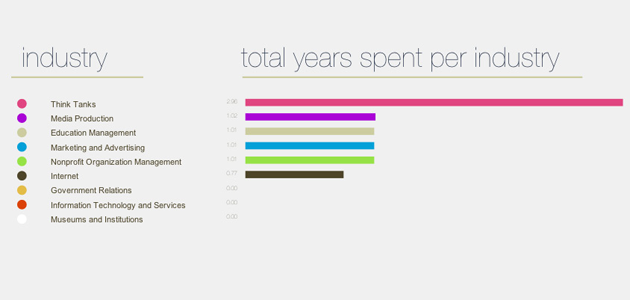
Responsive scaling of information containing elements is a technique that’s commonly used by interactive and static infographic designers.  Often, the data being used turns out to be of a variable size. In this situation, one option is to leave out data points, but this is not ideal because it may misrepresent the set by sampling incorrectly. Another option is to change the type of visualization, although this can result in communicating a different concept. Usually, the best option is to scale down the sizes of visual objects representing the data, but this only works when the results are within the maximum number of elements in the visualization.
  Here, data-driven elements take the entire height of their parent container, but this presents a problem when there are more rows of data to visualize.
  The solution is to develop the visualization so that the elements are scaled to fit their container as more are added. This maintains the integrity of the visualization without changing the overall layout or interpretation of the original design. Note that the width of the bars is scaled based on the quantitative values in the data, while the height of the bars is scaled based on the quantity of values in the data. Here is a code snippet, written using d3.js, that applies this concept of scaling of elements based on their width and height.
var maxX = d3.max(d3.values(values)); var maxY = d3.keys(values).length; var xscale = d3.scale.linear().domain([0, maxX]).range([0,width]); var yscale = d3.scale.linear().domain([0, maxY]).range([0,height]); var group = g.selectAll("g") .data(returnedData) .enter() .append("svg:g") .attr("class","bars") .attr("transform",function(d,i){ return "translate("+0+","+yscale(i)+")"; });
Fallbacks
Visual fallbacks are another important aspect of responsive information design. Since data may not be returned in the expected format (or at all), there need to be visual fallbacks to accomodate for different edge cases. 
Principle #2: Dynamic Story Telling
Data driven callouts can be useful devices for bringing attention to interesting or unique segments of data in a visualization. They can also be especially challenging, since it is hard to tell in advance what pieces of a visualization are worthy of calling out. In order to accomplish this, part of the analysis phase must be built into the data visualization.  The day with the peak appearances of a hashtag is called out in this area chart. That day in the life of a hashtag infographic is given special attention with this visual treatment.
Principle #3: Rapid Prototyping
The best way to head off the challenges of dealing with unknown and variable data is to start the design process by establishing a deep understanding of the data source. Try to quickly establish ‘what is possible’ to visualize from the information source you are using. For example, in designing the Facebook Monsterizer, the first step was to establish what user data was and wasn’t accessible through the Facebook API. Getting to the first intersection of data and design as soon as possible is key to speeding up the development process. Where data meets design is where everything breaks down. This point is where data constraints and design specifications must be negotiated to ensure an acceptable result for every combination. For more on responsive information design, see our slideshare presentation.

