How to Easily Check Visualizations for Accuracy

Updated: February 12, 2021

Need content for your business? Find top writers on WriterAccess!

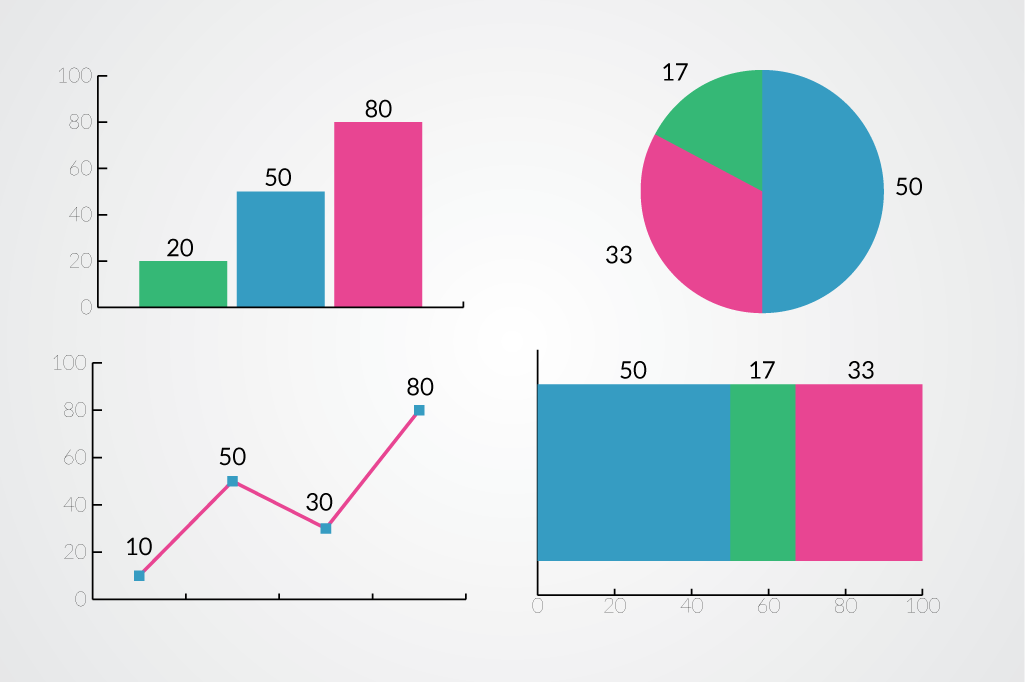
It is difficult to tell if many visualizations have been created correctly. Without looking up original sources and essentially re-creating the visualization yourself, it is often impossible to know if the visualization accurately shows data, or the relationships that were in the original data. This makes the trust relationship between visualizer and viewer extremely important, and as we all know, one mistake loses trust, and it’s a long battle to regain that reputation. Chart Segment Labeling Not all visualizations are difficult to double check though. There are a few data visualizations that can be checked against themselves. These visualizations are both the easiest way to lose a viewer’s trust (if you do them wrong), and a good tool to regain trust slowly (if you do them right). The key to being able to check all of these visualizations is having individual labeling of the chart segments.

Pie Charts

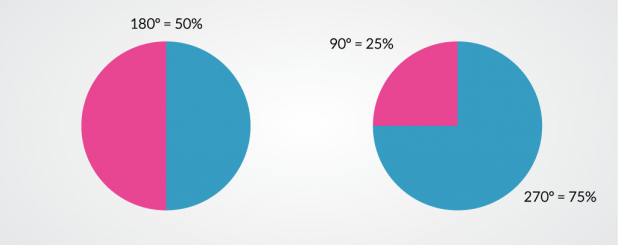
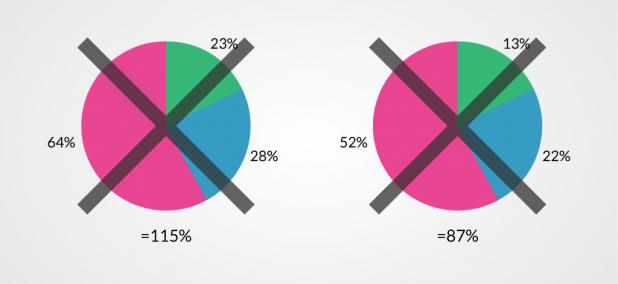
Pie charts are the easiest visualizations to check for internal consistency. The reason they are easy to check is because they contain an overarching rule – they must have a part to whole relationship. This means that pie charts that show percentages have to add up to 100%. If they add up to less or more, it means there is something wrong. Inaccurate Pie Totals It is also possible to check individual wedges of pie charts. They have a pretty simple geometric rule – 1% = 3.6º. People are pretty good at judging a few angles. If you see a right angle, you can tell pretty well that it’s 90º, and it’s fairly easy to tell a straight line from a slightly bent angle, so 180º is simple to catch. These two angles make it easy to visually check 25%, 50%, and 75% wedges. And checking wedges that are close to those values is easy too. 53% is a little over half the pie, 23% is just under that 90º angle. Pie Chart Angles to Percentages
Stacked Charts

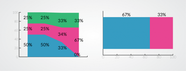
Percentage based stacked bar charts and area charts that have a part to whole relationship are the next easiest to check. These charts need to stack up to 100% just like a pie chart, and just like a pie chart the 25%, 50% and 75% thresholds are pretty easy to spot too. 50% is the easiest – it should be half the height of the chart. The others are pretty simple too, just 1/4 and 3/4 of the height. On these charts, thirds also become pretty easy to see, making 33% and 67% easily checkable. Stacked Chart Totals
Bar, Line, and Area Charts

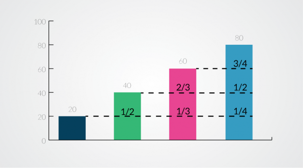
Standard bar charts, line charts, and area charts are also checkable, even if there is no part to whole relationship The strategy changes a little for these charts though. Instead of checking the bars, line, or area segments against the overall chart, check them against their neighbors to ensure they are proportional. The easiest segments to check are ones with a simple fractional relationship – 1/2, 1/3, 2/3, 1/4, 3/4. If the labels say that one bar should be half the height of the other, see if it looks like it is. Fractional Relationships Between Bars In a world with increasing quantities of visualizations it’s important to be able to trust what you see. As a viewer, take the time to double check visualizations that have individual labels. You might be surprised at what you see. And if you’re a creator of visualizations, be careful and proofread all the visualizations you build. Remember that all it takes is one mistake to lose that hard earned trust. Drew Skau is Visualization Architect at Visually and a PhD Computer Science Visualization student at UNCC with an undergraduate degree in Architecture. You can follow him on Twitter @SeeingStructure
Share
facebook
linkedin
twitter
mail

Human Crafted Content

Find top content freelancers on WriterAccess.

Human Crafted Content

Find top content freelancers on WriterAccess.

Subscribe to our blog

Sign up to receive Rock Content blog posts

Rock Content WriterAccess - Start a Free Trial

Order badass content with WriterAccess. Just as we do.

Find +15,000 skilled freelance writers, editors, content strategists, translators, designers and more for hire.

Want to receive more brilliant content like this for free?

Sign up to receive our content by email and be a member of the Rock Content Community!

Talk to an expert and enhance your company’s marketing results.

Rock Content offers solutions for producing high-quality content, increasing organic traffic, building interactive experiences, and improving conversions that will transform the outcomes of your company or agency. Let’s talk.