Gregor Aisch’s post last week on speedometer design hit close to home for me.
My dad has been an automotive engineer and designer for more than 30 years now. I’ve absorbed a wealth of automotive history and industry knowledge over the years by reading car mags, rebuilding old cars, watching the corporate shenanigans, and following Top Gear (the best TV show on the planet) and Drive.
Gregor raised a couple questions (below) about the design of the common speedometer, so I’m going to use his post as a jumping off point for further exploration of the context of speedometers. As real estate professionals say, “location, location, location.” When it comes to data visualization, we say “context, context, context.”
Download this post by entering your email below
Robert Kosara had a similar reaction, but he took it in a different direction. But, back to those questions..
- Current speed is only one number, so why use a relatively large area to display a single data point?
- Speed data is not periodic, so why use a radial chart?
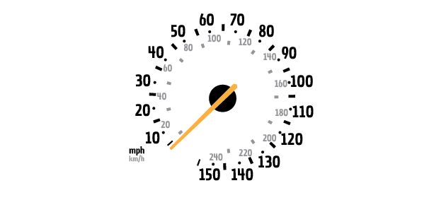
Here’s a drawing of the speedometer from my car. It displays speeds from 0 to 155 mph (0 to 240 km/h) 
To address questions of how small or large a speedo can be, as well as how much information it can display, we first need to establish the physical context of the layout. You may not have noticed that when you look at your speedometer, you’re looking at it through a window. That window is created by the steering wheel. The upper gap in the wheel defines the boundaries of the canvas that we can design within. When you turn the wheel, the viewable canvas area is even smaller.

The speedo also shares space on that canvas with other critical instruments: tachometer (engine speed), odometer (mileage), coolant temperature, turbocharger pressure, and fuel level.

A numeric display alone is no good
So why not just take that space devoted to the gauge and smack a big digital readout of current speed in its place?

Because it would suck. The movement of the needle around the gauge delivers a lot more information than first meets the eye. The speed of the needle indicates how rapidly the car is accelerating or decelerating. Imagine merging onto a highway.
On the entrance ramp, you glance down and mentally note the movement of the needle as you begin accelerating. You return your eyes and lift off the gas when you think you’ve roughly reached the appropriate speed. Your intuitive sense of that target speed was informed by the prior glance at the movement of the speedo.

Having the full range of speeds displayed at all times allows you to establish zones on the speedo.
Once you’ve learned the speed ranges of your particular car, you can glance at the cluster and get a quick approximation of your speed without having to read any of the characters on the panel. Usually, this rough awareness of speed is all that you need. Am I going slow, moderate, fast, or super fast?
Additionally, there are other “events” that occur at various points in the speed range. Many Porsche models have spoilers that deploy between 50mph and 75mph. European cars are sold with speed governors that cut engine power at 155mph. You can pay extra when you buy a BMW or Mercedes to have that governor deactivated.
The latest high-powered Corvette has exhaust valves that open above 3,500 rpm for better performance. It’s nice to be able to gauge where you are relative to these events.

Here’s a use case where seeing the position of the needle within the full range of values is critical: Shifting gears with manual transmissions, which much of the world still does.
Coordinating the position of the two main needles (the tach and the speedo) is essential both for properly timed upshifts and smooth downshifts (“rev matching”).
Each gear has a common range of RPM that correspond to a different range of speeds. My car has five gears, and each of those gears can drive the wheels between a given range of speeds. If you use a gear below it’s corresponding range, the engine may stall; if go above the range, you’ll redline the engine and risk damage.

The speedo is round because the wheels are round
The radial layout of the speedometer is a holdover from when it was a mechanical device. The typical speedo of the mid-1900’s transmits rotational speed from gearing in the transmission to the needle in the dashboard by way of a flexible, springy wire cable.
The cable is sheathed in a jacket and squared off at each end so it can be spun by the transmission and thus spin a magnet where it terminates behind the instrument panel.

That orange needle itself is not physically connected to any rotating parts in the drivetrain.
The needle is held in place by a lightweight spring pushing it toward the zero position. Behind the panel, the needle is attached to a metal “speedcup.” The magnet attached to the cable generates a magnetic field that grows stronger the faster it spins.
This magnetic field acts upon the speedcup, providing the force that pushes the needle away from zero. So, this mechanical design was the most reliable, cheapest way to translate the rotation of circular wheels (driven by the transmission) to the rotation of a needle around a circular gauge.
“Circle” is the native language of the car.. at least for the drivetrain. Additional translation from circular rotation to the linear movement of a mercury thermometer, for example, would have added cost and complexity to the mechanical design.
When cars had lower top speeds, there were some dashboards with more linear instrumentation layouts, but they achieved that by shorter travel of a longer needle along the arc of a bigger circle. True linear movement speed gauges are very rare. Gregor noted that his speedo had a non-uniform scale.
Well, check out this old Cadillac; the scale is stretched out on both ends.

However, in the 1980’s, there was an eletronical revolution that rendered the cable and magnet setup unnecessary; it was replaced with electromagnetic speed sensors, electronically controlled needles, and sometimes digital numeric displays.
Fast-forward to 2012 where we now have almost complete control over the instrument panel layout and can project graphics onto Heads-Up Displays (HUDs) that seem to hover in space in front of the driver.
The cluster below from the latest BMW 5 series is a 10.25″ LCD screen that displays distinct graphics depending on the selected driving mode. Two modes are shown below; ECO PRO and SPORT.
Note that in SPORT mode with manual shifts activated, the two main gauges are connected by a red glow to signify the important relationship between them, as I described above.


With adaptive display technology like the BMW LCD panel as well as alternative energy systems, we now have both new information to display, and new possibilities for displaying it. Now is the time to start brainstorming new instrument panel layouts.
Speedometers of the future are not shackled to the radial layout of the past. I’m open to radically different shapes and sizes of displays, but they’ll have to be thoughtfully designed to outshine the beloved dial.
Paul Van Slembrouck (@ptvan) is a visualization designer with a lead foot, based in Detroit.