You’ve worked hard to create an amazing campaign for your brand, combining top-notch content and engaging visuals. Now all you have to do is get that content in front of as many eyes as possible. Social media offers brands a distribution channel for the promotion and amplification of their content, but it’s also becoming an increasingly noisy place. To stand out above the clamor of the Facebook, LinkedIn and Twitter crowds and train the right eyes onto your content, you need to spend a little scratch to boost the reach of that content. Why? Because it’s just not going to be seen otherwise. You’re probably thinking, “but social media is supposed to be open and free!” Sorry, that’s no longer the case. (We’ll tell you why below.) And hand in hand with paid placement comes creating the right images to help boost performance further. Here’s what you need to know about getting your content promoted on each of the leading social networks.
As a publicly traded company, Facebook must now demonstrate profitability to shareholders. The result? The well-documented decline of brand pages’ organic reach. For content marketers on both the agency and brand side, this means one thing: Facebook is quickly becoming a pay-to-play network. Facebook’s self-serve advertising platform makes it easy to hyper-target key audiences, but there are some tips for crafting a relevant and effective ad — one that gets clicked, and more importantly, converts the person on the other side of the click into a fan, lead, or customer.
Relevance, a great call-to-action and a crystal clear value proposition work together to pull the user into your content, but it all comes down to strong visuals and ideal image size. The Facebook Ad Library is a useful tool for analyzing the performance and creative strategies of your competitors’ ads on the platform.
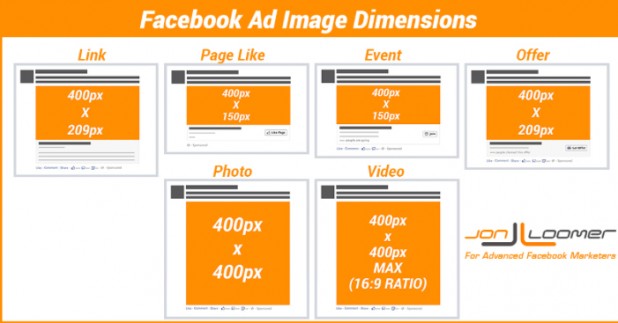
On Facebook, the best image size to upload is 1200 x 627px. If you’re placing an ad front and center into the newsfeed, you’re looking at a minimum of 600 x 600 pixels. Jon Loomer wrote an excellent post outlining the optimal image sizes for various Facebook ad products and media type. Keep it handy as you’re optimizing images for the most effective ads possible.
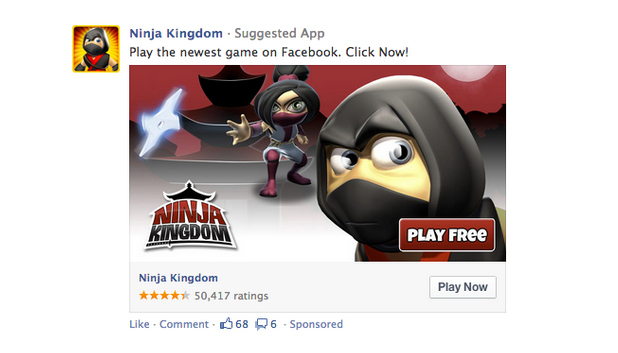
There’s good reason that big, bold visuals capture our attention as we’re doing a quick scroll through a Facebook timeline — they stand out against a wall of text. Newsfeed ads with clear calls-to-action (Install this App, Play this Game!) can be irresistible to eyes bored with text update after text update. A few key considerations:
- You’re limited to ninety characters to make your pitch, so keep it simple. Clarity trumps cleverness every time. Reserve about 25 characters for the headline — that’s about five words.
- Facebook’s guidelines limit the amount of text in images to 20%. Don’t fret. They’ve made it easy to check with this super handy grid tool.
- Choose the right type of ad for the right result. Promoted posts or Page Post ads are most often used to promote brand Facebook pages, but that doesn’t mean they’re off limits to other types of content. If you’re driving signups for a webinar series or announcing the availability of a new white paper, for instance, a promoted post is the most basic and least expensive option for showcasing visual content.
If you think Facebook is getting noisy, get a load of Twitter. According to Twitter’s recent IPO documentation, there are over 500 million tweets sent each day. That’s a lot of noise to rise above and get your content the attention it deserves. Twitter’s Lead Generation Cards were made available to all advertisers on the micro-blogging platform late last year. They’re like embedded landing pages in the body of a tweet. For your community following your tweets via twitter.com, they’re simple, one-click opt-ins for newsletters, claiming coupons and offers, or registering for your latest webinar. Here’s what you need to know about Twitter Cards (there are seven types that can be attached to tweets for a beautiful content consumption experience on web or mobile):
- The minimum required width for your uploaded image is 600px and at least 4:1 aspect ratio.
- Supported file types are: jpg, jpeg, png and gif.
- The card title should describe to content of the offer, and it’s a hard stop at 50 characters.
- Call to action label – Choose short calls to actions that make the benefit obvious. You have 20 characters to work with here, make ‘em count.
- To make Twitter cards display properly, you have to include a bit of HTML in your site header, but that’s easy to do.
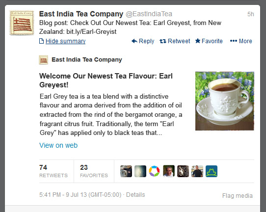
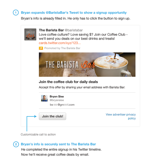
East India Tea Company used Twitter Cards to promote their blog posts. It’s a great use for online brand development. In this application, the enhanced layout looks very much like a rich snippet you’d find in search engine results and provide context to the content, encouraging more clickthroughs and deeper engagement onsite.
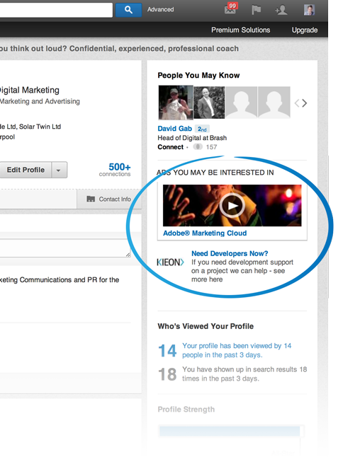
Let’s not forget LinkedIn. It’s all business, all the time on LinkedIn, as it should be. If your brand is targeting other business professionals, LinkedIn advertising offers a number of products to boost conversions and drive traffic. Sponsored posts pull images from the source links, but you have to define images for sidebar ads. LinkedIn supports image uploads for ads (PNG, JPEG, or GIF) with a maximum size of 2MB. Once it’s uploaded, your image will be resized to fix a 50px square. Ads with images perform up to 20% better, according to LinkedIn. What you need to know:
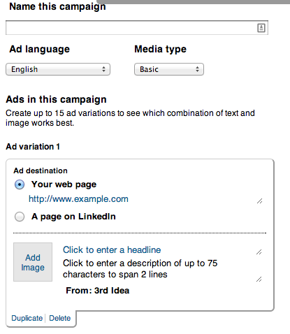
- Ad headlines are limited to 25 characters.
- Body descriptions are limited to 75 characters.
- Test, test, and test some more. The LinkedIn advertising platform will let you launch up to 15 different versions of the same ad to see which one proves most effective. This can help you test different combinations of headline, description, image and landing page to hit paydirt.
Remember that the social networks are distribution channels and, increasingly, display ad networks, so you have to carve out a little budget to train more qualified eyeballs on your content to meet those important business outcomes. Want to learn about creating visual content that drives engagement? Download our white paper, Visuals That Stick, with actionable advice on impactful design from the Visually creative team.
[optinlocker]Thank you for your interest in our Visuals That Stick white paper! You can download it here.[/optinlocker]
Jason Konopinski has been living the life of a fulltime freelancer since 2007, specializing in data-driven content development and lead-nurturing frameworks. He has worked with boutique PR, marketing, and advertising agencies to develop strategy, create cross-platform and cross-medium content, and help clients tell better stories. You can connect with him on Twitter at @jasonkonopinski.

