Download this post by entering your email below
Scatterplots may not be used too often in infographics, but they definitely have their place.
They can show large quantities of data and make it easy to see correlations between variables and clustering effects.
As a quick overview and analytical tool, scatterplots are invaluable and work with almost any continuous scale data.
Unfortunately, scatterplots aren’t always great for presentation. Several problems occur frequently, and it’s best to be aware of each when using scatterplots for analysis or presentation.
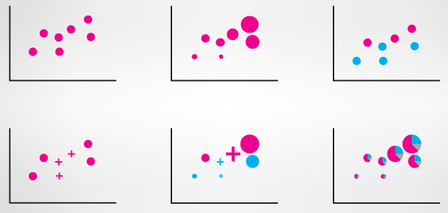
A scatterplot works by placing one dimension on the vertical axis and a different dimension on the horizontal axis.
Each piece of data is represented by a point on the chart. Variations on scatterplots introduce differently shaped or colored points for categories and differently sized points for quantitative data.
Occasionally, people use pie charts as the points in scatterplots to show even more data with a part-whole relationship.

The major cause of problems with scatterplots is discretization of values.
This happens when decimal places are rounded off, measurements are not accurate enough, or a data field is categorical.
The scatterplot below uses a standardized dataset about cars.
The problems with this scatterplot all derive from the x-axis; number of cylinders. There are so few values that cylinders is really a categorical scale being represented using numbers.
This causes overplotting problems so there are hundreds of values all stacked on top of each other.
This makes it difficult to see the full quantity of values in the dataset, and correlation and clustering is harder to find with so few possible values on the x-axis.

If you are dead-set on a scatterplot, there is not much you can do to remedy such a severe case of discretization, but in slightly better cases, there are some possible fixes.
Translucency is a powerful tool for dealing with overplotting.
Another possible mitigation technique is removing the fill of the mark. Both methods have advantages and disadvantages, and the combination of the two can also be useful.
Unfortunately, these methods are not a cure-all solution. It is still possible to have so many points or perfectly aligned points that pile up beyond the opacity range.

Ideally, avoiding data dimensions with low precision or few unique values is the best way to prevent these problems.
Sometimes data just doesn’t belong in a scatterplot and you should visualize another dimension instead.
In the case below, two continuous scales are shown and the overall shape of the group indicates negative correlation between the two dimensions.

If you really need to show categorical data, consider visually encoding it as color.
The following chart does have dimensions with lower unique value counts (data from Fisher’s Iris Data), however it does a good job of showing how color can help call out clusters.

Scatterplots definitely have limitations, most of which come from characteristics of the data.
When used correctly, however, they are great for overviews, finding outliers, and for showing patterns between some dimensions. For a data visualizer, a responsibly used scatterplot can be a very valuable tool.
Drew Skau is a scatterbrained PhD Computer Science Visualization student at UNCC, with an undergraduate degree in Architecture.