The Olympic games are inspired partly by Mt. Olympus, the tallest mountain in Greece. The origins of the games lie in competitions between the Greek Gods who lived on Mt. Olympus, and in order to pay tribute to their gods, Greeks participated in their own games. Today, shadows of that metaphor still exist in Christian Gross’s interactive, The Rising of Olympic Mountains. Here’s what he told us about creating the interactive. The current challenge at visualizing.org for creating interactive visualizations around the Olympic Summer Games was a good possibility to try out the new development skills I got while interning at the user experience and data visualization studio Interactive Things in Zurich. I was inspired by Mount Olympus, and wanted to do something related to the number of gold medals won by each country, along with a break down for each sport.

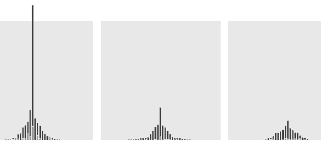
I decided to arrange the bar charts as a visual representation of a mountain. I tried to realize the metaphor of the olympic mountains in a very clean and simple way, so I limited the colors to show the selected sports and to indicate the medals won in the current Olympic game. I took the medal count of each sport and ranked them from the center outward, showing which are the top sports of each country, thus mimicking mountains. The sorting of each nation is done with the IOC ranking system that weights the gold, silver, and bronze medals to rank the country list. I used sports-reference.com as the data source and wrote a python script to fetch the information. Then I realized that the total number of medals of the United States would blast the scale of the visualisation. I had three possibilities to handle the issue. First, I could rescale the boundaries, but that would mean to lose the details of the countries with less medals. Second, I could use a logarithmic scale. Or third, I could use the fact to make my visualisation unique. I thought it was okay to let the bar break through because it shows US engagement in athletics more strongly.  Besides D3 and Python I used the JQuery plugin isotope to arrange the countries and to animate the transitions. I have to thank Jan Wächter, Jeremy Stucki and Benjamin Wiederkehr from Interactive Things for their help and inspirations. Christian Gross studies interaction design at the University of Applied Science in Potsdam, near Berlin. His currently focus is on designing user interfaces and information visualisations. You can find him on Behance and Dribble, and if you liked this interactive visualization, you can vote for his entry in the Visualizing.org Olympic Visualization Competition.