Appropriation, or the act of re-using and re-purposing pre-existing imagery, has long been an effective communication tool.
Artists have appropriated imagery for decades to comment on pop culture, but advertisers and marketers also use appropriated imagery to make a connection with audiences.
However, when not done correctly, “appropriation” can merely become a ripoff of someone else’s work.
It’s important to know where to draw the line. Appropriated imagery can be a cultural touchstone when the images are popular enough to be known by a broad swath of the audience.
Images become a language when enough people recognize them and understand their meaning. They can be a sort of shorthand that conveys messages, creates tone, sparks memories and creates connections between ideas.
The 2011 Volkswagen Super Bowl commercial, for example, was a fantastic example of appropriation.
By using Star Wars imagery and sound to tell a story throughout the commercial, the creators of this ad maximized the benefits of appropriation.
This works in part because Star Wars is so well known and so well-referenced throughout other pop culture and in daily life.
Americans generally know who Darth Vader is, what the Force is, and probably have other memories in which Star Wars plays a role.
Because of this, the ad makers didn’t have to waste any time explaining who this boy is dressed as or what he’s doing. It mimics the way that we reference pop culture in our own lives, as incorporated into our interactions and conversations, a natural shared point of understanding.
And it does so joyously, and in an original way, making it easily one of the most memorable Super Bowl ads in recent years.
However appropriation can run into problems when done incorrectly. Here are four things advertisers should avoid when referencing appropriated imagery.
Download this post by entering your email below
1. The imagery isn’t well-known enough to be understood as appropriation by the majority of the audience
A while back, Saturday Night Live wanted to do a sketch where Fred Armison impersonated radio personality and host of “This American Life,” Ira Glass. Millions of people listen to This American Life every week, more than some network television shows, but SNL cut the sketch after determining that not enough people knew Glass for the sketch to work. This provides a valuable lesson: don’t appropriate or reference imagery that isn’t part of the standard cultural vocabulary. Audiences don’t enjoy feeling like they’re on the outside of an inside joke. Part of this is knowing the audience and gauging what they would likely know. If SNL was airing on National Public Radio, such a reference would be incredibly appropriate.
2. Imagery isn’t incorporated or referenced in a way that benefits the brand

Think long and hard before using any images pulled from their original context.
Images come with baggage, and that baggage can’t, and shouldn’t, be taken away through appropriation.
Therefore any image, especially images that are sensitive, must be used deliberately and tastefully.
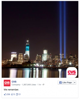
One terrible example of this was on Sept. 11 when CVS tweeted out a picture of two spotlights shining from the place where the Twin Towers once stood with their logo placed at the bottom.
The imagery is incredibly recognizable, burned into the mind of every American, but the appropriation felt like exploitation; taking a moment of shared grieving and turning it into a branding opportunity.
Also, audiences aren’t looking to brands to comment on every holiday or event. Keep it relevant, or don’t put it up at all.
3. Imagery is appropriated in a way that seems dissonant to the original work

Dissonance in appropriation can be done well.
The creator of this Simpsons take-off on Edvard Munch’s The Scream uses dissonant imagery, but preserves the tone of the original work and applies it to a new context.
Homer is comically imbued with the social anxiety portrayed in that famous painting.
However, dissonance is bad when it means getting the tone wrong. When the original context and tone are stripped, and only the visual aspect is left, the appropriation can be confusing or in bad taste.
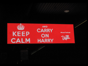
The “Keep calm and carry on” posters, for example, have been massively appropriated for all sorts of branding opportunities.

Despite the success of this appropriation, it strikes those with some knowledge of British history as rather gauche.
The original posters were distributed privately to British households by the government as a way to raise morale amidst the threat of the German Blitz in World War II.
The message of subdued resilience, “Keep calm and carry on,” implies that the people receiving it were anything but; the trauma and panic can be read between the lines.
Knowing this, it seems a bit tone-deaf to be applying the slogan to craft tote bags and using it to encourage playboy behavior.
While branding experts may have gotten away with subverting the tone in this case, don’t assume this will always be the case.
4. The imagery is so similar to the thing it’s referencing it seems like a rip-off
The most important part about appropriating imagery for advertising purposes is that the audience gets that it’s a reference.
There’s a fine line between appropriating and outright stealing, but appropriation is about making original work with existing imagery, not reusing someone else’s work.
Beyond the legal ramifications of taking other’s work, it’s just lazy and shows poor ethics.
The New York Time wrote an article not long after the release of the original iPhone about how Apple used imagery similar to the work of a famous video artist on its commercials.
According to the Times, Apple did so even after its requests to the artist and his gallery had been rejected.


