Soccer to some, football or fútbol to others, or simply The Beautiful Game, the most popular sport in the world peaks every four years with the World Cup. The sport boasts billions of fans worldwide (generous estimates put that number at 3.5 billion, or around half the world’s population) and commands a significant international media presence during the month-long tournament. Since the first World Cup in 1930, each competition has adopted its own distinct visual identity. From the first tournaments’ posters to the slick logos we know today, check out the visual evolution of the World Cup below.
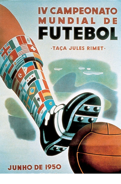
Early Years (1930 – 1950) – Poster Designs
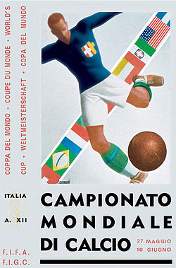
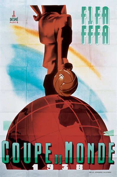
During the first four World Cups (there was no tournament in 1942 or 1946), event organizers created event posters instead of logos. The very first poster, from the 1930 tournament in Uruguay, shows a highly stylized goalie making a save.
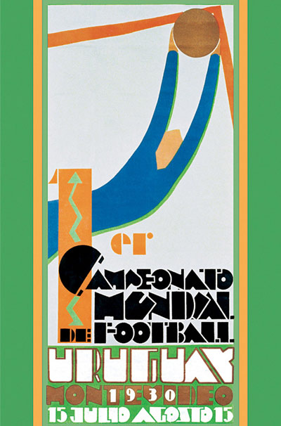
While the poster from the inaugural tournament was influenced by the avant-garde abstract and surreal movements of the era, later posters in this period were more traditional and adopted an art deco style.
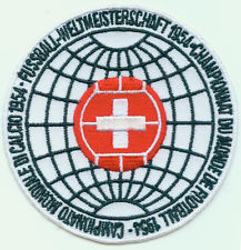
Mid 20th Century (1954 – 1966) – Local Rules
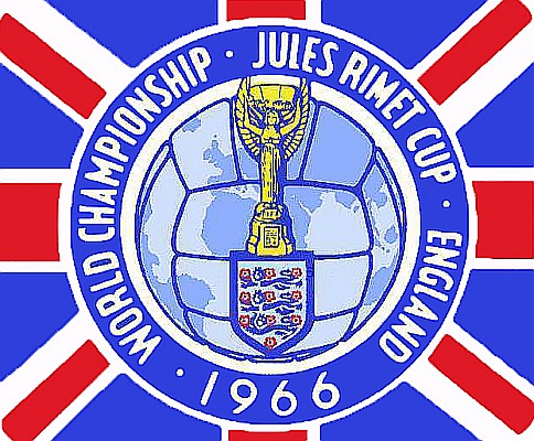
FIFA did not adopt an official logo for its tournaments until 1970. Prior to this, the host countries had total control over their tournament’s visual identity. The World Cup logo began to evolve into the single emblem that we know it as today during this period, but retained a bit of local flavor. Switzerland’s 1954 logo is centered around the distinctive white Swiss cross and England’s 1966 logo uses the Union Jack as the background.
Late 20th Century (1970 – 1998) – Simple Patriotism
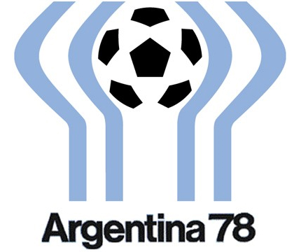
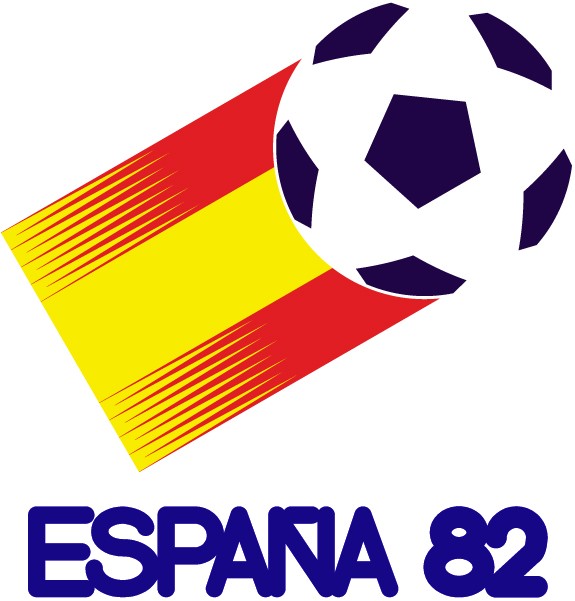
The World Cup logo did not change much during this time period, but almost all of the logos shared three key traits – the host country’s name, the host’s national colors and a ball. Argentina’s from 1978 adopts the simple blue and white of its flag; Spain’s from 1982 includes a modernized and sporty Spanish flag.
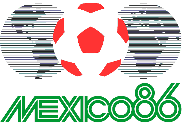
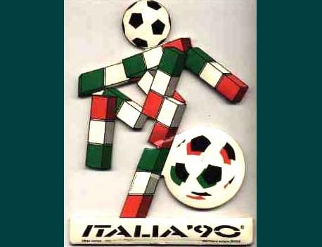
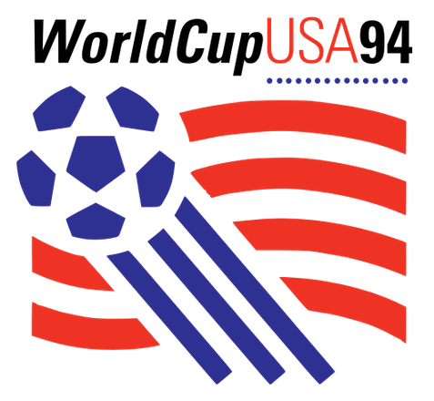
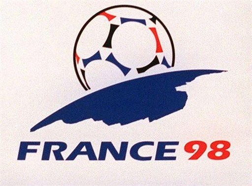
The hosts in both ‘86/’90 (Mexico and Italy) and ‘94/’98 (USA and France) shared national color schemes, which were reflected in their tournaments’ respective logos.
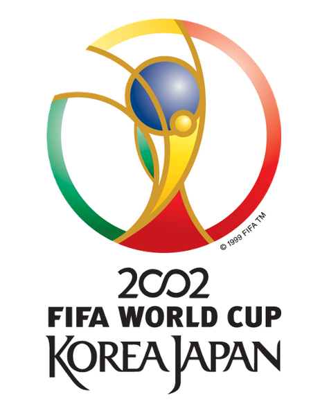
21st century – (2002 – Present) – High Concept Symbolism
Starting with the Korea/Japan tournament 2002, the World Cup logo began to stand for more than just a unified visual identity. Contemporary logos borrow from the host country’s culture and history to tell a story beyond just what happens on the pitch. The 2002 logo “builds on the artistic principles and traditions of Korea and Japan, such as asymmetry, dynamism and harmony, in order to live up to the high quality of design for which both countries are renowned,” said Andy Milligan, then an international project manager at Interbrand, the agency that designed the logo. The next two tournaments also integrated a miniature version of 2002 logo into their designs.
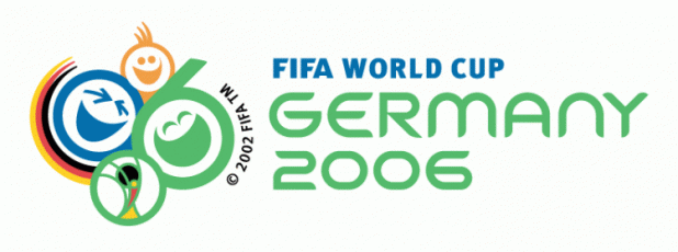
The 2006 logo, designed by the UK-based agency Whitestone, aimed to celebrate the German people’s joy, happiness, and smiles. “We want to be friendly hosts and celebrate a party with the entire world,” said Franz Beckenbauer, the Chairman of the Local Organising Committee of the 2006 World Cup. “Our logo expresses the relaxed, cheerful character of the upcoming FIFA World Cup.”
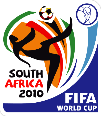
In South Africa in 2010, the logo intended to show the world a new side of both the South Africa people and the continent as a whole – “one of peace, progress and excellence,” said local head Danny Jordaan. The logo’s color scheme leans heavily on South Africa but forms an outline of the entire continent in a message of unity across the continent.
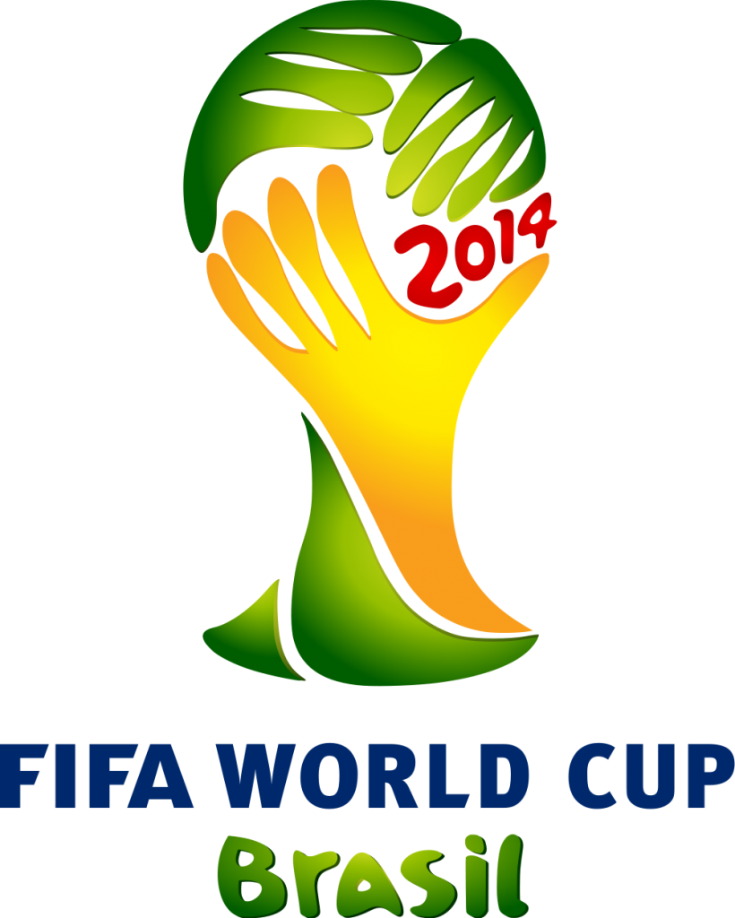
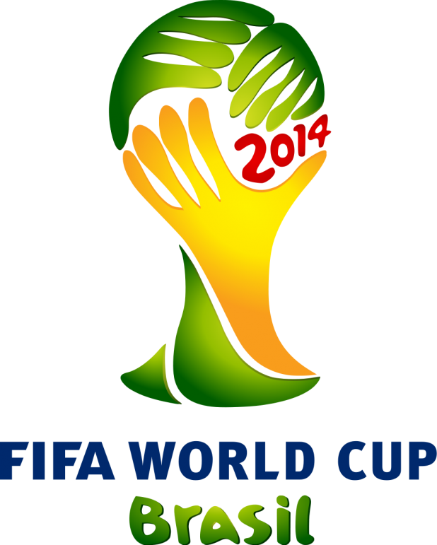
For this year’s World Cup, organizers asked 25 Brazilian-based agencies to submit proposals that incorporated Brazil’s twin dimensions – modernity and diversity. The winner, created by Africa Agency, was inspired from the “iconic photograph of three victorious hands together raising the world’s most famous trophy,” according to a FIFA press release. “As well as depicting the uplifting humanitarian notion of hands interlinking, the portrayal of the hands is symbolic of the yellow and green hands of Brazil warmly welcoming the world to Brazilian shores.”
For more on the evolution of sporting event logos throughout history, check out this infographic by Visually.
Jon Salm is an associate client analyst at Millward Brown Digital in New York City and a freelance data journalist in the Visual.ly marketplace. He has a bachelor’s degree in English from Washington and Lee University. You can follow him on twitter @S4LM3R.