Not even the experts agree. Despite sharing a common goal – to create solutions that meet their respective communication objectives – designers fight over the most basic notion in information design: what does and what doesn’t constitute an infographic? (Case in point: the comment section of this article on the do’s and don’ts of infographic design in Smashing Magazine.) Among the different approaches to visualization, one design element stands out in dividing the schools of thought: decoration. Business intelligence expert Stephen Few sums up his disdain for the ornamentation of infographics: “When visualizations are used primarily for artistic purposes, they are not what we call data visualizations or infographics, which are terms that have been in use for a long time with particular meanings.” Another highly visible figure, David McCandless, has popularized artistic visualizations and introduced data as a storytelling category to a wider audience. He describes his work: “I love taking all kinds of information – data, numbers, ideas, knowledge – and making them into images. When you visualize information in this way, you can start to see the patterns and connections that matter.”  (via Informationisbeautiful.net) Can we reconcile a notion of good design with fundamentally opposing attitudes when it comes to decoration? To stand a fighting chance we need to talk a bit of semantics.
How can we determine good design?
For the sake of argument, let’s define visualization as a representation of data that amplifies cognition. From here we can measure both efficacy (how easily comprehensible is the data) and veracity (how truthful is the explication of the data) of a given visualization. Decoration introduces visual noise into a design, compromising both categories:  (“A Design Problem,” via perceptualedge.com) Hence, those who use visualization to transform data in a way that maximizes the ease with which humans can interpret it, like Few, adamantly oppose embellishments. Here is a partial image of Few’s solution to the visualization above:
  (via perceptualedge.com) Now let us, again for the sake of the argument, define visualization as a contextualization of data that establishes frames of reference. With this definition we can test how well people attune to a given message. Decoration introduces visual metaphors and emotional appeal that go beyond what the truth conditions of the data have to offer. Those who use visualizations to make readers put the information they consume into the perspective of a predetermined narrative, like McCandless, employ the framing capabilities of ornamental design. What is good design practice according to the definitions above? Well, that depends entirely on your communication strategy. You could have the recipients of your message contextualize information themselves. Or you could provide the contextualization for them. Both strategies have merit. Depending on whom you are talking to and what you need to convey, one will be more suitable than the other. Are you issuing a warning? Then it is probably a good idea to put the data in a context that tells the audience what conclusion to draw from the facts without them having to waste time making up their minds. Think of critical pressure gauges in a power plant and alarms going off. Are you preparing data to help experts make a judgment call? Then it’s probably a good idea to put the data in front of them without the distraction of flashing lights and high-pitched sirens. Aside from these two communication strategies and their use of decoration (or lack thereof) to contextualize information, there is a third popular category of infographic examples that employ yet another communication strategy. These are the infographics that marketing departments churn out to garner brand recognition and SEO juice on the web.
  (via Microsoft) If we define visualization as a communication device that incentivizes sharing of a message through its packaging, the proliferation of web infographic posters is the metric by which successful design is measured. The novelty effect that leads us to prefer “new” information over things we have seen already and the desire of users to get a quick fix of eye candy drives the way decoration is used to dress up the mundane. It introduces hooks by which the attention of an audience is captured.
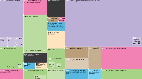
Take the design strategy that works for others and see if it works for you
Clearly, there are different definitions of what constitutes an infographic – and the categories which each of those definitions emphasize can be negotiated. You can make better choices if you inform yourself first and worry about what to call your design later. As linguists will point out, you don’t have much of a say in the matter anyway. The public will call a design an infographic whenever they feel like it, not when experts feel like it. If you are a marketer and want to create hooks to seed your message, don’t overlook what specialists on framing or veracity have to say. And if, as an analyst, you feel that your design has met the necessary threshold for efficacy to shrink the time it takes to interpret the data, why not tweak the design further and see whether you can get more people excited about it without losing too much clarity? Yes, you’ll always have to make tradeoffs. At the very least, learn how to deal with them and create the best possible solution for your needs. Don’t waste time arguing against the merit of other perspectives – we can surely do better than that. Jakob Jochmann explores meaning in communication and develops frameworks to streamline the transfer of information. You can find long reads and snippets at his blog, but he also shares 140 characters worth of cognitive science, design and other things that tickle his fancy on Twitter.