And the main way to achieve improvements in your conversions is through testing.
Tests arise from ideas, and ideas need to be prioritized and tested for constant improvement in our results.
But even if you think up a possible genius test, sometimes the idea is not executed because of other problems. Oftentimes, you’ll come up against a phrase constantly heard by marketing professionals: “We won’t be able to implement this, we would need a developer.”
This has always frustrated me. I don’t know about you, but it’s like having a bucket of cold water thrown over my head.
It’s the moment I see that my ideas cannot be tested and I will have to prioritize the least “out of the box” actions on my list.
Well, that used to frustrate me. That was before I started working, in 2021, at Rock Content, a global leader in content marketing, and met Ion and all its possibilities.
To summarize, Ion is Rock Content’s unique platform for designing and creating interactive content — no developer required.
It makes complex testing simple and opens up a range of options.
Ion’s capabilities allow you to push the user experience to another level that simply isn’t possible with just one-sided static content.
And, of course, I needed to be sure how that would be reflected in numbers.
So, in this article, I’m going to show you how my initial experiences were with this amazing tool in a step-by-step study with results from the first optimization project in interactive content.
We’ll get there soon. But first, we need to take a step back to understand what interactive content is.
What Is Interactive Content Anyway?
When we talk about interactive content, people might imagine objects moving inside a page or something like that. But interactivity goes far beyond that.
I can summarize interactive content as content where the user is immersed and fully active throughout the entire experience.
Calculators, infographics, interactive e-books, quizzes, solution seekers, and other types are very common.
Advantages of Interactive Content
In addition to capturing the user’s attention, interactive content provides something extremely important to marketers: data.
As the user navigates your interactive experience, you gather data intelligence from their responses, preferences, clicks across pages, sessions viewed and a host of other information that could be golden to you.
Well, if you know how to take advantage of this information…
Below, I’ll show you how I used this information to drive the results of an interactive e-book by increasing the submission rate for that material by 20.7%.
Shall we?
Case Study: How Interactivity Helped Me Increase the Conversion Rate of a Rich Material in Two Months by 20.7%
Before I tell you about what I did to increase this conversion rate so drastically, I need to describe for you the origins of this project. Where did it come from? What are the objectives of this study?
The Challenge
I must admit that, at the beginning of this study, my level of knowledge about Ion and its possibilities was extremely superficial.
And it’s not by chance… it had only been 5 months since I joined the Rock Content Marketing team.
I was very used to building static landing pages within the marketing automation tools, and I had no idea how big my limitations for performing tests and optimizations were.
That’s when I was challenged by the team supervisor, Marina Cordeiro, to improve my knowledge and experience with practice in the world of possibilities that the Ion tool offers to marketing professionals.
The challenge was the following: choose an interactive content already launched by us, define an improvement objective for it, promote and present my findings.
As I like to be challenged, I accepted right away and started the first stage of the project: choosing the material.
Content Chosen for the Study
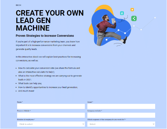
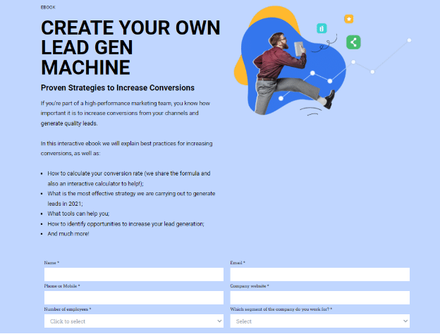
In July 2021, I released an interactive e-book called “Create a Lead Gen Machine.”
Despite its interactivity, the landing page for this material had been created within our marketing automation tool and was 100% static, as you can see below:
After conversion, the user received this full interactive e-book:
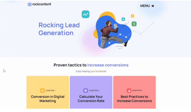
I saw in this material an excellent opportunity to carry out my strategies and start exploring the possibilities of the Ion tool.
The next step was to define the project’s KPIs and goals.
Project’s Goal
If my goal was to increase lead generation, the main indicator could not be different: The material’s conversion rate (number of conversions/number of visitors).
Having defined the indicator, I looked for historical data to understand the current situation and define my project’s goal.
The material was released 2 months before and the results so far were:
- Number of page views: 2,430
- Number of submissions: 728
- Conversion rate: 29.9%
With 2 months to run, I defined that the goal of my project would be to increase the material’s conversion rate by 15%, going from 29.9% to 34.3% in 2 months.
Analysis and Brainstorming
My next step was to understand the testing possibilities that Ion could provide, and I was surprised at first to learn that you can create multiple creatives for the same URL.
And more: within it, you can also define the percentage of traffic you want to distribute to each of them.
All you need to do is enter a value from 1 to 10 in the left column, where 10 is 100% of the traffic. See how it works in the image below:
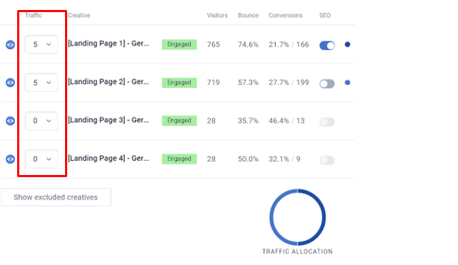
I had a lot of ideas to test at the same time and I had little time to run the project. This Ion function allowed me to run multiple tests at the same time, and that’s exactly what I needed!
After some brainstorming and benchmarking research, I decided which ideas I would prioritize for optimizing this material.
Unlock the Material
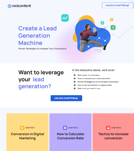
I decided that, instead of a landing page that didn’t show the full richness and real structure of the material that the user would find, I would take users to the e-book page itself.
The “hack” was that to access it, the user would need to “unlock the chapters” of the material.
See how it turned out:
Beginning the Tests
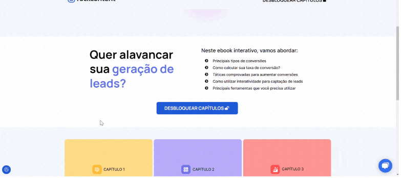
To put this experience into practice, I chose one of Rock Content’s main international markets: Brazil. That’s why, in the following Ion screenshots, you are going to see the interactive experience in Portuguese.
I decided that my test would consist of 4 landing pages and each would receive 25% of the URL’s traffic. Then, it would be easy to see which were the creative winners in the end.
See below for the initial structure of the tests:
Landing Page #1: A Copy of the Original Landing Page for Control
In order not to doubt the effectiveness of the tests I had proposed, I decided to create an exact copy of the landing page that had been made with our traditional marketing automation tool (but inside Ion).
Landing Page #2: Multi-Step Form
In the second creative, after the user clicked “unlock material,” I decided to test a multi-step form.
Instead of requesting all 6 fields at once, I split it into 3 steps:

Landing Page #3: Multi-Step Form + “Complete the Sentence”
Following the same idea as the multi-step form, I decided to test a format where the user fills in the form fields by completing a sentence.
For example, instead of simply asking the user to fill in “Which Segment of the Company Do You Work For?”, the person would complete the sentence “The company I work for is in the ____ business.”

Landing Page #4: Pop-up Form
The fourth type I decided to test was the pop-up form. After the user clicked on “unlock chapters,” a pop-up appeared containing the standard form we use.
I sent these ideas to our designer who, on the same day, gave me all the experiences the way I had envisioned them.
Thanks to Ion, robust changes can be made without the need for code or developers, and that’s amazing.
Using Ion’s Features to Measure
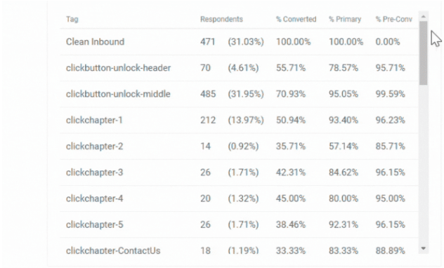
In Ion, you can track the entire user experience through “tags,” and this helps to break down the data and group it to facilitate quick interpretation.
Every click or session view can be mapped, providing you with extremely valuable data for optimizing your content.
The name of the tag is up to you. They are 100% customizable and can be included for click tracking, hovers, page session views, e-book chapter views and many other possibilities.
In the end, this is how the data will appear:
You can also visualize your experience in a graphic format:
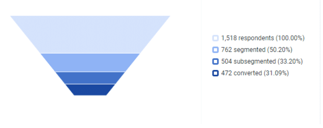
The cool thing about this type of visualization is that you can see the user’s journey in a simple and summarized way.
I planned what information I wanted to get from this experiment and, along with the ideas, I sent it to the designer who inserted the tags inside the pages (which later helped me analyze the results of my test).
Post-Launch Results
Once the landing pages were created, I promoted the material. Here are the results we obtained:
Landing Page 3
- Short Description: Multi-Step Form + “Complete the Sentence”
- Submissions: 337
- Visitors: 905
- Conversion Rate: 37.24%
Landing Page 1
- Short Description: Multi-Step Form + “Complete the Sentence”
- Submissions: 323
- Visitors: 941
- Conversion Rate: 34.33%
Landing Page 2
- Short description: Multi-Step Form
- Submissions: 297
- Visitors: 923
- Conversion Rate: 32.18%
Landing Page 4
- Short description: Pop-up Form
- Submissions: 246
- Visitors: 923
- Conversion Rate: 26.65%
As you can see, with 37.24%, Landing Page 3 was the one that got the best submission rates.
The original landing page copy came in second with 34.33%.
To make sure Landing Page 3 was really the winner, I used an A/B test calculator. You can find several on the internet, but this is the one I used.
The results showed there was a 90% chance that Landing Page 3 was the actual winner.
Relaunch
To ensure that the results would be relevant, I decided to eliminate the two landing pages with the lowest conversion rates and re-release the material with only the two highest.
The results were unquestionable.
Landing Page 3
- Short Description: Multi-Step Form + “Complete the Sentence”
- Submissions: 548
- Visitors: 1518
- Conversion Rate: 36.1%
Landing Page 1
- Short description: Copy of the Original Landing Page
- Submissions: 479
- Visitors: 1592
- Conversion Rate: 30.09%
Using the same test calculator, I was able to confirm with 100% certainty that Landing Page 3 was the winner.
Next Steps
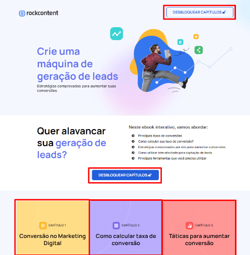
Looking at the tags, I noticed that 57% of visitors actually clicked to unlock the chapters.
My new hypothesis is that on each page we should only have 1 button to unlock the experience, instead of several, which is how it’s structured today:
But these are “scenes from the next episode”…
With the level of information that Ion provides us, hypotheses for new tests will not be lacking.
No More Limits in Optimization
Prior to the project, the limitations of the tools I was using resulted in restrictions on my optimization strategies — both to make what was in the field of idea a reality and to understand the users’ experience with my pages.
Today, my optimization strategies can be increasingly robust, in addition to being able to create amazing content experiences for our audience.
I invite you to learn more about interactive content and how to use it in your strategies and, of course, to get to know Ion as a tool to facilitate this wonderful path. Your KPIs will thank you.
Ready to get started?
Get in touch and learn how you can achieve similar results for your company.


