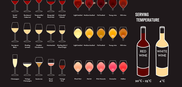
Whether you’re planning a party for guests you’d like to impress or attending one, choosing the right bottle of wine — to serve or bring to the host — can be a daunting task. The learning curve is steep and, dedicated oenophiles aside, few people have the time, money or even the refined palette to really get to know the many types, aromas, food pairings and serving suggestions for this popular drink. Enter infographics. For those who would like a quick-reference guide to wine basics, WineInvestment.com recently published the infographic below, aptly named A Beginner’s Guide to Wine. It walks you through the basics, like learning to read a wine label: 


