You know the importance of building an efficient marketing strategy in order to lead users through the sales funnel, right? A good way to do so is to offer appropriate content, according to the stage of the customer journey the person is at.
For example, when a user has a problem, he searches at Google and, if you have done a good job in SEO, he will find you. At this awareness stage, blog posts and infographics play an important role.
After that, the user gets to the evaluation stage, in which ebooks and webinars are great.
Finally, at the decision stage, the lead is almost taking the awaited decision of purchasing your product. Regardless of the type of content that he is consuming, which may be calculators and case studies, the landing page must be perfectly built in order to bring a high conversion rate.
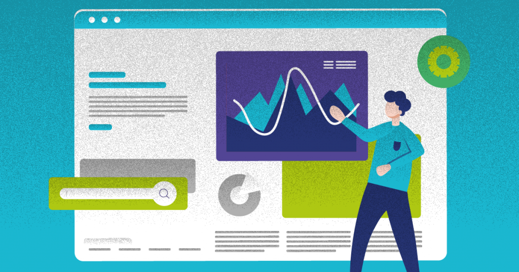
Therefore, in this article, we are going to explain how to create a compelling landing page design. So check out our tips below!
A/B tests
A landing page has various elements, like text, buttons, images, and so on. How can you find out, for example, the ideal color or position for the CTA button? And how about the title or the copy? Should they be changed? The only way to find it out is by using A/B tests.
Thus, start testing some modifications on your landing page, but, of course, changing one at a time. Otherwise, if you get good results after making several changes, how will you know which modification allowed it? So, at first, you can change, for example, the color of the CTA button and see what happens.
Then, it is good to make little changes in other elements and track the results.
Of course, A/B tests require automation tools, since this job would be hard to be done without software.
Thus, once you make a change in an element, take a look at the reports to find out what are the ideal characteristics for your landing page.
Focus
Depending on the complexity of your solution, it may require a more complex landing page. However, it will be better if you keep it not so big, so the lead will not be distracted with non-necessary information. After all, the objective is the conversion, right?
In fact, the main information must be above the fold and the scrolling has to be minimum. Of course, you can include testimonials and other elements, but the lead should not have to scroll for a long time until finding the CTA. So help him focus on what is more important.
SEO
SEO in landing pages? Yes, that’s what you’ve read. Actually, the main part of your blog’s optimization is not in landing pages, but in the posts and in the blog itself.
However, if you make a good job in the SEO of your landing page, you will increase your chances of being found at Google. Thus, users will be able to find you by means of not only your posts and regular pages, but also your landing pages.
So, use strategic keywords in the title, copy, URL, meta description, alt text of images, and so on. If you reach a good position at the Google results, you already know what will be the result: more traffic and more conversions.
Benchmarking
To create a compelling landing page, you don’t need to start from zero and struggle to find out a good structure. Actually, you can take a look at your competitors and see what they are doing. Visit their landing pages and analyze elements like colors, buttons, icons, images, and copy. Thus, based on what you see, build your own content.
In fact, even when you already have landing pages, you can do benchmarking in order to improve them and get better results for your marketing strategy.
Smart forms
When a user fills in a form on your website, you use that data in your marketing strategy, right? You may, for example, send him a nutrition flow and special offers.
However, when you implement smart forms, data can also be reused in landing pages. This way, information like name and email are automatically filled, so your lead can just click on the CTA button.
Thus, since he will not have to type something, he will be more likely to convert.
Mobile friendly
As you build your landing page, remember that many users will visit your website with their smartphones and tablets. Therefore, make your page responsive, so it can adjust itself to the screen of each device.
If you forget this detail, the users will leave your landing page at the moment they notice it doesn’t work well. Besides that, Google will understand that your website doesn’t offer a good experience, and you can imagine the result, right? With a bad SEO, the traffic will be affected.
Interactivity
According to the Demand Metric’s 2018 Benchmarking Study, 96% of marketers believe that content interactivity affects the buyer’s decisions. Furthermore, interactive content drives higher conversion rates. So how about using this interactivity on your landing page? The results could be great, huh?
In interactive content, the users actively participate instead of just passively reading, and they love that. Do you know why? The answer is simple: humans are interactive and like to interact not only with their peers but also with things.
So, if you add interactive elements on your landing page, users will engage and enjoy your website. Furthermore, you will be more likely to make sales.
As you’ve seen in this article, it is necessary to create a compelling landing page design in order to increase the number of sales and, of course, your revenue.
Just remember that, as you modify some elements, it is important to make A/B tests and analyze the results to find out which option is the best.
Thus, you will create a content that really converts. In fact, you can do it with the help of ion interactive, which allows the creation of interactive content with no programming!
Did you like our tips about landing page design? Since we’ve talked about interactivity, take a look at our post “How to generate revenue with interactive content”.


