Alberto Cairo teaches infographics and visualization at the University of Miami. He taught at UNC-Chapel Hill between 2005 and 2009, and has been director of infographics at El Mundo online, in Spain, and at Época magazine, in Brazil. He is author of “The Functional Art: An Introduction to Information Graphics and Visualization.” Designing an infographic or a data visualization is an act of engineering. Does this idea sound strange to you? Sometimes it does when I present it in lectures and classes. Many people tend to think that I am indulging in some sort of vague game of metaphors, but I am not. I say it quite literally. I believe that an infographic is a tool in a very similar way that hammers, saws, and screwdrivers are tools: They are instruments we devise and build to extend our capacities beyond their natural limits, to accomplish feats that would be extremely difficult — or even impossible — if tried without their aid. We humans are natural-born cyborgs. We are used to getting raw materials from the environment (whether that’s iron and wood, or information and data) and giving them shapes that are adapted to certain goals or tasks. Think about it this way: Tools are not always actual objects designed to help us with physical activities. A notebook, whether it is a Moleskine or an Evernote digital document, is a tool that expands our memory. A digital calculator, whether it is an inexpensive machine bought in the nearest Dollar Tree or an app downloaded to your iPhone, frees you from the burden of having to retain and execute many complex mathematical algorithms. Non-physical tools (or sets of tools and practices), such as statistics and the scientific method, evolved to let us gaze beyond what we would normally see, and to overcome our deepest biases and lazy habits of mind. The same is true for great visual displays of information. Take Dr. John Snow’s classic map and Voronoi diagram of the 1854 cholera outbreak in London, which is among my favorite examples of information design because of its spartan efficiency. Snow designed his masterpiece not as a mere presentation of data, but as a visual argument for empirical inquiry and scientific discussion. He wanted to show the evidence for the relationship between two variables: the likelihood of dying of cholera and the distance between the places where victims lived and a source of water contaminated by Vibrio cholerae bacteria. As expected, and with a few exceptions that Snow investigated thoroughly, the closer a building was to the deleterious Broad Street water pump (at the center of the map), the more victims were recorded. The shorter the distance, the higher the toll.

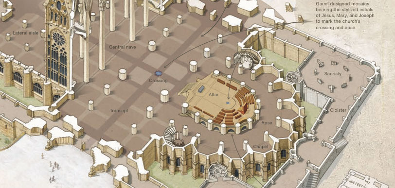
For details about how this map was designed, Read Steven Johnson’s book “The Ghost Map” or this Wikipedia article. Try to imagine these data presented in tabular form. The numbers, names of victims, addresses, etc., that Snow collected during his research would be useless, as the patterns of clustering would remain hidden behind the intersections of columns and rows. Patterns became noticeable only when they were arranged in a way the human brain could understand. Snow’s famous cholera map is a tool for analysis and intellectual debate the same way that a scatter plot is a conceptual tool to study correlations (or lack thereof) in data sets, a bar chart is a tool to compare values with precision, and a choropleth map is a tool to perceive the relative incidence of phenomena in an area. Good graphics are not just displays you can extract information from, but devices to explore information with. Moving to present times, I suggest you navigate this recent interactive graphic by The New York Times about how droughts affect crop production. The effective combination of stacked area charts, maps, and tables, offers an excellent overview of the multivariate data and many possibilities to play with. The information is organized in a way that lets you relate the regions where crop production is more abundant with those that suffer the most because of sparse rains. The richness and depth of this interactive presentation would be hard to achieve with other forms of encoding, such as mere copy, or a table.  https://www.nytimes.com/interactive/2012/08/24/us/drought-crops.html The notion that infographics and visualizations are conceptual technologies is applicable not only to quantitative data graphics, but also to explanatory diagrams and illustrations. Fernando Baptista’s rendering of the Basilica of the Holy Family (Sagrada Familia, below), published by National Geographic magazine, is a nice example. This painstaking portrait of the building invites readers to delve into the information and discover unexpected details. When I interviewed Fernando and Juan Velasco, graphics director at NGM, for The Functional Art, they told me that their illustrations are data visualizations, in a sense: “They are not just nice-looking drawings, but accurate depictions of reality with thousands of very precise data points”. NGM infographics are gorgeous, but that is a secondary component of their quality. They are, above all, accurate: Every single detail is double-checked and reviewed by experts; every line, patch, and shade of color has a meaning and a function. Their drawings are efficient. Almost nothing in them is gratuitous.

The principle that infographics and data visualizations must be thought of as tools can be useful, but it also has consequences that some designers simply ignore. The most important one is that it forces you to stop thinking just as an artist, and to start acting like some sort of craftsman. You are a professional whose main goal is to design devices to make people’s lives easier, not just to entertain them, or to sell them an idea or a product. You must care first about structure, precision, integrity, depth, and functionality. Only then you can think about decoration — if decoration is necessary at all — or a particular visual style based on typefaces or color palettes. This doesn’t mean that infographics should not be beautiful. Quite the contrary, if we want to attract readers and make them feel interested in relevant issues. Aesthetics and elegance are crucial. But if your aesthetic choices get in the way of the information, if they obscure your message or take away too much space that could have been used to better tell your story, you will be in trouble. Arguably, your “infographic” or “visualization” will not deserve to be labeled as such. Alberto’s book came out recently and can be ordered on Amazon. He has also made the first chapter and the John Grimwade, and Steve Duenes and Xaquín G.V. interviews available for download.