Data storytelling is a technique that transforms available data into a story. It combines data visualization formats (such as graphs, charts, animated maps, and so on) with narrative elements. The goal is to use a somewhat complex amount of data to tell a story in a simple, concise way.
In an increasingly data-driven culture, telling a story through data adds credibility to any marketing campaign. Another benefit of such a strategy is the engaging potential of those contents. As we will see further on, these are the stories that will stick with the audience, helping improve conversions and brand loyalty.
Keep on reading and get to know more about the following topics:
- What is data storytelling?
- Why tell a story with data?
- How to create relevant data storytelling?
- 3 data storytelling examples
Download this post by entering your email below
What is data storytelling?
Data storytelling is a technique that uses data to tell a story. It is a useful way to present insight — which means it can be used with both internal and external audiences. However, it is important to differentiate data storytelling from data visualization. Data visualization is representing data graphically, not necessarily telling a story.
If you are presenting a report, for instance, you can better sell an idea or make a point if counting on graphs, charts, or infographics, since such content retains your audience’s attention in a way a text or even a video cannot. They make it easier to process all the information at once as well as reach a decision.
Data storytelling goes beyond representing data in a more attractive way. To tell a story you also need a narrative, a context, and characters — and these are the factors that are key in making your audience actually engage with the content. Generally, data storytelling consists of showing how or why data changed over a period of time, which is why it is a good tool for presenting consumer’s behavior, for example.
Why tell a story with data?
We have never produced as much data as we do nowadays. Big Data is already a reality, and each day more and more companies are investing in a data-driven culture. With so much information available, data storytelling is a way to sort it all out and present it in a more palatable way so it can become more accessible.
Since it is easier to absorb information that way, data storytelling also makes your content stick. At the end of the day, these are the stories that will generate engagement, whether being shared online or creating word of mouth marketing — yes, it still exists and it still matters!
Beyond being visually appealing, data storytelling also reinforces credibility. As much information as we currently have, unfortunately, there is also as much fake news. In this context, it will not be long until the data-driven approach is also client-demanded.
Interactivity is another current trend in digital marketing. It brings brands and clients closer and works as a two-way street since companies can gather information about their customers in the process as well.
Many data visualization elements not only allow consumer participation but also encourage it — and there are many data visualization software that can help you find the best-suited format for your audience.
How to create relevant data storytelling?
We already have covered the basics regarding data storytelling and its importance to a marketing strategy, so now let’s discuss what to consider when doing that!
Be clear and concise
The idea of investing in data storytelling is that you need to break down huge and/or complex data into something simpler. That way, it basically goes without saying you should rely on clear and concise language.
Think about your persona’s cognitive load and choose visuals that give as much information as possible with as little effort as possible. The deeper you know your audience the greater your chances of acing on this choice.
Highlight an insight
As we have already mentioned, turning data into something more accessible is great to make a point or sell an idea. It is essential that you identify which is the main insight that your data storytelling is trying to pass on. Without it, there are great chances you are dealing with a data visualization content instead of with a story.
This “ta-da moment” generally arises from the combination of two or more data sets together. Determining a goal to your data storytelling can be helpful: do you want to inspire your target? Do you rather tell a funny story? Or what?
Combine words and visuals
Telling a story through data is not the same as telling a story with no words at all. On the contrary, words should be used to make visuals even more appealing.
At the same time that you want to reduce your audience’s cognitive load, you want to highlight the bit of information you need to stick on their minds, so presenting it through text and visuals has its perks.
Make it shareable
If you want your story to reach more people you should make it as shareable as possible. How do we do that? Two features are essential here: the first one is the visual appeal, of course. Figure out your audience’s taste and identify formats and design patterns that are more suitable to them.
Secondly, do not underestimate the context. Why are you telling this story to these people through this data? In other words, why should they care? It will not matter how beautiful or interactive your story is if you are discussing something your consumer does not want to hear about.
3 data storytelling examples
Now that you know what relevant data storytelling should deliver to any audience, let’s remember (or get to know) 3 good examples of well-established brands that presented information through a mix of data and narrative.
1. Spotify
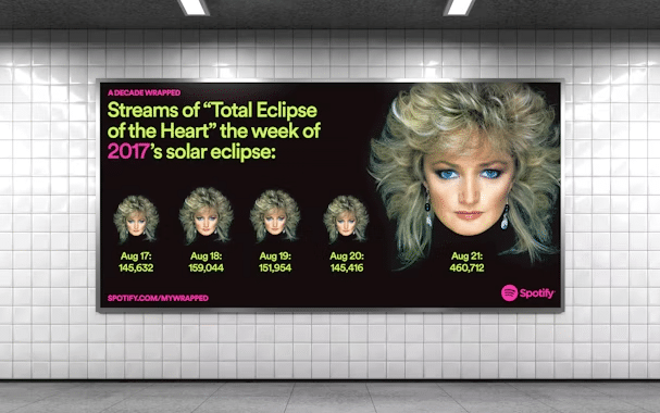
The annual “Wrapped” campaign might be one of the greatest interactive data storytelling examples of all time. Since 2016, Spotify presents its users with an elaborated timeline that showcases their most listened artists, tracks, and, more recently, podcasts of the year.
The streaming app uses its user’s data not only to talk individually with its clients but also to demonstrate how interesting Big Data can be. It does not matter how specific a consumption pattern might be, it still can be relatable, fun, or both. Who would not want to know how many times “Total Eclipse of The Heart” was played during an eclipse week?
This case gets even more interesting when we see that (even being an online product!) Spotify was able to take its data storytelling out of the online sphere, presenting it in traditional media as well — as shown in the picture below.
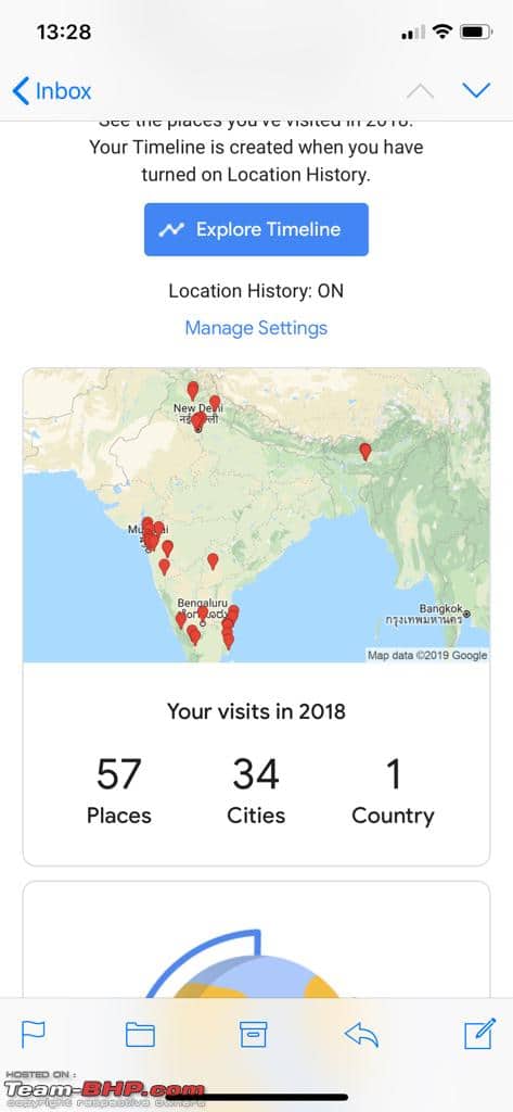
2. Google Maps
Google Maps provides a monthly report about travel to its users who activate the “Location History” function on their mobile devices. Interestingly enough, it is possible to explore this feature by interacting with Google Maps itself.
You can track your more visited places and cities, remember pictures taken at each location, and acquire information about your most used means of transportation. Do you know how much time you spent on public transport or in your car in the past month? Maybe you have cycled away more than you walked around, or have you not?
All this information can be tracked through this tool. As you can see, Google Maps counts on all the main features good data storytelling should have: context, change over time, and characters (yourself!).
3. John’s Hopkins Hospital
Yes, we are facing a worldwide pandemic. Even though little is known about the disease so far, with people sick all over the globe we receive huge loads of information about it on a daily basis. Again, fake news is a hazard, so how can we be sure to gather all the information needed from a reliable source?
The Maryland teaching hospital Johns Hopkins created a somewhat real-time dashboard that yields relevant numbers about the COVID-19 situation worldwide. If you think this is only a good example of data visualization (since we lack the narrative factor here), you are correct!
However, it is also possible to check a critical trends section, in which you can follow the spread of the virus through time on a combination of animated videos, interactive maps, and small paragraphs of text.
As you clearly see now, data storytelling is already a trend and will continue to differentiate relevant brands from their competitors. Beyond being visually appealing, it is an intelligent approach that conveys credibility and can be used in many different ways and for a variety of purposes — from a fun way to exemplify consumer behavior of an app to an official demonstration of the pandemic growth, for example.
Interested in using data to tell your story? We can help! Contact our team right away and check it out!
![[ROCK NA] [EBOOK SEO] Complete Guide](https://rockcontent.com/wp-content/uploads/2024/06/banner_Search-Engine-Optimization.png)