It’s no secret that data visualization has found a home in journalism. With the explosion of online news coverage over the past decade, journalists and computer scientists have formed an unlikely alliance to tell stories with data and visually enhance web-produced content.
The graphics and interactive visualizations that have emerged from this relationship have changed both audiences and newsrooms in mainstream journalism outfits around the world. Now, a reader can explore data sets and compose stories along with guidance from their favorite muckrakers, giving unprecedented transparency to the news-gathering process.
For newsrooms, programmers and designers now hold a place of privilege as journalists vie for their overbooked time in the hope that they can get an interactive component for their latest story package.
A good visualization component not only earns a story more reads, likes and shares than a conventional text piece, it typically has a longer trail of activity as readers keep coming back. With budgets already tight across the industry, multimedia journalists need to start taking it upon themselves to learn the tools of their medium to make the most of their resources.
Not all, or even most, reporters will be coders or designers in the near future, but fortunately there are enough user-friendly data storytelling tools for all levels of technological skill to allow the average journalist to whip up a compelling interactive map, timeline or chart without using advanced computer skills.
Here are some of the best free (and code-free) tools for adding data visualization and interactive components to your next story.
Download this post by entering your email below
Map tools

Perhaps one of the most difficult tasks in text journalism is to give readers a sense of geography using only the written word. If a reporter does include a map, oftentimes it is some variation on a Google map, which is functional, but could be more aesthetically pleasing and offer more options for incorporating data. Here are some options for more extensive map options for geographical reporting.
1. Geocommons
Geocommons is a free and easy-to-use mapping program that allows users to upload their data straight to the web. It offers a variety of basemaps and icon options, the ability to upload files of your own, and makes it easy to share your maps over the web.
Out of all the free mapping program options, Geocommons is the easiest to pick up and understand, and probably the fastest way to get a geographic dataset online to accompany a story.
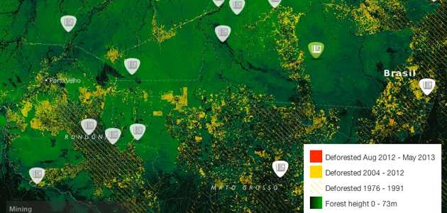
2. MapBox/ TileMill
MapBox, on the other hand, requires a little more getting used to, but makes it easier for the user to alter aesthetic details like colors.
This web application offers two basic basemaps, a street map and a terrain map, and allows the user to overlay data on roads and buildings and easily change the language. Unfortunately, data have to be manually entered, and there are not many options to style data.
Fortunately, the MapBox people have created TileMill, a downloadable program that offers all the aesthetic qualities of MapBox in a more customizable package. For those willing to learn some code, TileMill is worth the time it takes to figure out the language.
The maps are based off of a sort off CSS (called CartoCSS) that targets certain layers and parts of the map for customization. There are enough helping hands within the program to help code novices get through it, even if there is a learning curve at first.
TileMill maps can then be uploaded to your MapBox account in order to be embedded on the web. Overall, MapBox and TileMill are probably more useful for longer term projects, where you can really fuss over the details and time is less of an issue. If used properly, though, the end result can be stunning.
3. QGIS
Quantum GIS, or QGIS for short, is an open source downloadable mapping program that is the most utilitarian of the bunch. That doesn’t mean its products aren’t pretty, though.
Take a look at this screenshot taken from the QGIS website: QGIS definitely provides the steepest learning curve, but also the most practical way to create seriously data-heavy maps.
If you’re looking to learn more, the University of California Berkeley Graduate School of Journalism provides an online course that teaches QGIS basics specifically for journalists.
The maps can be published to the web just like the other programs, though not as quickly. Like TileMill, this is better for more intensive projects that are less time sensitive.
Timeline tools
Timeline tools are also valuable in the journalist’s toolset as a way to quickly establish chronology. Before interactive timelines became more readily adopted, journalists were stuck creating timelines out of text, which did a poor job of representing time, or static graphics, which limited the amount of data you could display by size of the page.
4. Timeline.js
The cleanest and easiest to use timeline maker on the web is Timeline.js, a project from Northwestern University’s Knight Lab, which brings together students and academics from the college’s journalism and engineering schools.
The process of making a timeline with Timeline.js is as easy as publishing a Google doc to the web, taking the link and inserting it in their timeline maker.
The timelines can easily incorporate media like video, pictures, Google maps and websites to make them more engaging. Timeline.js projects also look good at whatever width you publish them.
Whether you can devote the entire width of your page to the timeline, or only 600 pixels, the timeline adapts and continues to look clean and uncluttered.
5. Tiki-Toki
Tiki-Toki is a nice option for news timelines, since it allows for an “about” page that displays ahead of your timeline, but comes with some qualifications. The user interface is easy to use, and creates many options for incorporating other media.
It also allows for the user to place a photo in the background of the timeline, but this could really be asking for trouble. If you choose to place an image in the background, do try to keep it simple.
Unfortunately, the free account only allows users to create one timeline, and doesn’t include an embed code. To make more timelines, and to make them web-friendly, you would have to sign up for a premium account, which costs either $5.00 a month or $20, depending on what kind of traffic you’re expecting.
Data viz tools
Journalists looking for good data visualization options also have a decent palette to choose from.
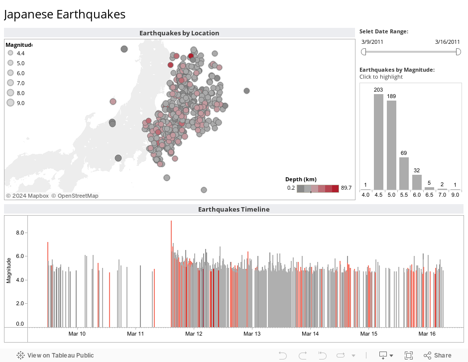
6. Tableau desktop – for journalists!
Recently, Tableau announced that it would offer its desktop service free to journalists who are members of the Investigative Reporters & Editors organization (IRE), saying that while Tableau public is an important tool journalists need to publish data stories to the web, they “often need to keep stories private while they are developing those stories.”
While Tableau is still not available on Mac, the developers said that creating a Mac-compatible option was one of their goals going forward.
This seems to be the latest in partnerships between tech and journalism outfits in the goal of public service, following Jeff Bezos of Amazon buying out the Washington Post, and the Center for Investigative Reporting pairing up with Google to host TechRaking, among others.
7. Google Fusion Tables
Google’s Fusion Tables are still in their experimental phase, but analytics experts in journalism and other industries are already excited about their possibilities.
While Google Docs can be a good visualization starting point, Fusion Tables really allow users to work with more complex data sets and view more visualization options, including some innovative map options.
Here, Al Jazeera used the technology to build a graph of American troop levels in Afghanistan since the invasion:
8. Many Eyes
The IBM data visualization project Many Eyes is also a user-friendly web application that allows users to upload data sets and choose from a variety of visualization options for interactive websites.
The advantage Many Eyes has over some of its competitors is the options available, which allow users to create everything from standard bar charts to word clouds, to maps.
Are you a journalist? Do you have any favorite tools for adding graphics and interactivity to your stories that we missed? Let us know!
Allison McCartney is an editor at the PBS NewsHour, focused on education and informational graphics, and a freelance designer in the Visual.ly marketplace. She has a bachelor’s degree from Washington University in St. Louis, where she studied Middle Eastern history and art. You can follow her on Twitter @anmccartney.