Making sure your audience can easily understand your content is critical in any business. That is why working with an education infographic can be highly beneficial in an environment where even the most complex information needs to be grasped by people.
You can use an infographic to display all sorts of information. No matter what kind of data you have, you can use your creativity to include them in scenes, use shapes to show proportion, and even add animation to it.
There are multiple kinds of infographics; you just need to come up with the right one for yourself.
When publishing content in the Education field, you can also count on the infographic’s versatility.
In this article, you will learn why this tool is so important and see great examples to inspire you. Check it out!
- When are education infographics useful?
- What are the best examples of education infographics?
- How to build a good education infographic?
When are education infographics useful?
In general, infographics are powerful tools to help people easily understand even the most complex subjects. This is done through the appropriate data visualization, as it usually combines information in several forms.
With that definition in mind, it is clear why education infographics are such a good fit. After all, it is all about making sure your piece of information is well understood by your target audience. This makes infographics very useful learning tools as well as a great medium to display data on Education.
However, in order to enjoy the benefits of working with education infographics, you must learn how to create quality content. This means learning data literacy, which is the knowledge of understanding information in its rawest form, and knowing how to display it visually.

What are the 6 best examples of education infographics?
Now that you know why working with education infographics is so beneficial, the next step is seeing them in action. There are multiple kinds and approaches to this type of content, so it is possible to grasp all of its potential by learning from other people’s work.
Here are the 6 best examples of education infographics for you to check out and get inspired:
1. Top 10 Most Read Books in the World
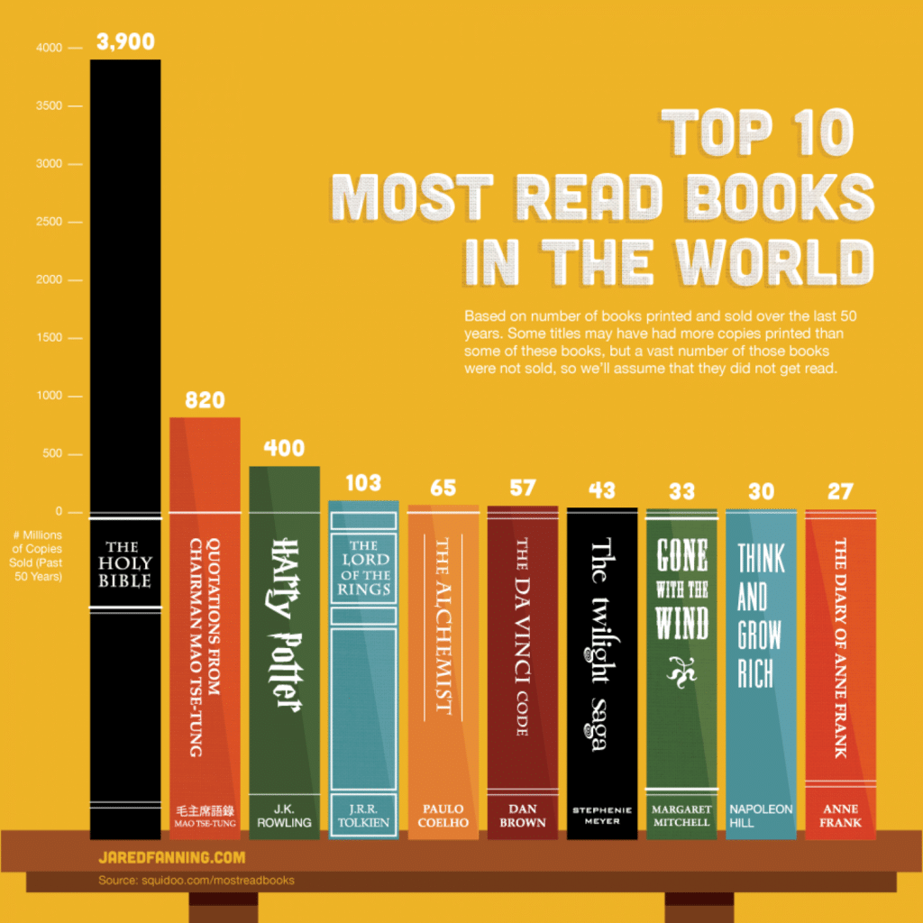
You can use an infographic to display data while also constructing a scene. This is what happens in this example, which shows the top 10 most-read books in the world over the past 50 years.
The image is built to resemble a bookshelf, with each book being proportionally longer based on the approximate number of copies sold.
In this example, the way that data is displayed makes a big difference in how it is understood by the audience. It could be a simple table with the titles on the left and the sales on the right, but an education infographic is a helpful tool to show that information in an easier, or even fun way.
2. Basic English Grammar
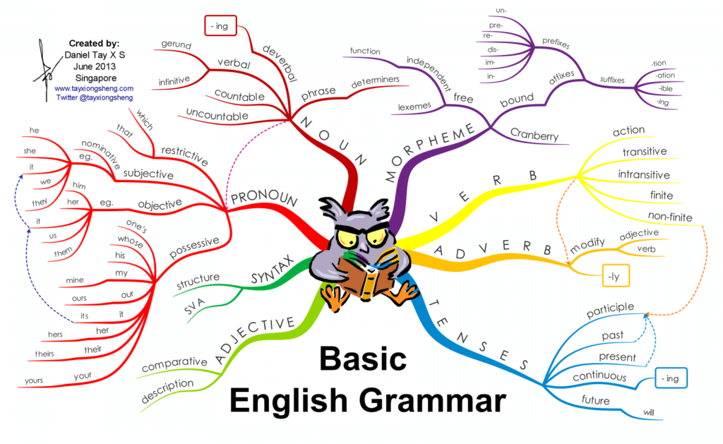
An infographic can be used to display the common hierarchy between certain items, even if those are basic English grammar components.
The infographic’s layout is made to resemble a tree, with each branch showing the hierarchy of several grammar elements. By following each one, the viewer is able to see the differences between pronouns and nouns, verbs and adverbs, and others.
A less interesting approach would be to describe all of them individually, but the infographic format helps visualize how they connect.
3. Did I Plagiarize? The Types and Severity of Plagiarism Violations
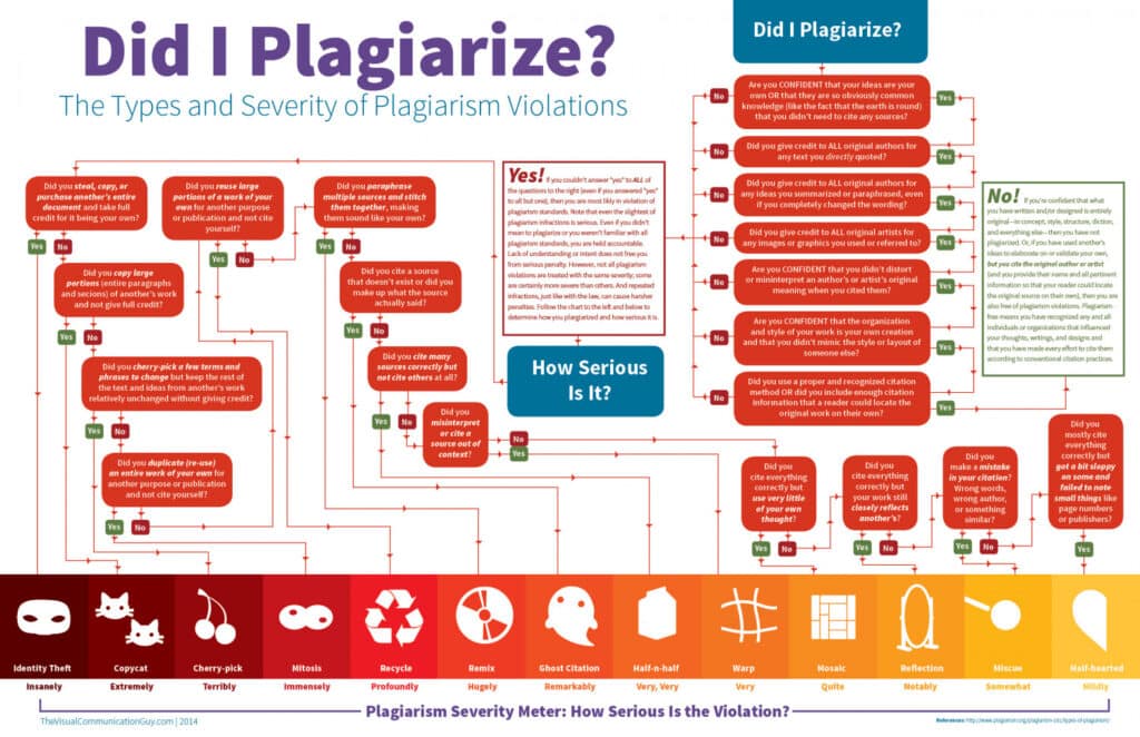
The definition of plagiarism is highly complex since it deals with several conditions and some thin lines. Because of that, the flowchart is a very handy format that helps the viewer reach a conclusion while following the “path” that best describes their situation.
After reaching the end of the flowchart, the viewer is able to see how serious their case is based on the scale at the bottom. Thus, the infographic combines data on each case of plagiarism and their individual degrees of severity.
4. Aftermarket Education
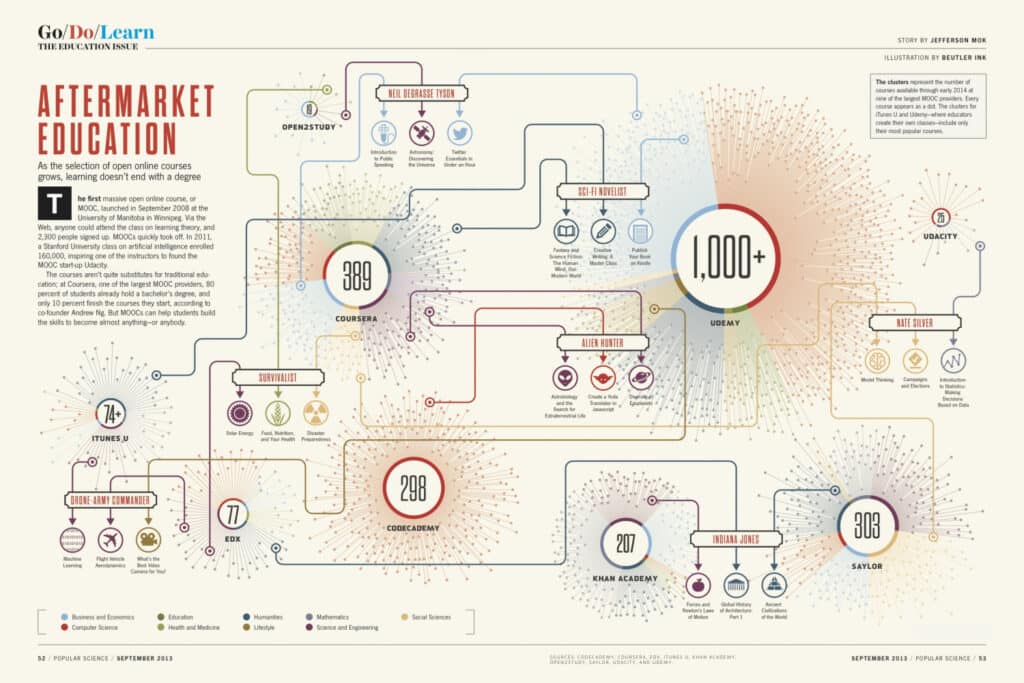
In this example, you can see how several different pieces of information can be combined in an infographic to help the viewer quickly grasp a concept at a glance. In Aftermarket Education, one can take a look at the current landscape in the online courses market.
Each circle is a different online academy. The several lines that come out of them represent the various courses they offer. The larger the academy circle, the more courses it offers. In addition, they are color-coded based on the area of expertise.
5. Prepositions
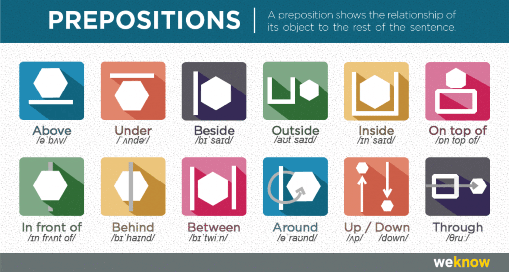
A visual representation can greatly help with grammar comprehension. In this infographic, several auxiliary images are displayed on top of each kind of preposition in order to make them easier to understand.
This is an example of how an infographic works best when it simplifies what cannot be as easily conveyed only through text. By using the same shapes in all cases, it is easy to make comparisons among them.
6. A Dropout Epidemic
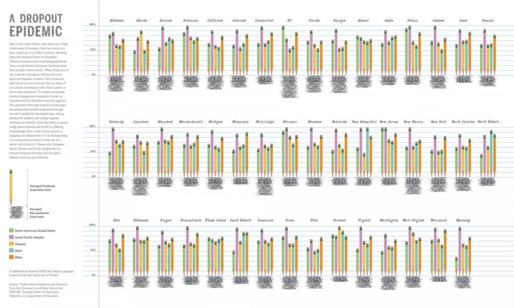
This education infographic brings forth the information that one kid drops out of high school every twenty-six seconds in the United States. Based on the same survey, the image breaks down the data by American state.
The numbers are divided by race, which helps highlight several instances of inequality. There is also the creative choice to make each graph bar into pencils, which is closely related to the school environment.
How to build a good education infographic?
Quality is not a completely subjective element of your education infographic. If it contains the right elements and is appropriately tailored to the right audience, its quality will be undeniable. In addition, it will be successful in helping you reach your goals.
Are you ready to learn the right steps? Here are the best tips to build a good education infographic:
1. Consider your audience’s knowledge
In order for your education infographic to truly help your audience, it needs to match their level of comprehension. Do not use assumptions as data; instead, take a look at what survey and research information you already have to draw your conclusions.
2. Define your infographic’s focus
A recurring trait of the best education infographics you saw above is that they were all focused on a single piece of information. Do not try to fill your content with all kinds of data you find. Instead, choose what it is that you want to convey and focus on that.
3. Obtain quality data
No education infographic is able to positively affect an audience by bringing bogus data. A critical step to the creation of your content involves obtaining the right data and understanding its implications.
4. Use the right tools
Building an education infographic requires good creation tools to really deliver quality results. As you probably saw in the examples above, a decent layout makes a huge difference in setting your content aside from others. Do not limit yourself to free tools either, as they will hamper your progress.
5. Do not forget to adapt to different devices
How is your data visualization for mobile? If you want your education infographic to be easily accessible by all audiences, make sure that it has the right format to be seen on multiple screen sizes and connection speeds.
By looking at examples of education infographics, it becomes clear how versatile this content format is. When properly developed, it can bridge multiple gaps of information in several different fields and help your business communicate with your audience on the subjects they are interested in.
Consider the tips in this article and start working on your own education infographic!