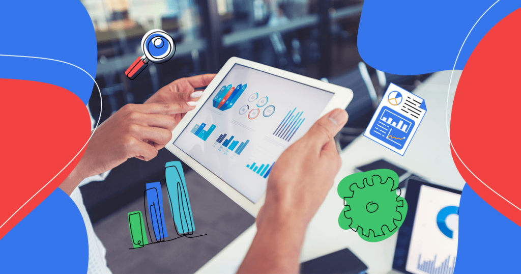
The human brain processes images 60,000 faster than text. That’s why humans have used visuals like maps and signs since the beginning of civilization.
Computer graphics have taken things to a whole new level. Visuals such as infographics, interactive widgets, and heat maps make it easy for anyone to convey information or make a point.
Visualization helps people remember information better than they would otherwise. It also elicits emotions, which encourage people to act on what they see.
- Why Is Data Visualization Important in Healthcare?
- 5 Ways to Use Healthcare Data Visualization
- What’s Next?
Download this post by entering your email below
Why Is Data Visualization Important in Healthcare?
Companies in all industries can benefit from using data visualization. However, the industries that benefit most are the ones that are hard for many consumers to understand.
Understanding of the healthcare industry has grown due to the COVID-19 pandemic. People are more familiar with healthcare terminology than in times past. However, many still struggle to understand healthcare’s intricacies.
Healthcare visuals make it easy to explain important stats and trends. Visuals can also motivate consumers to take positive action to improve their health.
A visual on the effects of a healthy lifestyle, for instance, can motivate people to exercise and eat healthy foods. A visual on the impact of early treatment could motivate people to come for regular check-ups. Showing the prevalence of a disease in a particular area motivates people to take preventive measures to avoid getting sick.
Visuals can also explain trends in the healthcare industry that consumers should be aware of. Understanding new technology and procedures can help consumers make informed healthcare choices.
Want to show how a particular treatment compares to an older one? Do you need to show how new medications improve health and well-being? Visuals will get the job done.
5 Ways to Use Healthcare Data Visualization
If you’re not sure how to start using visualization in the healthcare industry, consider the following options. Each one is ideal for displaying certain types of data in a clear, concise, memorable manner.
Interactive Widgets
Interactive data displays make it easy for users to interact with your data in various ways. They’re an attention-grabbing format. What’s more, they save you the hassle of having to create multiple visuals to display your data.
Interactive widgets are ideal if you want to compare data in different formats. Do you want to make it easy for people to sort data by location, age range, or gender? If so, an interactive widget may be just what you need.
The drawback of an interactive tool is that it doesn’t highlight a single topic or statistic. If you’re trying to drive people to take one specific action, an interactive tool may not be what you need.
Alternatively, an interactive widget can help people who want personalized information. They can provide custom answers based on one’s age, gender, weight, location, or other criteria. Such a widget is perfect for connecting people to the services that will meet their needs.
Infographics
Infographics are powerful yet versatile visuals. They often include charts and bubble clouds. They can also include pie graphs and pictographs.
Infographics are great for displaying condensed information about a particular topic. It could be preventative health care, the importance of vaccinations, or the need for regular pap smears. The possibilities are endless.
Furthermore, infographics get eight times as many shares on social media as text summaries. If you want to generate awareness about an important topic, an infographic is an ideal tool for the job.
Charts
Charts can be simple or complex. They are often used in infographics, but you can also show them as a standalone visual. There are several types of charts you can pick from to display your data in the most effective way.
Bar charts compare two or more elements. Line charts show progress (or lack of it) throughout a period of time.
Pie charts compare parts of a whole. They can show the percentage of people affected by a condition. They’re also perfect for displaying financial information.
Bubble charts contrast different values for different elements. If you want to highlight four or five important stats in different but similar categories, use a bubble chart.
Histograms are similar to bar charts but with an important difference. While bar charts compare elements, histograms show the frequency of a particular event.
Charts are great for highlighting stats in a narrow field. They help your audience remember a single point and take action on this point.
Heat Maps
Do you need to show geographic data? It could be the prevalence of a certain disease. It could be the number of specialized healthcare facilities in a particular area.
Heat maps enable consumers to see location-based data at a glance. They can also compare data across various states or countries.
Scatter Plots
Scatter plots are useful if your variables are related to each other. You could use such a chart to show the relation between weight and height. It could also show information about the rate of a particular health condition.
Unlike other visuals, scatter plots aren’t immediately understood. You’ll need to be careful to include only the most important data points. Adding a legend can help readers grasp the data at a glance.
What’s Next?
Data visuals are an essential tool any healthcare company can use to reach the public. Visuals help important information go viral. They help people understand their options and make the best medical decisions.
What’s more, creating your own custom visuals isn’t as hard as it used to be. In times past, you had to hire a graphics designer to make a custom visual. Now, however, you can do it on your own even if you don’t know how to code.
Ion is a platform designed to make it easy for anyone to create interactive content. You can make any type of visual you need on the platform. Ion also provides an embed code to make it easy to share your content on multiple platforms.
Additionally, Ion has the tools you need to do A/B testing on your visuals. This enables you to get to know your audience better and get better at reaching people.
Are you ready to access the tools you need to create attention-grabbing visuals? If so, request a demo to see if Ion is a good fit for your business.


