If you are a Marketing professional, you’ve probably been following the latest Instagram changes in order to curb TikTok’s growth. Now, it looks like its latest update was a little more drastic.
After the head of Instagram Adam Mosseri said that the platform is “no longer a square photo-sharing app”, Instagram will officially change the layout with full-screen vertical home feeds, to fully prioritize videos. This change will make photos, stories, and carousels no longer so intuitive.
Basically, the copied and pasted feed from TikTok. Soon, we all will be asking the question: why does my Instagram look like TikTok? Really, it will be very difficult to distinguish one from another.
The change is still in a test period, and some users were randomly selected to use the beta version of the new interface — and I was one of them.
That’s why I’m bringing you closer look at what the future of Instagram will look like—and, consequently, the content we produce and consume within the platform.
Get ready for a new (and dull) era of short vertical videos. And nothing else.
Instagram is becoming TikTok
As I said, I was one of the users chosen during this test period for a full-screen feed, and what I can say is that the new layout just doesn’t look… natural.
With the new Instagram feed, posts will fill the entire screen (one at a time, regardless of size).
If you liked to scroll down the feed and see the post slowly appearing on your screen… forget it. Just as we do on TikTok, instead of scrolling the screen, Instagram users will swipe the screen to jump from post to post.
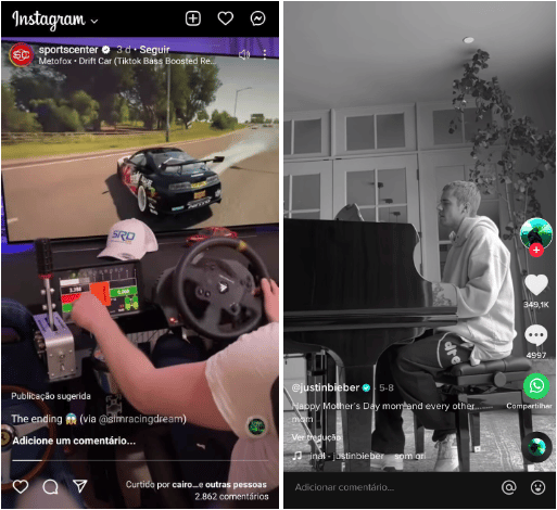
Indeed, for reels, the new feed is actually nice. I put an image below of how reels are appearing in the new Instagram layout, alongside a TikTok video for us to compare:

More alike every day, huh?
With the video content fielding almost the entire screen, you get a better experience (and stay solely with the content without having spoilers from the next post when swiping down).
But, even for reels, the new Instagram feed has its complications… it’s a lot less intuitive for users to leave their likes on the post, and even less to comment (the comments, which previously appeared just below the post, are only visible if the user clicks to open them).
We know today that likes, comments, and shares are part of what we understand as engagement on a post. I wonder if, with the feed update, what will matter above all is the number of views, for example. It’s quite possible… as you can see, the save post button, for example, simply dropped out of the on-screen options. But, for now, Instagram has not made any statements on how the algorithm will behave with this change.
But the critical part starts when we see how other types of content, such as carousels and photos, are appearing on the TikTok-style Instagram feed.
Everything that is not reels seems to no longer “fit” in the social network. Take a look at the image below, from some Rock Content publications, with the new feed layout:
It looks like you’re posting content in a format that wasn’t made for the platform. As a user experience, it gets bizarre.
Just to make a comparison, here’s the same feed post before the update:
You can see the square video, possible reactions available to you (like, comment, share or save), the subtitles, comments, and the next post already appearing, just waiting for you to scroll.
It looks a lot more fitting than in the old layout, doesn’t it?
Old layout: a social network that supports content in different formats, and they coexist well within the feed.
New layout: it’s meant to be a platform for vertically recorded videos… but it accepts posting images and other formats. But, even so, everything that isn’t vertical looks weird on the platform, like it doesn’t belong there.
And well, this is a problem. At least today (and even with the feed update), Instagram does not allow image posting in the feed with a 1080×1920 pixels aspect ratio (the same aspect ratio as reels and stories). The maximum vertical format allowed for images, for now, is 1080x1350px.
Maybe, when the feed change gets to everybody, Instagram will allow new proportions for images. Or, maybe, they really don’t want us to post photos and cards anymore, so they’ll just keep the weirdness of everything, other than vertical videos.
In short, the user experience of the new layout is bizarre. We are seeing the contents of one social channel, embedded in a layout of another (which simply doesn’t fit in).
And this, honestly, concerns me (as a user and also as a marketer). How much does such a pluralized platform have to lose by limiting its previously diverse content options to a single format?
Is this really the best strategy to go head-to-head with TikTok?
All about TikTok
Why is Instagram becoming TikTok? Well, the Chinese social media platform has been bothering other social channels for a while now. Not just Instagram (is it just me or do all social platforms now have a feature to add short videos?)
The reason is quite simple: TikTok simply does not stop growing and retains users like no other platform. It passed YouTube, Facebook and Instagram’s time spent records in 2021.
State of Mobile 2021 survey points out that TikTok will grow up to 325% year-over-year. It was also nominated as the best app in the US last year, according to eMarketer.
TikTok has grown so fast it’s broken models.
So yeah, if I was Adam Mosseri (or Mark Zuckerberg), I’d also be worried about TikTok and its business model.
Efforts to bring users back began subtly:
- The introduction of reels (and algorithms’ priority for this type of content compared to other types).
- Tests of 60-second stories.
- Offering cash bonuses to creators making top reels.
- Announcing the prioritizing of “original” content over reposted ones in late April (which was basically a bag for users to stop reposting TikTok content on Instagram).
- Investing in creators’ tools and templates. And the list goes on…
And now, finally, testing for the change in the users’ feed.
But perhaps Instagram has forgotten an essential question for any business: do my users even want that?
Apparently, I’m not alone in the opinion that the new Instagram feed is awkward. After the release of the test update, hundreds of beta tester users also spoke out.
what is this new Instagram layout? full 9:16 format. seems to be the death of photography on the platform. pic.twitter.com/rtlUayhzBL
— Hannah Cassidy (@hannah_cassidy) May 17, 2022
So do we all hate this Instagram new layout or just me??
— Caitlin Connolly (@Caitlin34210616) May 18, 2022
the new instagram layout is so ugly it’s putting me off going on the app
— Holly | The Caffeinated Reader (@hollysamanthamc) May 18, 2022
If the goal is to stop people migrating to TikTok for good, and get them to stay on Instagram, engaged and involved… something is not working.
If Instagram becomes TikTok, why would people stay on Instagram?
I’ve been an Instagram user since forever.
The idea of posting square photos of my daily life, with those “hipster” filters, pleased me right away. Sure, soon Facebook bought the app and a lot changed — but something about Instagram’s essence remained.
We were able to post in other formats and new tools arrived, but Instagram was still the social channel where you share your life through images, and follow people with the same purpose.
Back in 2016, we only had Snapchat to share our life in real-time (knowing that the content would be gone in 24 hours). Soon Instagram brought this through stories — causing a growth decrease of 82% for Snapchat that year.
But that move just made sense. Instagram was adding a function to the existing behavior of its users of sharing their lives through images, and it was very well received.
It didn’t take long for brands to understand their space inside Instagram either. The type of content shared on Instagram has expanded beyond “personal life in photos, stories, and videos”. Gradually, the concept of influencers and creators emerged.
Instagram has adapted to meet this demand. Carousels, non-square image formats, videos, LIVEs, shoppable experiences.
It became a very pluralistic platform for how you could produce and consume content.
While scrolling through your feed, you could, at the same time, see a carousel from a brand that you follow, photos of a dinner an influencer was having, stories of a trip your friend went, a funny video, a quick insight from a specialist, a LIVE on a topic you like… everything coexisting in harmony and at the same time in your feed.
Of course, Instagram had its problems before the TikTok war started. Last year, The Wall Street Journal published internal research showing that one in three girls think Instagram makes body image issues worse and that the social app is causing anxiety and depression. The company knew about these problems but thought more about profits than public well-being.
But issues aside, the “essence” of why people were on Instagram (in my user opinion), held true.
And then, that changed.
Suddenly, the main button is no longer to upload content but to navigate on reels. Our feed increasingly shows less of the people and brands we follow and more algorithm recommendations.
Brands and creators find themselves almost “forced” to post reels to get engagement.
And if you, like me, are on Instagram for content that goes beyond short videos… you might start to feel a little cornered.
Last but not least
Instagram is (still) one of my favorite personal social media channels. But we are losing so many interesting formats on the app, little by little.
We are becoming orphans of what was once Instagram (without, for now, any other social network to replace it), and we are being left with two TikToks.
Everyone loses. Brands, creators, and users.
If the social network doesn’t have a differential, a reason why people are specifically on it… sooner or later, users will simply leave. And if users aren’t there, brands won’t be either.
When you want to consume fast content, you go to Twitter.
If you want to see a longer video, you go to YouTube.
If you’re thinking of changing up your living room decor or looking for something visual, you head to Pinterest.
If you need a group about training your Golden Terrier, Facebook is still the best option.
Each social network has its particularities. It’s one of the reasons why users and brands manage to be in more than one at the same time—using some more and some less.
Social networks should, yes, put effort into being the most relevant ones. I get it. User attention is literally gold.
But if they don’t have their own unique features, users simply won’t stick around. And it’s a pretty risky game to be in.
Take care of your Instagram Marketing strategy. Soon, everything is going to change for everybody. Instagram hasn’t given much information on when it intends to end the trial period and incorporate the change for all users… but sooner or later it will happen. And it will bring drastic changes.
Your posts will also have to change, as well. And, just to make everything a little harder: Instagram could fall into a crisis which harms businesses that are very dependent on it. You better be prepared.


