Ten years ago, I created the first in what would become a hugely popular series of annual visualizations of the federal budget, “Death and Taxes.” It was, in retrospect, garbage:

There was no reason for it to be anything but garbage.
Unbalanced design; no attention to typography. Back then, I wasn’t a designer and I didn’t know anything about the federal government. (My day job was selling faux vintage bric-a-brac to identity deficient 20-somethings at Urban Outfitters.)
It was 2004 and infographics wasn’t even a word. But if you can’t be the best at something, be the first.
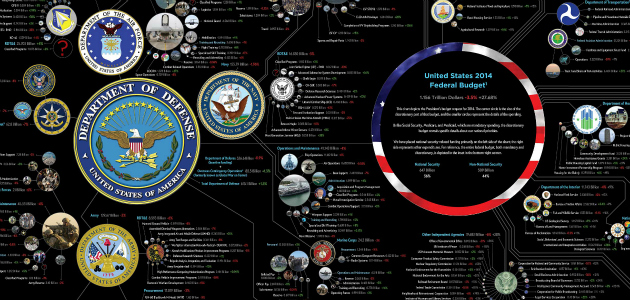
Prior to Death and Taxes, the federal budget visualizations were confined to the bounds of a Power Point slide. The pie charts and bar charts worked for the top line figures, but were incompatible with the 1,000-page beast of a budget the govertment put out each year.
Download this post by entering your email below
The only reason the chart became a poster was be cause it was just too large to fit on any computer screen. It still is. The image became a brief internet hit two years later, in 2006, and I started doing one each year.
The poster progressed in terms of design, density, and accuracy, too, as I started to develop a sense of how the government worked.


Along the way, I became known as an infographics guy, which developed into some great opportunities and partnerships. Infographics themselves rose to prominence, further expanding the poster’s (and my own) reach.
Eventually I ended up here as Creative Director of Visual.ly, a long way from selling faux vintage bric-a-brac at Urban Outfitters. But with my own personal development and opportunies came new demands for my time, and the annual research and production of the Death and Taxes poster is not something I could continue.
In fact, I didn’t manage to get a poster out for 2013. But it was clear from the emails and feedback that this project just could not fade into the internet ether. It was too important.
There is still, after all these year, no more open and accessible record of government spending. Fortunately, around that time I was approached by Nathaniel of Time Plots about continuing the posters’ production. If you don’t know Time Plots, they are the glorious intersection of government, data-vis and posters.
Seriously, that is all they do, and they are the best at it. I knew the annual Death and Taxes project would be a natural fit there.
So starting with the 2014 edition of Death and Taxes and going forward, Nathan and his crack team will be handling all development and production of the poster.
I have a few of the new posters myself and they have already innovated on the concept and design.
The Death and Taxes project is an exercise in transparency, accessibility and design of the most important document the federal government puts out each year. It is also solely supported by sales of the poster, so I encourage you all to support the Death and Taxes project buy purchasing a poster this year. Your walls will thank you, and so will I.
Jess Bachman is a Creative Director at Visual.ly. Follow him on Twitter.