2013 is here, the world didn’t end, and as always, time marches onward. Time really doesn’t have any units that are inherent to it, but we break it up into chunks so that we can describe and measure it. We get the units we use to measure it from the periodicity of the daily and yearly cycles caused by our position relative to our sun. Time is also not something we can see. We observe changes that happen as time passes, but we can never see time itself. This means that it’s a wonderful abstract concept that has led to some pretty cool visualizations. The most common way of showing year-scale time is with the standard monthly calendar. XKCD put out this one that has a slight twist. It doesn’t show day of week, but it does size the dates based on how frequently the date is mentioned in literature.

People have also tried several radial adaptations of the standard calendar, like this one for 2013 by cesarojedac.

And mohitlakhmani, whom we recently featured here on the blog, has made one that is 3D.

Since each month is roughly 30 days, a year also fits nicely into a table heat map, like in Common Birthdays by codementum.

And that same table can be drawn radially.

Since our delineation of time comes from our position relative to the sun, it makes sense to use the sun in the visual representation. This Solar Calendar for 2011 by kirstinmck shows when the sun is up for the northern hemisphere. Since this calendar shows sun cycles, your location on Earth also matters.

Kirstinmck has also done a Lunar Calendar for 2011 that shows how the moon cycle lines up with our monthly and yearly cycles.

And she also made one for 2010 that combines the sun and moon, but breaks them down month by month.

Other people have created their own approaches as well. This version includes a lot more text, but it shows most American holidays, Moon phases, Equinoxes and Solstices, and zodiac signs.

Plainworks has also done a unique series of calendars that cycle through hues to show time of year. They are all in German, and show German holidays. This one uses a circle…

…while this one is rectilinear.

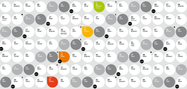
And this one uses a tabular view. The weekly periodicity in it creates diagonals marking weekends.

No matter how you visualize your year, here’s to a great 2013! Drew Skau is Visualization Architect at Visual.ly and a PhD Computer Science Visualization student at UNCC with an undergraduate degree in Architecture. You can follow him on twitter @SeeingStructure