There are infographics for pretty much everything these days. But of all the topics or issues you could tackle, one of the easiest to visualize successfully — both in terms of quality and shareability — are television shows. Why? For one, many TV shows have twisty plots or complicated relationships that just beg to be laid out in a beautiful design. Since television is visual by its very nature, the visual aspects of those infographics are already there — and in many cases, the fans would appreciate them for that alone. But most importantly, let’s not forget that designers and data visualization professionals are people too — and like most of us, they have their favorite TV shows. When you create an infographic about something you enjoy, love or even obsess about, you will design not only with knowledge, but with heart as well. Here are nine such visualizations.
1. A Graphic Tribute to Game of Thrones
 Just in time for the much-anticipated Season 3 premiere, Nigel Evan Dennis brings us this stunning interactive visualization that will tell you pretty much everything you want to know about the show’s characters – without giving away the saucy plot lines (you should watch the show to see those for yourself — and read the books, if you truly want to understand everything that’s going on). Each character is illustrated in a minimalist – but very true to life – design and classified according to their house and faith, and there is an interactive timeline (shown above) for the show’s fans to peruse. (Click on the image below to launch the interactive.)

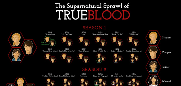
2. The Supernatural Sprawl of True Blood
True Blood began as a love story between a vampire and a human telepath, with a bit of shifter sprinkled in. Then, with each new episode, more supernatural beings came into the mix: werewolves, werepanthers, demons, witches, mediums, ghosts… By Season 5, even the truest of Truebies could have easily lost count. This visualization, aptly named The Supernatural Sprawl of True Blood, breaks down what type of creatures appeared in each single episode during the show’s first five seasons.

3.Lostalgic
 Santiago Ortiz is one of the data vis community’s most respected professionals. His amazing work includes Pleiades, which visualizes Twitter communities, and the 7 sets Venn Diagram: an interactive visualization of seven colors, mixed to create 128 combinations. But most impressive — particularly to fans of the cult TV show LOST — is his Lostalgic: an interactive visualization of the script of LOST in its entirety; every single character, episode, even word. The visualization has several functionalities, including a matrix of characters (sized based on their lines in a particular episode), a graph that maps out character relationships and even a “reenactment” option that will take you through the script, line by line. There is so much to do and explore here, LOST fans can get lost in this interactive for hours.
4. Walking Dead Zombie Kills
Even those of us who don’t watch the Walking Dead know that this show is about zombies — and killings. The infographic below visualizes zombie kills — very tastefully, too.

5. Vampire Diaries: Surviving Death
The Vampire Diaries has a faithful following, overwhelmingly among the female demographic (especially teenagers and their moms). Luckily, infographic designer Michelle Calderon is a fan and created this visualization in the weeks leading up to the Season 4 premiere (the season is already under way).

6. Dexter’s Victims
Watching Dexter isn’t recommended if blood makes you squeamish. The killings are many, the blood is free-flowing. The infographic below, visualizing Dexter’s victims during the show’s first five seasons, should give you a pretty good idea of just how gory things can get:

7. Breaking Bad Periodic Table
“Periodic table” visualizations — other than the one created by Dmitri Mendeleev — are rarely successful and often downright cheesy. Hardly any data other than that in the Periodic Table of the Elements lends itself to a periodic table visualization. That is, unless you’re looking at the Periodic Table of Breaking Bad characters. It’s only fitting!

8. Mad Drinkers
What do the men (and women) of Mad Men do? Why, they drink. The Mad Drinkers interactive visualization captures the spirit of the show perfectly:

9. Relationships in Gossip Girl
Finally, one just for fun. Remember Gossip Girl? If you never watched that show, here’s how it goes down: not much happens over the course of six seasons, other than every single one of the main characters dating everyone else. The infographic below captures that perfectly, with just the appropriate amount of simplicity:

Aleks Todorova is the editorial director at Visual.ly. The Vampire Diaries is her favorite TV show – and she is not ashamed to admit it. She is often guilty of talking about it on Twitter, too.