Colors impact our daily lives, both online and offline, evoking sensations and even emotions when placed in context.
In the world of Digital Marketing, where conveying a message is paramount, colors can determine the conversion rate on a landing page. It goes beyond aesthetics, and most marketing professionals grasp its significance. As a Creative Designer at Rock Content, I continuously create color combinations organically, drawing upon the knowledge I’ve accumulated throughout my career.
However, there’s a crucial aspect in color selection that, unfortunately, few professionals pay adequate attention to, and it can make a difference to your results and, primarily, your audience: accessibility.
In this article, I aim to clarify what color accessibility entails, share my journey in implementing more accessible visual changes at Rock Content, and guide you on how to do the same for your brand.
What is Color Accessibility?
When we talk about color accessibility, we are talking about inclusion.
When creating websites, applications, and social media assets, we must ensure they are accessible and usable for all individuals, regardless of their visual acuity. This includes people with low vision, color blindness, or other conditions that affect their ability to see colors.
Have you ever had to strain to read a text due to excessive similarity between the background and font colors, whether they were too close, light, or dark? Well, you’ve already experienced a situation where color accessibility was not properly planned. In such cases, where the background color and the elements blend, we are dealing with a low contrast problem.
And why does this matter? Color accessibility enhances the user experience and also broadens the reach of your content. When people can easily read and understand what we share, they stay on our blogs longer and interact more, leading to increased conversions.
Color Contrast
Color contrast is a fundamental principle in the world of visual design. It refers to the difference between the colors used in a project, specifically the variation in brightness and saturation between two closely positioned colors. This concept is directly related to readability. Text with high contrast against the background is easy to read, while text with low contrast can be difficult to distinguish, especially under varying lighting conditions.

To avoid relying solely on one’s perception of color composition, designers and developers use a reference based on research, the Web Content Accessibility Guidelines (WCAG). WCAG indicates three different levels of accessibility: A, AA, and AAA.
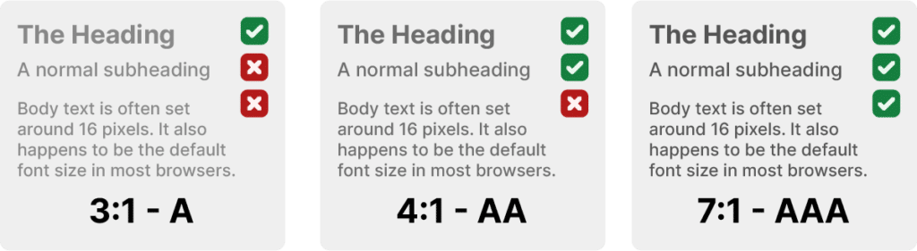
The AAA standard is, of course, the most recommended. In other words, as the contrast ratio between the elements increases, it becomes easier to differentiate the background from the typography.
When dealing with larger texts, such as headlines, there is more flexibility in contrast, as we have a larger font with greater weight (e.g., bold), which helps improve the contrast.
Useful Tools and Resources for Ensuring Color Accessibility
If you’ve read this far, you might be wondering, “Okay, but how do I apply WCAG guidelines in my daily work? How do I know if the contrast between text and the background meets A, AA, or AAA standards?”
There is a highly complex formula for making this calculation, but don’t worry! Numerous tools can analyze this for you. Here are some of them:
Take it a Step Further
According to the World Health Organization (WHO), approximately 2.2 billion people worldwide have some form of vision impairment. Color blindness, according to Color Blind Awareness, affects 1 in every 12 men and 1 in every 200 women, which corresponds to around 4.5% of the global population.
Considering this, don’t rely solely on colors to convey your information. Add visual elements to make your layouts more accessible.
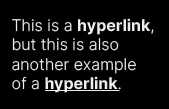
Links
Whenever you add a hyperlink to your content, don’t forget to underline the text. This greatly aids people with visual difficulties in identification.
Forms
Creating forms is no easy task. We always want to make them as visually appealing as possible so that leads don’t hesitate before filling them out. However, in attempting to create a modern layout, we might inadvertently make non-inclusive choices.
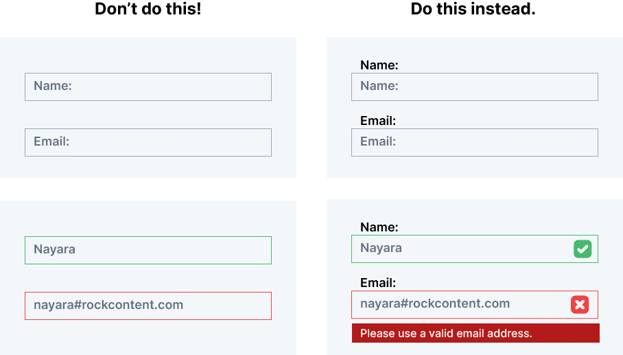
Placeholder Text
Always prefer describing what should be inserted in the label because placeholder text is often written in a very light gray tone, which can make life difficult for people with visual impairments.
Alerts
We frequently use green and red colors to indicate success and error. However, for color-blind individuals, these colors can be easily confused. Therefore, in addition to colors, use an icon to indicate whether the input has been entered correctly or contains an error.
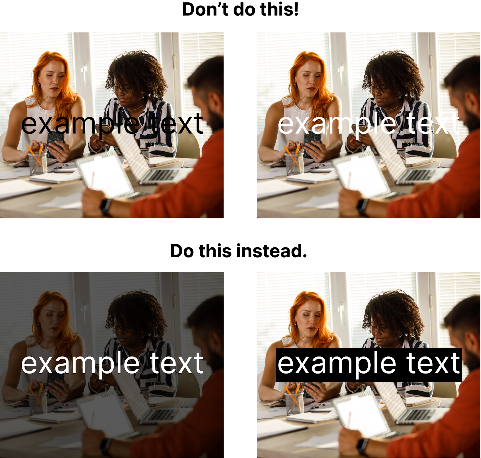
Text on Image
Placing text on an image is always a tense moment because a portion or the entire image may not offer sufficient contrast to make the text stand out. In such cases, I have two suggestions: treat the image to reduce opacity. This way, you increase the contrast and make the text more readable, or add a box behind the text.
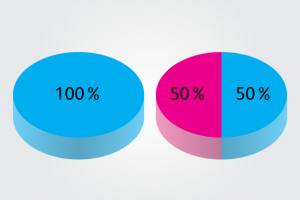
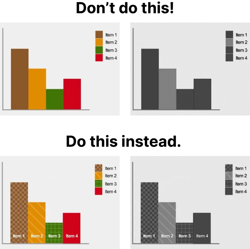
Graphics
Graphics are excellent for visually presenting data, but a very common mistake (of which I still find myself guilty) is an excessive reliance on colors. For individuals with visual limitations, this can be a real challenge. One solution would be to consider incorporating distinct backgrounds and textures into graphics.
Color Combinations
When creating a layout from scratch, we have complete control over the colors to be used. With that in mind, I recommend that whenever possible, you avoid the following color combinations:
green + red
green + brown
blue + purple
green + blue
light green + yellow
blue + gray
green + gray
green + black
yellow + white

Embrace Color Accessibility
The tips in this article are just the first step that you and your team can integrate into your daily routine to create content with more accessible colors.
Considering accessibility goes beyond colors, if you would like to delve deeper into the subject, I recommend reading WCAG 2.1. The amount of information may seem overwhelming at first, but it’s definitely worth studying.
If you’d like to learn more about colors and their impact on communication, here on the Rock Content blog, there’s an incredible article about the subject.

