If you still don’t know how to choose the right typography for your blog, you’ve come to the right place. Typography is the creation and application process to add styles, formats, and visual combinations of words.
Choosing the best typography helps you to add more homogeneity, legibility, readability, and harmony to content pieces.
Increasing blog visibility requires the best browsing experience for the user, and that involves the ability to read what is being transmitted well. That is why typography is one of the most relevant areas of graphic design.
Knowing some rules allows you to create pieces of content more suitable for SEO and visual marketing strategies. In this article, we will explain some of the principles and techniques to create incredible typographic text and images. Here is everything you will see:
- What is typography?
- What is the difference between font and typeface?
- How to classify the font styles?
- What are the pillars of typographic application?
- How to choose the right typography for your blog?
- Where to find free fonts?
What is typography?
Typography is basically the printing of the fonts. As the majority of writing today is digital, which does not require the physical printing and the proper drawing of fonts on paper, that meaning has fallen into disuse.
Now, it refers to the entire study, creation, and application of characters, styles, formats, and visual arrangements of the words.
However, regardless of the method used to create the fonts, typography is the basis of written communication. When you choose the adequate composition, you can convey the right message for the reader with good readability.
What is the difference between font and typeface?
In typographic design projects, professionals refer to writing as font or typeface. In terms of typographic composition, the concepts are different. Typeface refers to the design, and the font is how you present it, that is, with the chosen style, size, and visual elements.
For example, Bodoni is a typographic family, but Bodoni 10 pt. Bold or Bodoni 14 pt. Italic are two different fonts that belong to the same typeface.
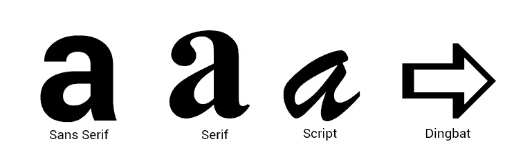
How to classify the font styles?
There are four font styles classifications:
- Sans Serif — indicated for the most striking titles and parts in the texts.
- Serif — suitable for books and large volumes of printed text, as its design helps in the fluidity of reading without causing eye strain.
- Script — simulates handwriting.
- Dingbat — decorative fonts, consisting of different symbols in place of the letters of the alphabet.
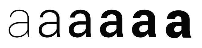
However, each family can cover some variations: Thin, Light, Regular, Medium or Semibold, Bold and Black, Extra Bold, and Italic.
What the user should never do is change the font manually in editing software because that can completely deform the font design.
What are the pillars of typographic application?
There are three pillars of the typographic application that can help you to create your blog’s visual identity. Here are some considerations for each of them.
Typographic measures
The character reference lines delimit the font space. Each typeface has a different one, which is known as:
- Ascending — the maximum height that the vertical projection of the fonts can reach at the top (t, l, d, for example).
- Upper case — the highest corresponding to capital letters.
- Descending — it is the line that indicates how below the centerline the letters with vertical projections can reach (g, j, p, and q, for example).
- Baseline — it is a baseline on which most fonts are written (except descending parts).
There are also measures known as leading, tracking, and kerning:
- Leading — is the distance between lines.
- Tracking — is the distance between words.
- Kerning — is the distance between characters.
Visual hierarchization
The visual hierarchy uses different sizes, families, distances, and variations from the same font and aims to highlight the information without causing visual pollution in the content.
Designers use this tactic to prioritize phrases or content or reduce their importance in texts. For example, sentences written with a larger or bold font draw more reader attention and are read first.
Graphic composition
The graphic composition is essential for the readability of the content — it is related to SEO strategy. One of its aspects is the negative space of the entire web page visual design.
Those spaces available between letters, phrases, and paragraphs help to improve the reading and, consequently, it is a requirement well regarded by search engines to improve the user’s browsing experience.
Besides that, the text alignment on the page (left, right, centered, or justified) also interferes with this requirement.
Professionals prioritize designs with the “F” format — neuromarketing tests help to identify the reader’s visual direction and attest that the reading process is done in the letter F format.

So you can fit much text in this format to ensure more understandable information. Left alignment is the best format to help with this process.
How to choose the right typography for your blog?
The font says a lot about your projects. Choosing it is an essential step in building an image that will captivate your persona.
The font choice must follow a purpose to not disturb the project. Typography causes, at first sight, a perception in readers (positive or negative) — and that is important to understand how they will judge all the remaining designs.
Thus, knowing how to choose the right typography for your blog is the best way to set the tone of the entire project to guide the reader’s feelings towards interacting with your design without distractions or visual appeals. So, before looking for a bank of free fonts, consider the following questions.
1. Determine your blog’s personality
To combine the message and the purpose of design, you must list the qualities and characteristics that you want to communicate with it. Will the content of your blog be more serious or relaxed? What do you want to discuss?
If you’re getting out of the way, ask yourself:
“Does this font support the qualities of the brand or complement the purpose of my design?”
The best font choices follow those principles.
2. Consider disclosure channels
The medium through which the design will be transmitted also interferes with the typographic choice. For example, a book needs a font that does not tire your eyesight.
On the other hand, social media posts require fonts suitable for mobile devices — they are the primary channel for younger users, and your blog must have a responsive design for each device.
3. Avoid decorative fonts for long-reading
Decorative fonts are never suitable for long-readings and should be used only in titles and to convey short information. Avoid fonts that cause visual impressions if the project does not refer to the related context. For example, wood texture represents the rustic; chalk reminds the school environment.
Using decorative fonts can help to reach a better positive impact, although the incorrect use makes the design look inappropriate for your typography brand strategy. To make no mistake, select a more neutral font.
4. Choose neutral fonts
Every designer needs some neutral fonts to adapt well to any context. They are usually applying Serif or Sans Serif to avoid drawing attention or tiring reading experience.
Making writing variations with the same typeface is a relevant strategy to highlight information without compromising homogeneity. Those typographic families present different measures and styles (light, regular, medium, bold or heavy, narrow, condensed, extended, or small caps).
5. Use complementary fonts
Find a combination of fonts that are pleasant to the reader to base all your blog content on. To do that, determine which characteristic the fonts share — if they are very different, they will have nothing in common.
That can be related to the height and width or structure of the font. To make it easier, choose fonts produced by the same designer — you will have more chances to find fonts sharing the same appearance or structure, which facilitates the combination.
6. Determine the maximum number of fonts to use
Some designers say that one font is enough for most projects and that three is the maximum amount to avoid a polluted and messy layout.
Where to find free fonts?
See below five free font banks to choose the best typography for your project.
1. Google Fonts
The Google Fonts directory is free and one of the best tools for anyone who needs typography for a graphic or web project. The catalog is extensive and well organized.
2. Adobe Typekit
The Adobe font bank has a free version with more than 230 fonts for you to synchronize with other company applications.
3. Fontsquirrel
One of the best-organized banks, Fontsquirrel has the catalog indicated for commercial and corporate websites.
4. Fontfabric
In Fontfabric, renowned designers offer complete collections and demos of fonts that will transform the look of your content.
5. Da Font
The Da Font bank has a compilation of fonts sent by users from all over the world. Some categories to classify them help users to choose.
Knowing how to choose the right typography for your blog is crucial for your blog success. Now, you can adapt the visual design to SEO strategies and ensure a more appropriate and harmonious reading experience for your persona.
If your website is based on WordPress, you can use some WordPress typography plugins to fit your project and optimize the process of changing fonts.
So, have you discovered the best font for your blog? Learn more about corporate projects with our guide.