How to trigger your users’ behavior is crucial in marketing. This may sound counterintuitive but success in marketing strategy does not start with strategy.
Rather, it should start with the context, being the context a deep understanding of your business objectives and your audience.
There are no tactics without a strategy. And there is no strategy without a clear understanding of your audience.
Here is where psychology — better, comprehension of basic psychology principles — can help.
Psychology and Persuasion
Psychology is the study of mental processes that lead to human behavior. It affects everything we do.
As a content marketer or designer, it’s helpful to understand psychological principles, whether you’re working to make an existing website more intuitive or building a digital experience aligned with how users make decisions.
Psychology can help us answer questions like: “Why do users behave the way they do?”, “Which elements of design will facilitate the behaviors I want users to engage in?”.
Yet, psychological principles mostly reside in the realm of academic research and literature, which are often inaccessible for marketers.
Before we start, a note on persuasion. This post covers a few principles focused on persuading users.
Although persuasion has a bad reputation — and I understand why — it isn’t an inherently negative action. It is just a way to influence, for better or worse.
Victor S. Yocco, author of “Design for the Mind: Seven Psychological Principles of Persuasive Design,” put it well:
“Utilising dark patterns or tricking a user into doing something they wouldn’t otherwise do is not persuasion. It’s being an asshole.”
That’s exactly the point. This post is not about that kind of persuasion.
What I’ll present here is a collection of principles, examples, and best practices that will make your content and design more persuasive, in order to trigger behaviors users were already considering.
In other words, you’ll learn how to increase conversions by understanding psychology, engaging readers in specific behaviors, and creating calls to action at the right time.
Applying the Elaboration Likelihood Model
Persuasion is part of every aspect of our lives. Businesses want us to buy their products. Politicians desire our votes. And people want us to like them.
The same ideas hold true for websites, apps, content destinations, and other digital properties.
Good design persuades users to engage with your product or content in the way you intend, leading to your desired outcome.
Persuasion involves more than words. Aesthetics and user experience can make a website or application more persuasive. They can reinforce your audience’s attitudes.
A digital experience can also dissuade users. If someone encounters nine pop-ups, a long loading time, or three pages of disclaimers to get to your core message, there is a high probability they will leave your site before you get your point across.
Distractions, whether physical, visual, or intangible, can temporarily halt the whole persuasion process.
Academics have attempted to explain how persuasion works on individuals for decades.
The Elaboration Likelihood Model (ELM), one of the most frequently cited models of persuasion, explains how shaping attitudes also shapes behaviors.
Incorporating the principles of the ELM into your message and design will maximize your influence on user attitudes and, therefore, behaviors.
Central and peripheral routes
When someone is presented with information, some level of “elaboration” occurs. To elaborate on something means to take the time to really think about it.
If you have to buy a car, for instance, you will spend a lot of time thinking about which car is best for you. You will search on Google, talk to friends, and visit car dealers.
This is what the ELM is about: how likely are we to elaborate, and on what level?
The level of elaboration determines which processing route the message takes: central or peripheral.
Central route processing (high level of attention) means your audience cares more about the message. They’ll pay more attention and scrutinize the quality and strength of the argument.
Any attitudes formed or reinforced this way are thought to be more resistant to counter-arguments.
Attitudes formed through the central route tend to be hard to change — either they are positive or negative attitudes.
Peripheral route processing (low level of attention) happens on a more superficial level.
Your audience will pay less attention to the message itself while being influenced by secondary factors, such as source credibility, visual appeal, presentation, and enticements like food, sex, and humor.
Attitudes formed or reinforced this way are thought to be less enduring, subject to change through counter-arguments, and in need of continual reinforcement.
A view of the two routes
To illustrate the difference between central and peripheral route processing — and how messaging and design can address each — let’s look at an example.
Imagine two potential customers, both in need of a new compact car.
Abby is a car expert who often reads car magazines. Joe barely knows about cars; he’s interested in finding a quality car, with good design (he loves design products) at a good price.
While both users will have some level of central route processing (i.e. pricing), it is more likely that Abby, with her interest in cars and mechanics, will be attentive to the messages.
Abby searches for car details, specs, and comparison information. Her process will likely follow the central route.
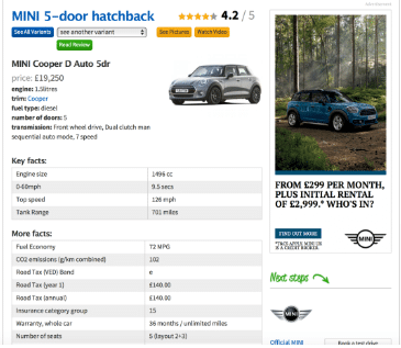
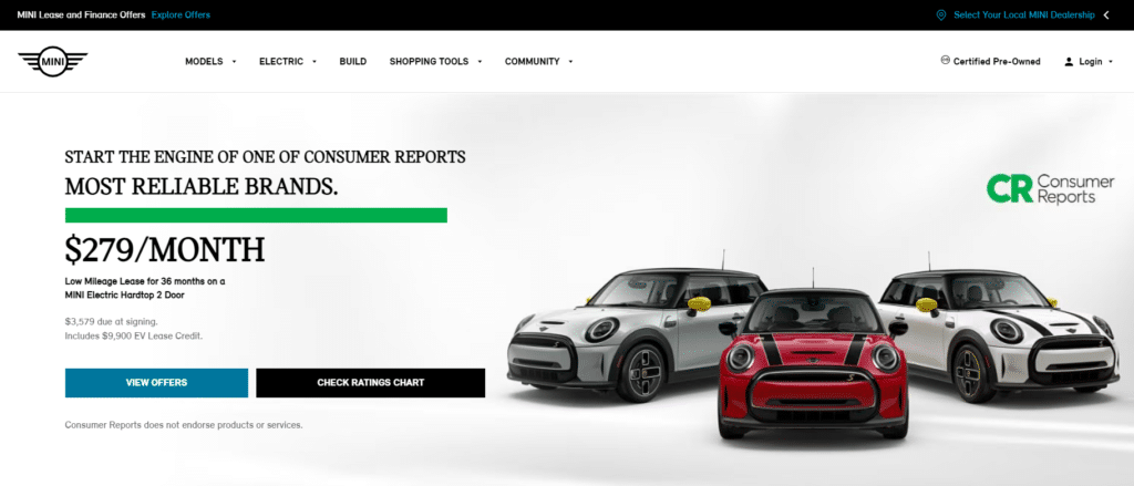
Joe, instead, looks at different sites before deciding on a new Mini Cooper model.
He’s not really interested in technical details. He likes the way the website presents the car. He loves the design, and he’s attracted by large images and customizable color combinations. Joe goes the peripheral route.
Promoting the Central Route
This example leads to our next area of exploration: what promotes central route processing and high elaboration? How can we push visitors to the central route?
Researchers have found two main factors influencing a shift to the central route: motivation and ability.
Motivation (relevancy) is often influenced by relevance. A user who feels directly impacted by a topic is more likely to process a message through the central route.
Ability (capability) is a straightforward concept. For central route processing to occur, your message must align with your audience’s thinking capabilities.
If people lack the mental ability to process your message, they will not be able to critically evaluate it and are guaranteed to process it through the peripheral route.
In other words: if you want people to pay attention to your content, make it relevant and easy to understand.
Fogg’s Behavior Model can help you connect motivation and ability.
Fogg Behavior Model: motivation, ability, and prompts
Dr. BJ Fogg founded the Persuasive Technology Lab (now renamed Behavior Design Lab) at Stanford University and has done some amazing research on behavior design.
Behavior design is where psychology, design, and technology meet — a systematic way to influence the desired behavior.
Fogg defines behavior design as a way to “computerize behavior change” and “computerize persuasion“.
Behavior design is where psychology, design, and technology meet: a systematic way to influence the desired behavior.
BJ Fogg
Fogg’s model explains that three elements must come together at the same time for a behavior to occur: motivation, ability, and prompts.
If one of those elements is missing, then the action won’t happen. In short:
B = MAP
Ability and motivation have a trade-off relationship when it comes to performing behaviors.
That’s what the curved line on the Behavior Model represents.
You can see the point when we should ask users to engage in a behavior (check our site, click this button) because they’ll be most likely to say “Yes!”.
We must design our content to increase motivation and ability to the point where a prompt will be successful.
If a design presents the prompt (trigger or call to action) before motivation and ability reach sufficiently high levels, the behavior won’t occur.
Here’s how you can account for each in your content and design.
Motivation
The most effective way to increase motivation is through strong messages that show why your product and content are relevant to your audience.
Several factors can also boost motivation, like:
- status;
- early access (remember Gmail?);
- pleasure or pain;
- hope and fear;
- social acceptance and social rejection;
- power;
- rewards.
Take this example from Vitality insurance. Most people who visit the site already have strong motivation, and an Apple watch reward may further increase it.
Ability
Convey your message in a way that your audience understands. There are two paths to increasing ability.
The hard way is to train people to understand your message. The easier (and best) path is simplicity. Make it easy for your audience to understand what you offer and how to receive it: make your design accessible.
This leads to an important rule: if you must choose what to optimize for, always choose ability over motivation. Simplicity changes behavior.
Become a master of simplification, not motivation.
Victor S. Yocco, Design for the Mind
Simplicity is the minimally satisfying solution at the lowest cost. Simplicity has a direct connection to persuasive technology.
Technologies that make something easier to do are more likely to get people to do that thing. An obvious example is Amazon’s “Buy now with 1 click”.
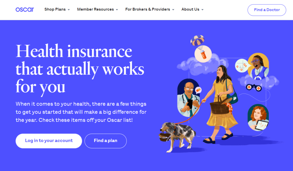
Oscar’s website is a perfect example of simplicity. The health insurance company makes a complex topic accessible. The Oscar website enables ability and facilitates a central route.
The Prompt
Without a prompt, a target behavior will not happen. Prompts tell people to do it now.
Sometimes a prompt can be external, like a message alert. Other times, the prompt can come from our daily routine: walking through the kitchen may trigger us to open the fridge.
The concept of a prompt has different names, but content marketers generally refer to it as a call to action or CTA — Fogg once called this element the “Trigger”; he changed this term in late 2018. Now he uses “Prompt”.
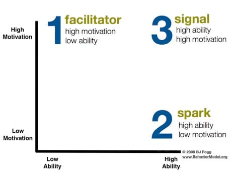
The way to encourage desired user behavior is to “place hot prompts in the path of motivated users,” as BJ Fogg would say.
The closer the timing of an external prompt with an internal prompt, the sooner an association forms. In general, an internal prompt is created when a user has a consistently great experience with content or an application.
After continuously getting rewarded by the application, an association is made between the application and the need that prompted the opening of it.
Since internal prompts take the form of internal drives and thoughts, they’re pretty much impossible to measure or rely on. That’s why external prompts are a product designer’s best friend.
Examples of external prompts are:
- Emails;
- Push notifications (eg. email subscriptions pop-ups);
- Text messages.
These prompts are most effective when actionable, personalized, and timely. If a user is presented with a CTA when they’re able and somewhat motivated to perform a behavior, it’s likely that they will.
Cialdini’s Principles of Persuasion
We have seen how elaboration occurs and how it is facilitated by motivation, ability/simplicity, and prompts.
Persuasion expert, Dr. Robert B. Cialdini, adds one more element. Since we live in an age of information overload, we don’t always have the time to process all of the information and make informed decisions.
This incapacity makes us look for signals that help us decide if we want to do something. Cialdini calls these signals “shortcuts.”
Enabling these shortcuts through design and content will facilitate users to adopt the central processing route.
Status Quo: people generally prefer the status quo, even if they say (or their actions suggest) they’re open to new ideas or ways of doing things.
If your company’s products or services require customers to venture out of their comfort zone, explore risk-free mechanisms that allow customers to experience them.
Meal box companies like Blue Apron, do this by offering free meals to new customers. This tactic is appealing to everyone, but especially those who are reluctant to try a new dinner routine.
Reciprocity: people generally feel indebted to those who do something for them without asking for anything in return.
Simply put, the more you give to your customers, the more they’ll be willing to give back to you.
Whether it’s bestowing customers with an unexpected discount or free gift, the idea is to go above and beyond without requesting anything in return.
Some B2B software companies do this by automatically extending free trials or giving customers exclusive access to new product features.
For example, Freshbooks has been known to send automated free trial extension emails to users who haven’t purchased after initial trials. This is also the concept behind the big rock content marketing model.
Social Proof and Acceptance: we generally value opinions and ideas from people like us, and we feel greater compulsion to act when we see others like us taking action.
Social proof comes in a lot of forms: customer case studies, testimonials, reviews, and social engagement, to name a few.
For example, MarketingProfs applies this principle on its new membership page by pointing out that more than 600,000 marketers have signed up, motivating the reader to become part of that group, as well.
Scarcity and Fear Of Missing Out (FOMO): when we fear that something is scarce, we feel compelled to act — buying, stockpiling, or experiencing that thing before it’s gone.
This is an incredibly powerful psychological principle that marketers have used for years to drive action.
By using limited-time offers or showing consumers what their friends are purchasing, you can create a sense of urgency to buy.
Amazon’s Deal of the Day is a perfect example. It hits on both scarcity (only so many deals are available) and FOMO (you only have so much time). Same with airline companies that show how many seats are left at specific price points.
Authority: influencer marketing’s principles are based on the authority shortcut — people will consume your content (and will buy your services/products) because you have some degree of knowledge and authority, enough credibility for people to want to read what you have to say.
It works well in B2B and B2C, even if the kind of authority can be of very different nature.
Kaya Skin Clinic, a beauty clinic that focuses on improving the looks of a person by delivering services that enhance beauty and skin, found that including the word “expert” in the opt-in form as a call to action was a powerful application of the law of authority.
In fact, lead generation increased 137%, and as a consequence revenue increased 22% when Kaya’s agency decided to change CTA, including now the expert term.
A new CTA, taking advantage of the authority principle
Liking: finally, liking (or likeness), based on the straightforward principle that we are easily persuaded by people who are like us or people we like.
Similarity boosts liking. If we are members of the same group or have commonalities, it’s even easier to like you.
Cialdini suggests using the “About Us” page to become more likable, by including individual information and personal interests. PetsRelocation.com represents a good example of well designed About Page and a good application of Cialdini’s liking principle.
How (and when) we should use the principles
Let’s now translate what we’ve learned into a message clearly understandable by content marketers.
The question we should ask ourselves is: when should we use the psychology principles?
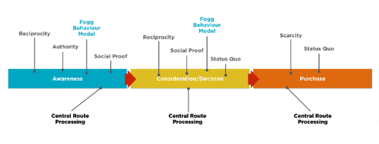
If we consider the simplified buyer journey we can summarise saying that:
- Central Route Processing should drive the entire journey. In fact, we have seen how any attitudes formed or reinforced this way will be more resistant to counter-arguments; attitudes formed through the central route will tend in fact to be hard to change. This means we need to work to increase motivation and ability/simplicity through the full journey.
- Fogg Behaviour Model: similar consideration here. Prompts (CTAs) will trigger behaviors in different phases of the journey.
- Cialdini’s principles of influence: some principles could be more appropriate for a specific phase vs others. For example, the principle of scarcity can trigger the consumer’s actions in the purchase phase. Authority can be extremely useful in the very first phase of the journey, where enterprises (especially B2B) should be considered authoritative and gain trust because of their understanding of specific domains. Social Proof is extremely helpful in several phases of the journey and with specific audiences.
Visually:
You should all pay close attention to these principles, learn what they’re all about, and apply them to your own content hubs, apps, and digital properties.
If you incorporate them properly, you’ll notice an unmistakable boost in your conversions over time. Understanding your audience’s behavior will be instrumental in the success of the overall Content Marketing strategy.
And to escalate your results, you’ll always need to count on a solid marketing strategy. In this article, we explained how to apply the Strategy Kernel, by Richard Rumelt, in your business!
Ready to elevate your content creation? Join WriterAccess and tap into a network of over 15,000 skilled professionals, from writers to designers and strategists. Leverage our cutting-edge AI features and vast image banks to refine your strategy and scale your content production.
Plus, with our new WriterAccess Humanizer service, ensure your content not only engages but resonates deeply by infusing AI-generated material with authentic human creativity.
Start your 14-day free trial today and don’t just keep up with the digital marketing game—lead it. Explore WriterAccess now!

