While a picture may be worth a thousand words, words in a picture are worth even more.
Using text to tell a story as it’s shown can supercharge an infographic’s impact. After all, words have a specificity and exactness that most images lack.
While a pie chart or bar graph displays raw data to excellent effect, an explanatory sentence tells you why that data matters: comparing it to other data, building bridges in your image.
The balance is delicate: too many images and you overwhelm the viewer with lines and color, too much text and you drown the message in the minutia.
Let’s take a look at some infographics that get the balance just right!
Download this post by entering your email below
Olympic Evolution
If you don’t need words, don’t use them. In this infographic, we know immediately that flags represent countries. We don’t need an explanation.
The only text found in this image is in the title and paragraph description. It’s powerful and communicative, few words required.

From Visually.
Largest Payouts in Sports
Visualizing numbers with minimal text. A number or statistic should always provoke this question: “How can that number be visualized?”.
Simply writing out numbers is fine in a text document but in an infographic, it’s often a missed opportunity.
Representing data in graphs, charts, or with creative juxtapositions is an infographic’s bread and butter.
This is how you make the data hit home. Save the text for the words. In “Largest Payouts in Sports” numbers are represented with simple circles creating an easy-to-interpret comparison.

From Visually.
Kitchen Cheat Sheet
If your subject matter already has its own standardized methods for data representation, don’t reinvent the wheel.
Rather than confusing things with cleverness, the “Kitchen Cheat Sheet” designer used simple charts, like those you’d find in a cookbook.
To keep the visuals interesting, they highlighted each section with an iconic overlay. The viewer is drawn to the appropriate section instinctively and recognizes the familiar data layout.
The best part: there is no extraneous text. It all serves the narrative succinctly.

From Visually.
What Are The Odds?
Handling a text-heavy script. Sometimes cutthroat editing still leaves you with a wordy script.
‘What are the Odds” is quite text-heavy but the way the data is visualized — the timeline-style progression, well-spaced graphics, and bold headings — gives it an open, clear, and manageable air.
Numbers and images are used whenever possible and text is small so the viewer can follow the graphic progression without stopping to read, if he pleases.

From Visually.
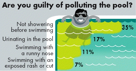
Are you guilty of polluting the pool?
Ask the Expert. We spoke with J. Ford Huffman, data visualization expert and Visual.ly advisor, about the relationship between text and images in an infographic.
Here are his comments, along with two infographics that illustrate his advice.
Do you think there is a golden middle-ground here, or does the balance of text and image change for different audiences?
First, the text and the image must reinforce each other. Each must show or tell what the other cannot. Each has a function, and neither function is to decorate.
The two elements — text and image — have one purpose: to work together to tell a story simply and/or to explain a complex thing in a simple way.
The graphic is supposed to organize the way we see and read. In the 1980s, more newsrooms started understanding the value of graphics. There was a tendency to do mega-graphics for major news events.
If there were 33 Olympics events, each one of them got a big graphic in advance of the competition. Why? Because designers could.
There were half-page and full-page graphics with lots of colors and visuals and text elements. Many of them were hard to read. Readers didn’t enjoy or read a dense full-page graphic any more than they enjoyed or read a dense page of body type.
The late John Monahan, who directed informational graphics at Gannett News Service and then at The Associated Press, convinced me that successful graphics are concise ones, ones that use no more space and text and art than necessary.
Anybody can fill space. The smart artist uses minimal space (unless they are being paid by the inch.)
As a follow up, if you were designing an infographic for an audience of academics, would you be more generous with the exposition, or do you think most people respond to visual storytelling with roughly the same level of text tolerance?
Would I give an academic audience more to read? Only if I wanted to bore them in return for their having made me read Silas Marner.
The designer Mario Garcia has always said a reader will read about any subject if the story is displayed well.
I think the same applies to the “story” (text) in a graphic. If the subject matter is compelling and if the text is enlightening — and well-written, well-edited, and well-sourced — the audience will begin reading.
Whether the audience continues reading is up to the person who produced (reported, researched, and wrote) the text.
Few readers want to read more than they have to read, no matter what platform or device. My hunch is that if a graphic is text-heavy, its visual isn’t doing its job well and-or the writer didn’t know when to stop writing.
Sometimes having lots of words is inevitable. What techniques do you think make a particularly wordy infographic work?
One technique? Editing.
Any text ought to omit needless words, as Strunk and White urge. Text ought not to grow in order to compensate for a weak visual.
Look closely at the visual part of the graphic.
Is the visual doing its job? Instead of additional words does the graphic need improved visual detail?
Seriously: If a graphic must be wordy I recommend dividing the edited text into segments, which can make the text easier to read. And if a graphic requires really long text, I recommend that the designer and editor use a text-only narrative — a story! — besides the graphic.