Data visualization examples could help you understand how data is relevant nowadays. It represents data in a visual context to help people who use static plans, such as maps, to understand the information concept.
With this piece of content, we can show information easily and quickly to exhibit indicators, trends, and narratives with details that may otherwise go undetected.
We can make better decisions and improve processes with data. According to IBM, 2.5 quintillion bytes of data are created every day from social media, sensors, webpages, ERPs, CRMs and TMSs.
Nearly two-thirds of consumers are visual learners. Thus, data visualization is essential to building a brand name in any industry.
Data visualization has been around since the Stone Age. However, humanity has long passed the point of drawing on cave walls.
With computerization, it’s possible to showcase detailed data in an easy-to-process manner. This makes it simple to help your audience grasp and remember complex information.
Download this post by entering your email below
What Is Data Visualization?
Data visualization is the graphic representation of data. Common examples include pie charts, line graphs, bar graphs, scatter plots, heat maps, bubble charts, and spider charts. Other examples range from infographics and pictographs to interactive maps.
Data visualization can help you make smart digital marketing decisions. It lets you see stats at a glance, so you know what your audience wants.
It also helps your audience make informed decisions. With visualization, customers can easily find information and solutions to problems.
Latest Trends In Data Visualization
There are examples of data visualization that effectively demonstrate the power of image resources and information quality to convince people about different concepts and causes, from areas such as marketing, business and consumer goods, to history and sustainability. The better you can visually convey your ideas, the more you can benefit from this information.
Here is a list of interactive and static data visualization examples to inspire you in 2024.
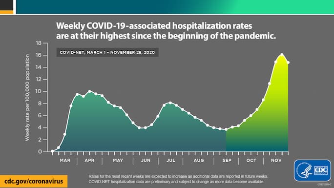
1. Public health trend analysis
As COVID-19 spread worldwide, health organizations used data visualization to deliver crucial information to the public. The CDC, for instance, used a line graph to show the hospitalization rate but added color to the visual. It was a tactful yet effective way to highlight the spike in hospitalizations, making the graph easy to read and remember:
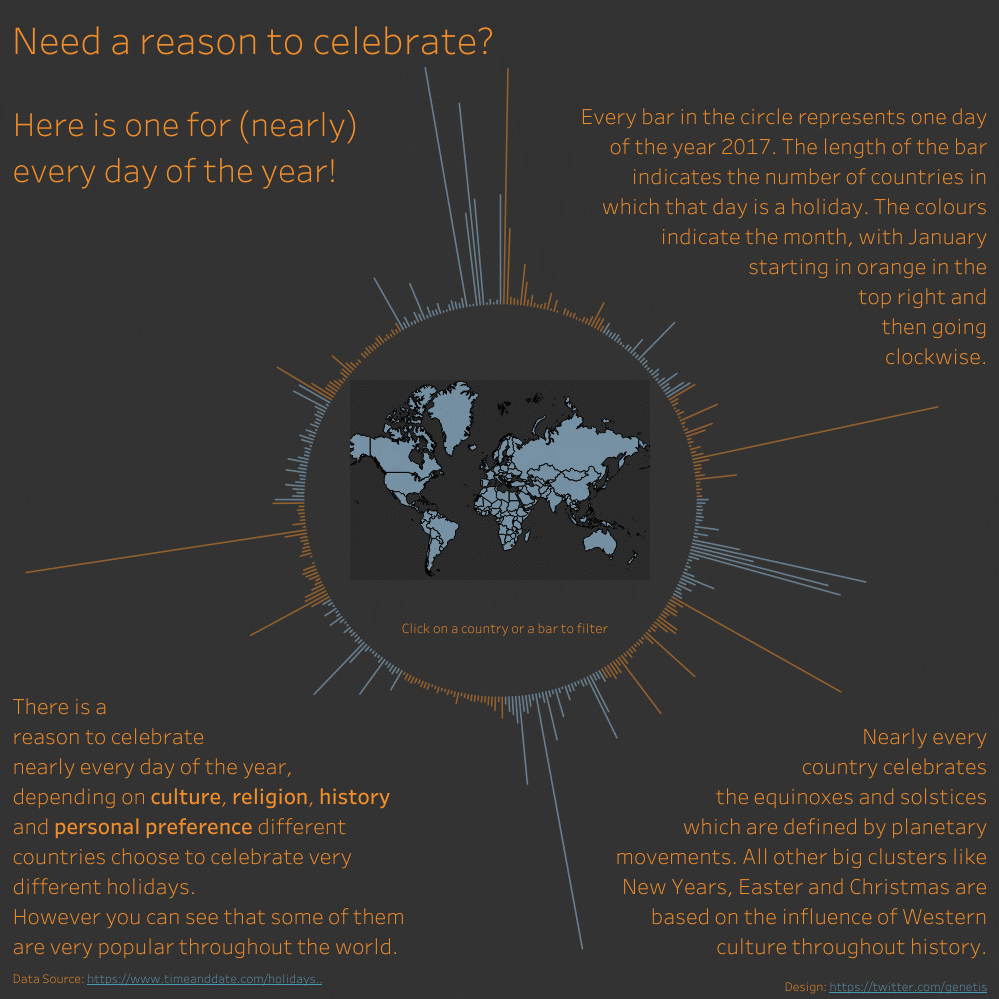
2. Interactive geospatial analysis
Do you want to learn about country-to-country net migration? How about U.S. electricity sources or the population density of New York City?
Interactive geospatial analyses don’t just showcase data. They also enable you to interact with it. This format allows users who want more information to find it. At the same time, it doesn’t overwhelm all viewers with too many statistics.
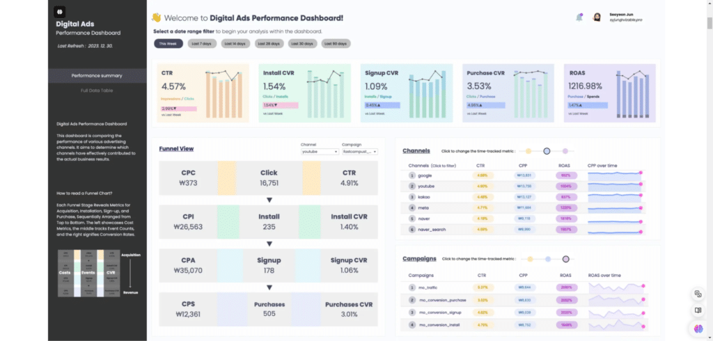
3. Business performance dashboards
If you have a website, then you’ve probably seen a business performance dashboard. It supplies information ranging from site visits to keyword performance and per-page bounce rates.
Business performance dashboards are also great for visualizing financial information. You can see expenditures, gross income, net income, and more.
4. Accessibility in data visualization
If you want people to understand and remember your data, you need to make sure your visualizations are accessible.
An accessible visualization features clear color contrasts. The chart has labels and a key to identify symbols. All text on the chart is clearly visible.
5. Creative and artistic visualizations
What does creative, artistic, and clear visualization look like? Consider the following examples.
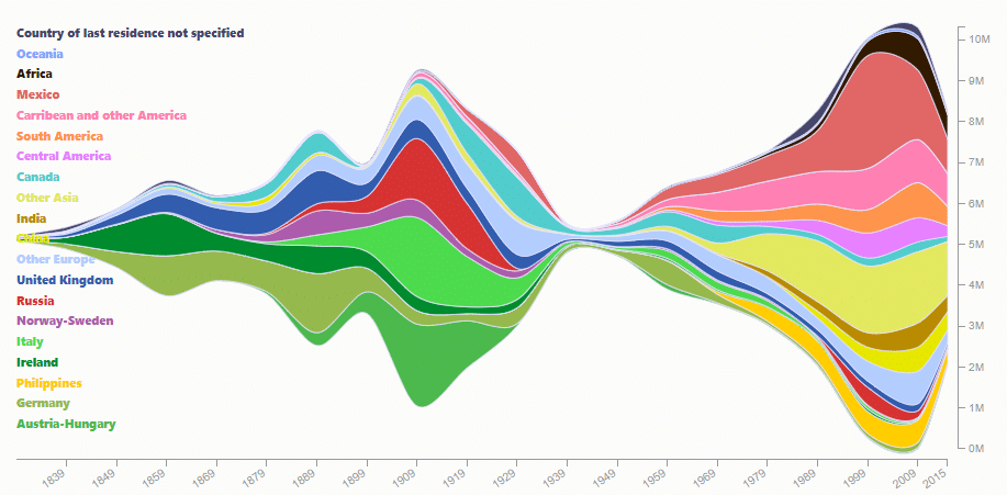
Award-winning journalist Talia Bronshtein created a steamgraph to show information about immigration to the United States. The multiple bright colors get your attention while making it easy to see where immigrants come from. You can also see which years have more or less immigration.
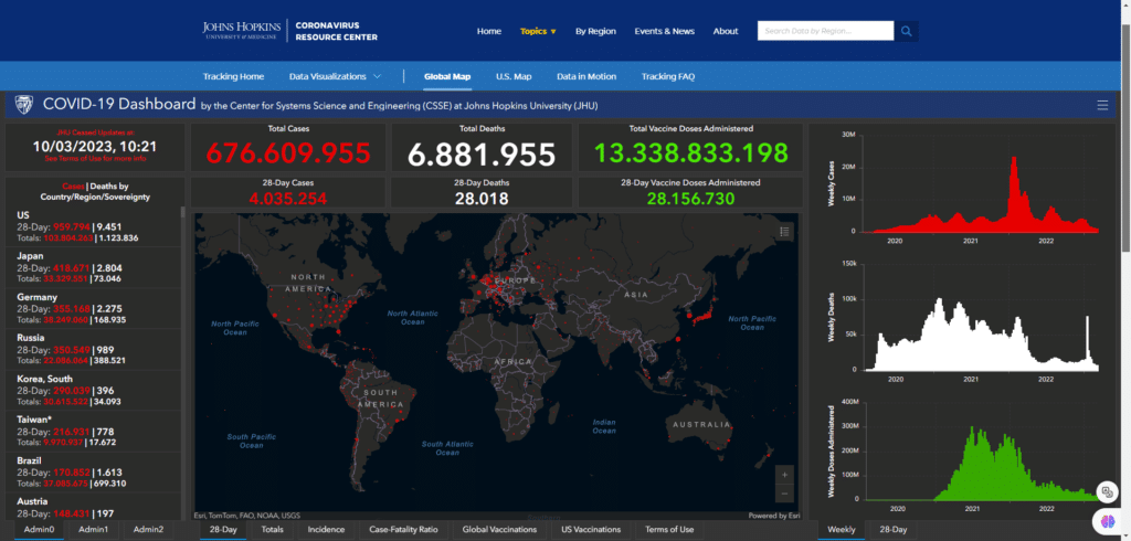
On the other hand, when Johns Hopkins University created a heat map to show COVID-19 statistics, it used four main colors. A dark background contrasts well with the text and lines, which are white, green, and red. The map grabs your attention, and you can see the most important stats with a cursory glance.
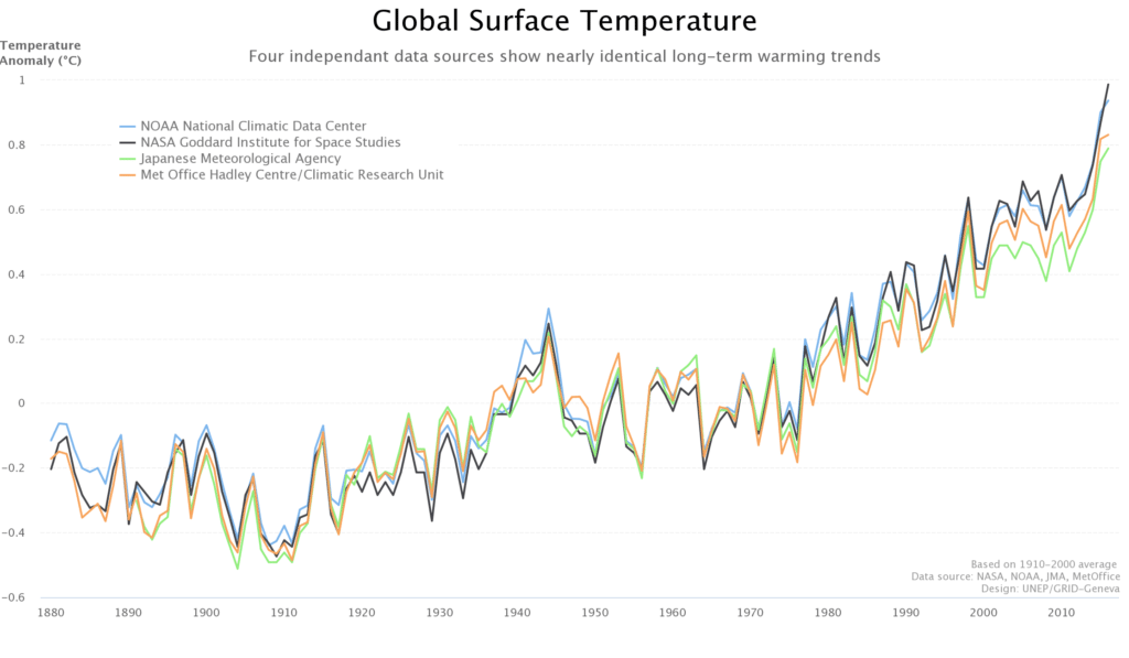
The UN Environmental Program’s global temperature graph isn’t flashy. Its primary purpose is to show that data from four reliable sources is almost identical. It accomplishes this objective with limited use of color and an uncluttered white background.
How to Create Effective Data Visualizations
There are many techniques you can use to design great visualizations. You can also find plenty of excellent tools for the job, including Tableau, D3.js, and Power BI.
Understanding the concepts outlined above is key to creating great visualizations. However, you also need to know which type of visualization is best for a particular task.
Big data visualization
Do you need to visualize massive amounts of data? Are you trying to capture trends, reveal patterns, or provide insight for decision-makers?
Effective ways to showcase large quantities of data include charts, maps, plots, and word clouds. These visualization options make it easy to see lots of information at a glance. They also allow for easy comparison of different statistics.
Interactive data visualization
Interactive data visualizations are ideal for comparing spending trends and consumer trends. They also work well when you want to analyze employee performance.
At the same time, they’re a valuable tool for consumer marketing. Interactive visualizations make it easy for customers to remember a single point or statistic. They also provide an eye-catching way to boost likes and shares on social media.
Reuters’ interactive data visualization on plastic bottle usage is a good example of this trend. It grabs your attention and makes you want to read the article. Users may not remember the exact numbers, but they’ll never forget the point this visual makes.
Data storytelling
Data storytelling isn’t exactly the same as data visualization. The end goal of telling a story isn’t to help readers remember stats. Rather, it’s to show a progression of events over a set period of time.
Images are a must for data storytelling. They help keep text to a minimum. Even so, you’ll need some text to help readers understand what’s happening and why.
Spotify’s Wrapped campaign is a good example of data storytelling. It tells users what they listened to last year. It also shows when a user listened to certain albums the most.
Do you want people to explore their behavior? Are you trying to show changes over an extended time period? If so, data storytelling could be an ideal tool for your company.

Why data visualization is so important?
Before seeing some data visualization examples, you have to know why it is essential for any situation. Check it out.
It reveals trends
Data visualization can reveal patterns and trends hiding in Big Data. Every day, companies collect a large amount of data in their operational systems. It is raw data that says who bought what, where, when and in what quantity.
It is essential information for the business routine. If this information is used to detect buying trends, for example, they are practicing Business Intelligence (BI).
It puts information into context
One of the strengths of data visualization is their ability to place isolated pieces of information into a bigger context and make it more understandable when we think about the whole.
If we tell the audience that something is significant, but we do not convince them, they may never see how important it is.
It saves the reader’s time
Data visualization can summarize the amount of information: simplifying and consolidating a big volume of data in a piece of content that can be seen in less than a minute, and, in the process, save readers time and effort.
It empowers the narrative
Data visualization also democratize access to information: we have to think that some people cannot read in common ways. It also makes the content more interesting for all kinds of users and empowers them to get the visualization by images, interactive media, and animation.
It gives more perspective for a story
Putting the information in context, the visualization of data allows readers to apply the information in historical series, to give a temporal perspective to the result that will be visualized.
It explains a process
Data visualization makes the process easy to understand. We can break it down into parts and give the reader bite-sized pieces of information that are easily absorbable.
It stimulates the user’s imagination
Data visualization will not only do the hard work in helping to understand complex information, but it may also stimulate readers’ imagination by allowing them to think about different hypothetical possibilities and unexpected situations.
It could change a really bad scenario
Data could help people to change their minds and understand the real situation they are in. Recently, the virus report from Imperial College jarred the U.S. and the U.K. government to action about COVID-19 in their countries.
Made by a team of 50 scientists, relating to the World Health Organization and led by an epidemiologist, Neil Ferguson, this piece of data content with mathematical models changed these governments’ insights, because it had shown that COVID-19 would overwhelm hospitals and that they had no choice but to impose lockdown policies.
It is metaphoric
Metaphors are a good way to communicate complex ideas, making them simple to understand and to be visualized by symbols, signs, and comparisons.
Some data visualization examples, such as The Internet Map, created by Ruslan Enikeev, use this strategy. He uses planets in a solar system to exemplify the influence of websites in the Internet context.

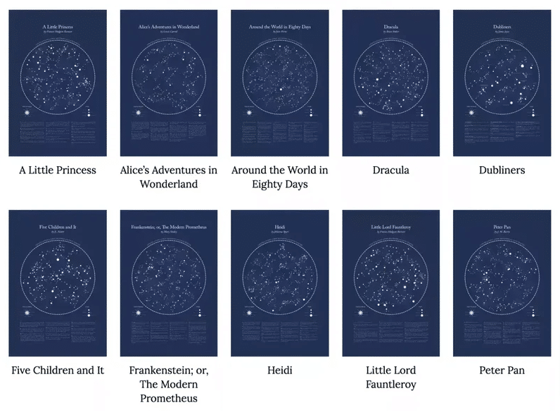
There is another unusual and original way to explore constellations: this visualization was named one of the most beautiful data visualizations of 2017. It combines literature and astronomy.
The artist uses the grammatical structure of opening sentences from classics well-known works, such as Robin Hood and The Phantom of the Opera, to create a diagram in the form of a constellation for each sentence.
It could be a storytelling
Some data visualization examples are efficient to communicate information, convince people, and reveal trends. But it also could be storytelling, because it says an understandable story by steps that should not go ignored.
Interactive data visualization examples are unique and have an appeal to the senses: make all experience interactive with audio, images, and the possibility to click, hover, and scroll through content.
Wrapping Up
Data visualization is an invaluable tool for any business. It helps you process data in-house to make informed, data-driven decisions. It enables you to better understand your audience and meet consumer needs.
Data visualizations can also help you provide consumers with the information they need. However, you’ll need to research and plan ahead to make sure your visualization hits the mark. Choose the format, colors, and fonts with care to boost your odds of success.
With Rock Content’s Interactive Content Experiences, you can benefit from expert assistance that helps you pick the right visualization style for any audience. Contact us to find out more or schedule a free consultation at your convenience.