Publishing blogs are a vital part of any organization’s content marketing strategy.
Not only are they a great tool to expand visibility and outreach, but well-designed, high-quality blogs can also help position your organization’s authority and expertise in your industry.
However, even the most interesting, informative, and entertaining blogs can sink into oblivion if they aren’t created with careful intent.
To compete in today’s crowded web landscape, you’ll need to invest effort and pay attention to design and SEO when publishing blog posts.
Are you looking to take your blog posts up to the next level? In this article, we’ll discuss best blog design practices and examples we think you should know.
What is the Importance of Design for a Blog?
Most of us know what makes up good blog content, but what we often don’t consider is the design that goes along with it.
A thoughtful blog design gives readers a positive experience.
It is comprised of the components utilized to create an outstanding post people will want to click on — and actually read.
Other objectives directly correlating to good blog design include:
- Helping build brand loyalty.
- Attracting visitors to your website.
- Avoiding visitors bouncing to competitors.
- Building new leads.
- Gaining steady conversions.
- Earning customers’ return business.
Bottom line, if you prioritize your blogging efforts, you’re going to recoup a much larger ROI than those who don’t.
5 Best Practices to Use in Blog Design
Your goal should be to create attractive, digestible, and easily found content. This, along with adding elements search engines seek, will go a long way towards creating the perfect blog.
Overall, good components to utilize when putting together a high-quality blog design include the following:
1. Publish industry-relevant content
While an off-topic post might entertain or attract viral attention, if it ultimately doesn’t connect back to your brand in some shape or form, you’re going to quickly lose your audience once the initial hype is over.
People expect some sort of industry-relevant connection. They also anticipate a steady feed of fresh content. Stale content diverts from the appeal of a website.
This doesn’t mean you can’t stretch it a bit to entice audiences and have some fun.
Just make sure any blog content you post resonates with your audience. Otherwise, they’re likely to bounce to a competitor who is providing the information they seek.
2. Use rich keywords
Capturing the prolonged attention of readers is only one part of the equation.
You need to try to capitalize on integrating rich (and relevant) keywords to get the best search engine placement.
Fortunately, you have choices here. You can go with one of these great free keyword tools or invest in a paid option.
A general rule of thumb is to publish blog posts that are 1,200 words or more, integrating competitive keywords throughout the text. Some blog posts go up to 4,000 words.
Again, consider your audience and determine the number of words that are enough to adequately cover what you want to share.
Google often changes its algorithm and, while this is critical to consider when aiming for good SERPs, ultimately, it’s the user preferences that will attract and drive traffic to your blog posts and, by extension, your sales website.
3. Integrate a balance of good imagery
We’ve all heard how good imagery adds a better aesthetic and drives more engagement and traffic. There is a definite truth to the old adage that states a picture is worth 1,000 words.
While this philosophy applies to blogs, the more mysterious aspect of integrating imagery into blog posts is how many should be included.
Is it an exact science? (Obviously, you’re not going to substitute one image for 1,000 words.)
Turns out, it’s not an exact science after all. What’s important is finding the right balance between words and images.
According to BuzzSumo, articles featuring images every 75-100 words received double the web traffic and 30x more shares. That’s pretty significant!
However, components such as overall word count and relevancy are going to heavily factor in. In other words, choose your photos, infographics, videos, and charts wisely, and then place them strategically.
4. Create attractive and user-friendly pages
Even if the most important information readers want is written within a blog post, if it’s not attractive or user-friendly, visitors are going to bounce off to another page. Most likely that of a competitor.
Best practices for creating attractive and user-friendly pages include:
- Using short, descriptive subheadings.
- Selecting typography that’s easily readable and swimmable.
- Integrate white space to make content digestible.
- Choosing easy-to-see colors that complement one another and align with the brand (remember, sometimes less is more.
- Including article quick-summary boxes (can also be beneficial for SERPs).
- Making your CTAs stand out.
- Strategically placing your lead magnets.
- Adding a good search tool (highlight your most amazing content).
- Utilizing an adequate grid width to keep content in view.
- Estimating read time so readers know what to expect.
- Building good user experience, including navigability and accessibility.
One of the most important elements of good blog post design is to not just create for the web, but optimize for mobile format.
Statistics suggest more than 90% of the global internet population in 2021 accessed online content using their mobile devices.
5. Integrate consistency when publishing
Consistency is another vital component — don’t use different voice tones, varying fonts on different pages, or integrate alternate colors.
Treat your blog design like you would your logo: keep it familiar so it’s easily and immediately recognizable.
By using the above strategic design tips, you can produce high-quality blog content, build brand loyalty, make sharing easier, build followers/sign-ups, and, ultimately, widely expand your web visibility.
Not to mention, capture the attention of Google and other search engines.
Interesting Blog Design Statistics
We found the following statistics shared by Orbit Media to be enlightening when it comes to considering which blog features you might want to add to your design.
Take a deeper dive to see what others are doing to help get an idea of where the online climate is migrating when it comes to best blog design practices.
- 79% include links to related articles.
- 73% of blogs use a search tool.
- 71% include the date (this is controversial since some argue it makes a page look dated but for timely content it’s critical).
- 64% feature an author’s photo.
- 51% allow comments (a great way to engage — but to succeed, someone must be dedicated to reading and responding).
- 44% use one column (no sidebar).
- 44% use popup windows for CTA, 13% utilize sticky footers and headers, and 12% use slide-in boxes; alternatively, 43% don’t use CTA overlays at all.
- Roughly 35% of blogs position share buttons on the top, 30% on the bottom; 30% on the side (the main takeaway here is to include them but don’t make them distracting).
- 14% highlight reading time.
Carefully examining your options, knowing your audience preferences, and putting emphasis on your strategic goals can help drive your decisions on which elements to include and how they should be positioned.
4 of the Best Examples of Blog Design
Statistics shared by Amazon Web Services indicate that 88% of consumers are unlikely to return to a page that offers a poor experience.
Remember: simplicity, navigability, consistency, credibility, accessibility, and a user-centric approach all go a long way towards boosting your own brand’s visibility and becoming a resource everyone will want to read.
To get a better visual of popular blogs that have great design and perform well, here are some of our favorite examples.
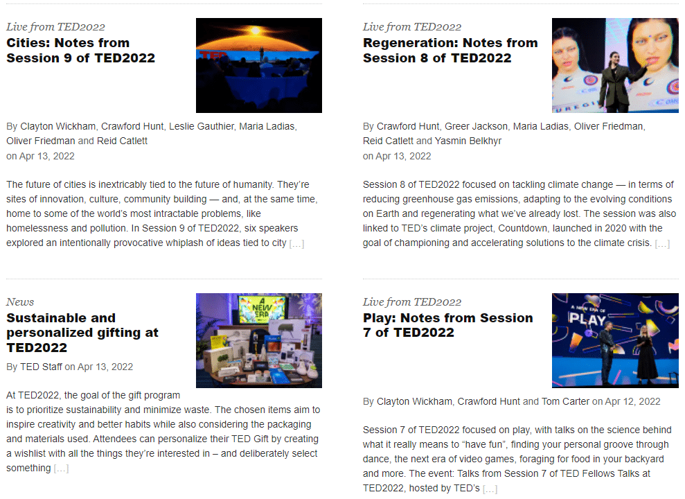
1. TED
The TED blog offers plenty of white space, is easy on the eyes, offers filter options for readers, and is designed to be user-friendly in its simplicity.

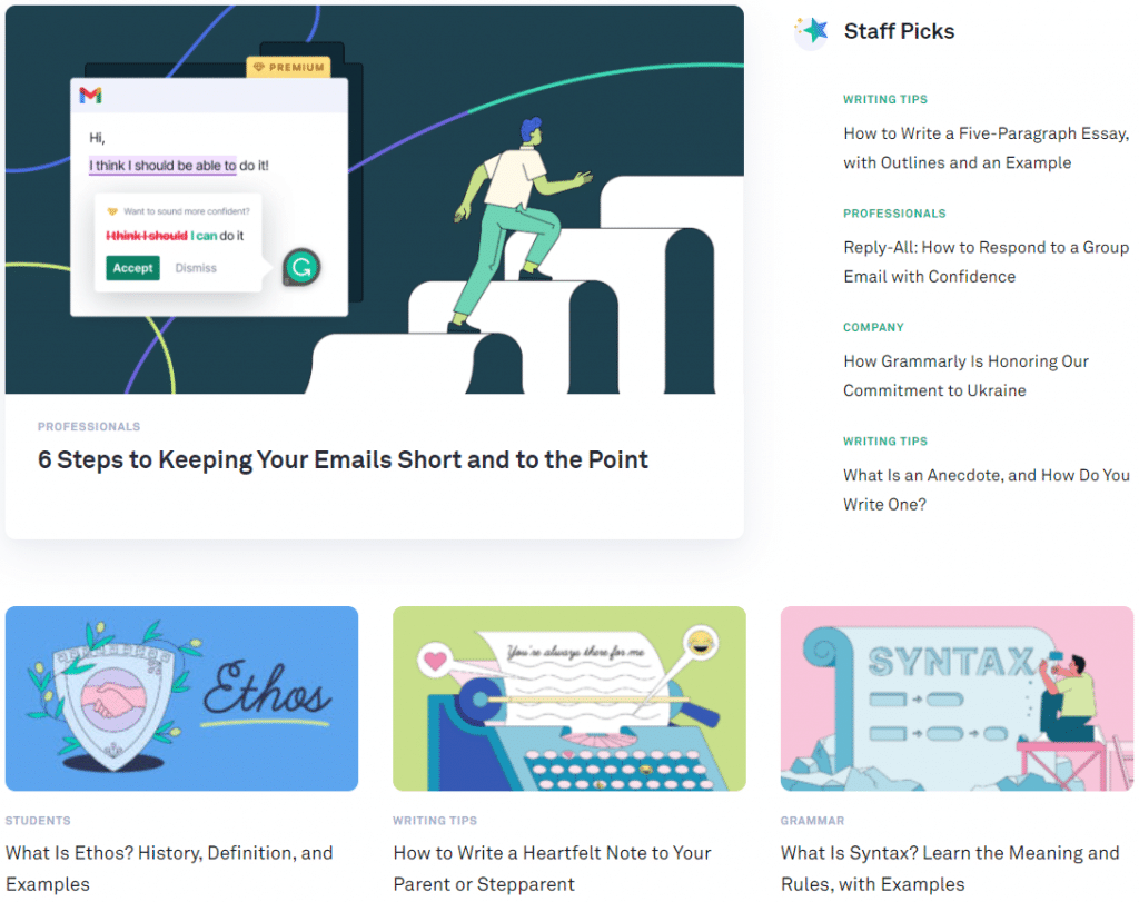
2. Grammarly
If you’re familiar with Grammarly, you know they use blue and green with ample white space to convey their message — this follows to their blog.
A user-friendly blog, posts are listed in order with white eye-drawing illustrations to capture a reader’s attention.

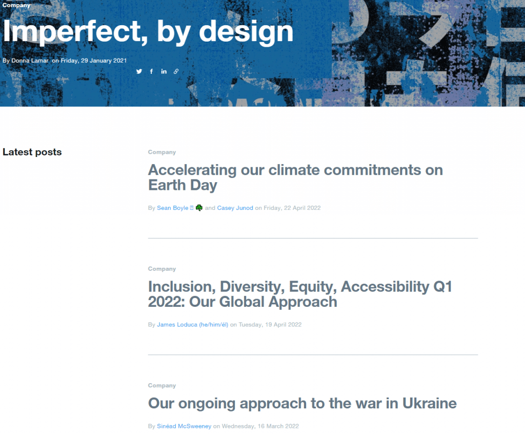
3. Twitter
We think the Twitter Blog is a perfect example, since it looks like an extension of the social media site with the familiar blue, conveying to the reader its brand identity.
Their blog includes nice white space and links out to other blogs for special interests (e.g. businesses, developers, etc.)

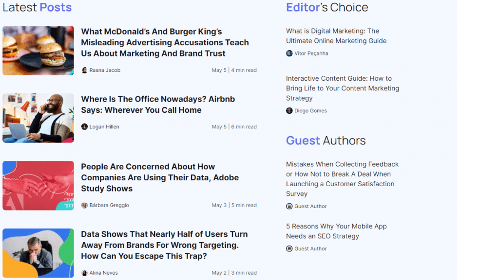
4. Rock Content
Our bias may be showing a bit here, but we’ve carefully crafted our look to reflect our brand while simultaneously highlighting important information to our readers.
Our subscription button is easy to find and visitors to the blog are presented with numerous options for topics they might want to read.

Wrap Up: Good Blog Design Takes You to the Next Level
The internet has made the world a lot smaller by allowing us to easily connect, but at the same time, it’s a pretty crowded environment.
With almost 2 billion websites (and literally growing every few seconds), you want to make sure your blog attracts attention, but perhaps more importantly, keeps readers on your pages.
A good narrative design of your blog will boost your ability to tell a story people will want to hear.
Revamp your blog design and content with skilled freelance professionals. Click here to start WriterAccess’ free trial and transform your blog into a visually stunning and captivating online destination.

