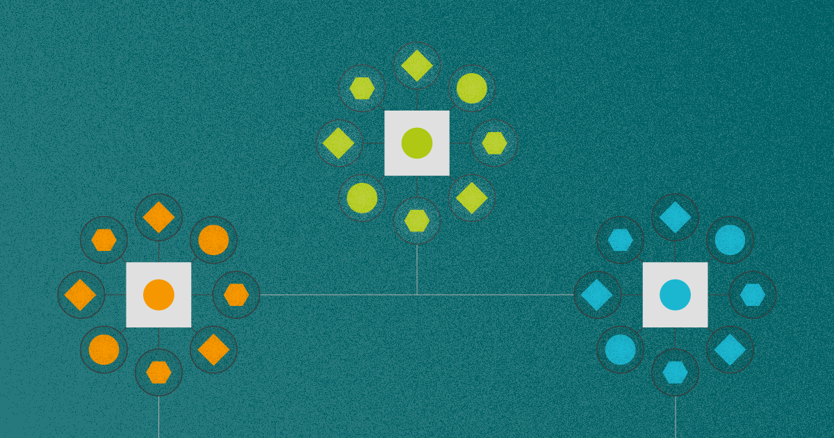
Network visualizations: the links that bind us
Network visualization is a great strategy to with data. This content formed by links and nodes is pretty interesting and(...)
Network visualization is a great strategy to with data. This content formed by links and nodes is pretty interesting and(...)
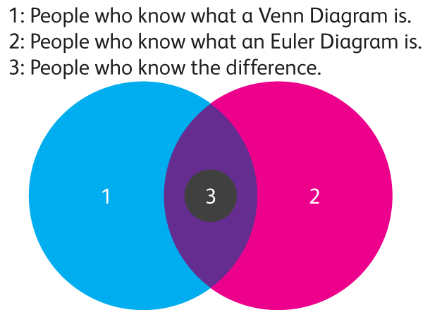
Venn and Euler (pronounced 'oiler') diagrams are incredibly popular on the internet as funny charts. They offer a simple(...)
Most visualizations end up as passing follies that are significant in the short-term, but in the long-run they fade to t(...)
What makes a good information visualization piece? Not even the experts agree. Despite sharing a common goal – to crea(...)
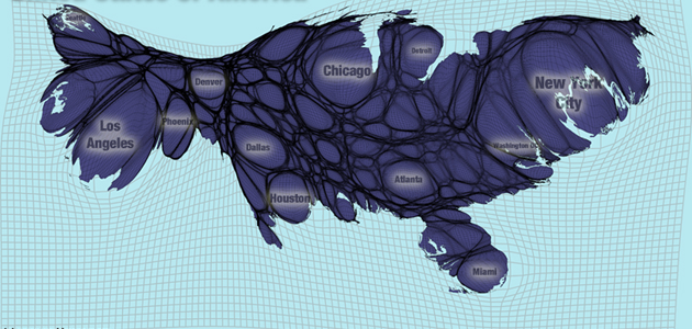
Maps are probably the biggest subsection of visualization types. There are many variations on map types, each with its o(...)
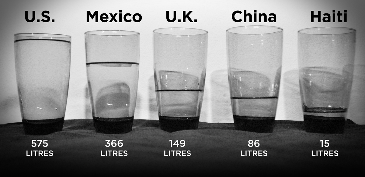
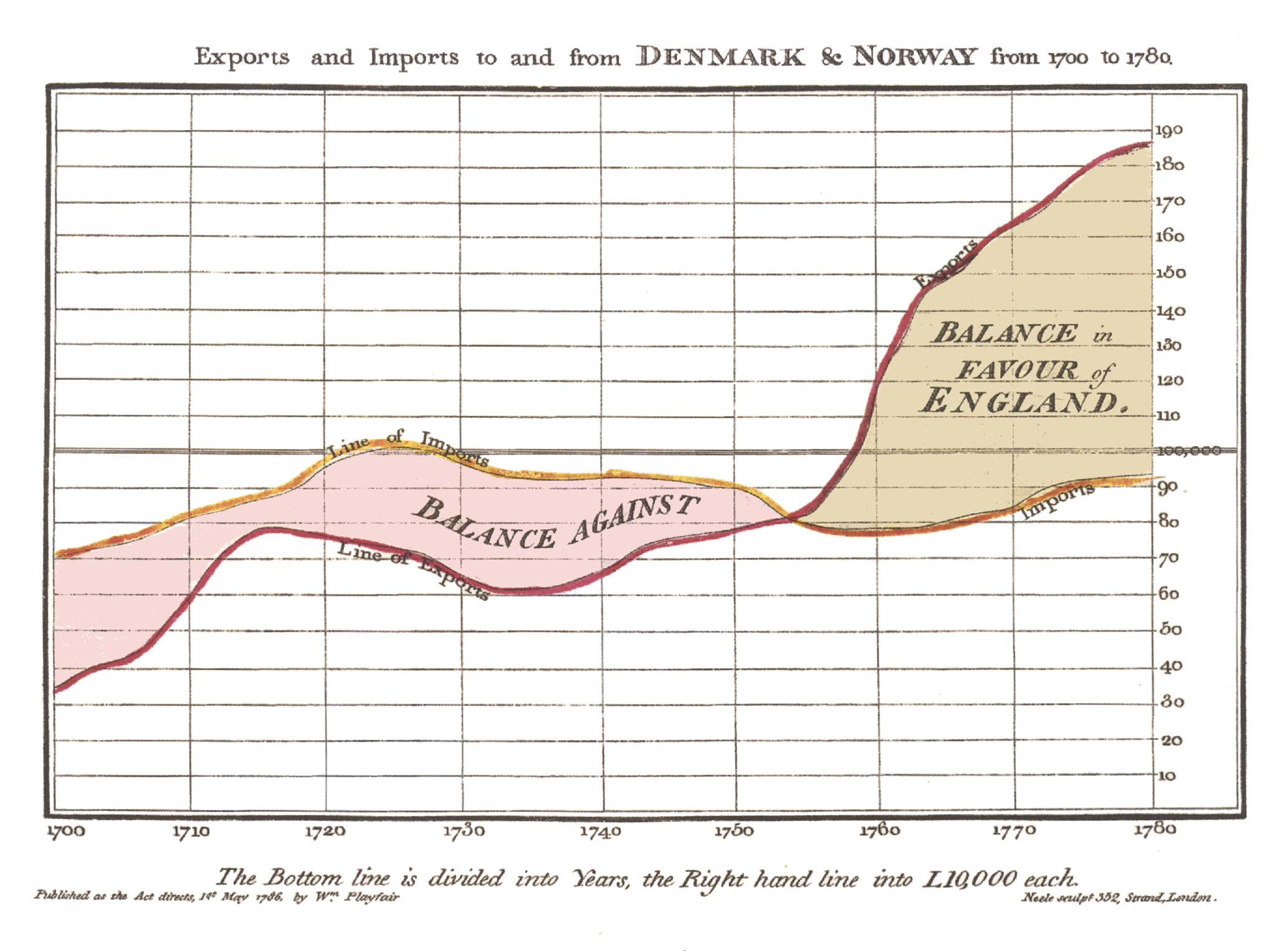
Real-world infographics, analog data visualization, physical visualization… there’s no official term for it yet,(...)
There are a lot of bad infographics out there. Some just don’t work with human perception and because of that, end(...)
What could be worse than a poorly designed infographic? A poorly sourced one. Too many infographics and data visualizati(...)
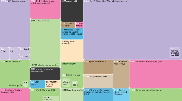
Treemaps have proliferated fast and far since Ben Shneiderman invented them in 1990. One reason for this quick spre(...)