Your website is the premier face of your business.
It’s the perfect online real estate to showcase who you are and what you offer.
A website also provides you with a chance to create the best user experience possible with not only a visually pleasing design but easy and efficient navigation as well.
That’s where optimal website design comes into play.
Without easy, intuitive navigating on your website, your visitor is likely to grow frustrated rather quickly, and you’ll undoubtedly see a higher bounce rate and a decline in conversion rates.
Keep reading to discover the best website navigation examples to inspire your own!
What is Website Navigation?
Website navigation refers to the structure of a website and how its content is organized and connected.
It involves the overall website hierarchy and link structure.
More simply put, website navigation is a tool to guide visitors to the information and pages they are looking for easily.
This navigation plays a crucial role in whether visitors actually find what it is they came to your website for or not.
Types of Website Navigation
When it comes to website navigation, the terms bar and menu are often used to describe the different types. These link-based tools provide slightly different user experiences and include the following.
Horizontal Navigation
Most everyone is already familiar with this type of website navigation as it is located at the top of many websites today.
It is often called the top menu, main navigation, or the horizontal navigation.
Website visitors are drawn to the top of the site for ways to access the various information available, and this ensures they are able to find what they need.
Examples of labels for horizontal navigation include About Us, Products, Services, Plans, News, Blog, and Contact.
Vertical Navigation
The vertical navigation, also referred to as sidebar navigation, lists out the website pages in a column located on the right or left side of the page.
You can often find this type of navigation to categorize blog posts and articles.
While less common than horizontal placement, the advantages of vertical navigation include:
- Provides a way for visitors to easily scan for what they need.
- Accommodates longer page labels.
- Includes room for more primary, top-level links.
Footer Menu
A footer menu situated at the bottom of a webpage is usually accompanied by a horizontal navigation bar at the top.
For visitors looking for something in particular, they can look in both places for clues as to where to go next on your website.
The footer menu is often more in-depth than the horizontal one and usually links to the most essential pages on your site.
Common links in the bottom menu may include:
- Careers available with your company.
- Privacy policies and other legal matters.
- Customer loyalty programs.
- Ways to contact the website owner.
In addition, those visitors to your site who do scroll down to the lower part of your site tend to be more engaged with your brand. For this reason, make sure you offer valuable reasons for them to be there.
Dropdown Menu
Dropdown menus extend from a horizontal menu bar whenever a website visitor hovers over or clicks on one of the main options.
These menus are beneficial in conserving space on the screen and help you avoid an overly busy website layout.
Mega Menu
Unlike the dropdown menu, mega menus provide you with the opportunity to add multiple content categories.
These mega menus expand wider, giving visitors a fuller breakout of your content, making it super convenient for them to locate what they want.
You will often see these on catalog, magazine, and blog sites.
Hamburger Icon
Hamburger navigation buttons serve as space savors for you and a way for visitors to expand your content offerings easily.
The button itself consists of a three-line icon and is often found in mobile web design. A visitor just clicks on the icon, and a drop-down or pop-out menu appears.
In most instances, linked content labels are still listed horizontally on laptop and desktop computer screens but hide behind the hamburger icon button on smaller screens, such as mobile devices.
Full Screen Menu
The full screen navigation is simply an overlay taking up most of the screen, providing you with ample space to add menu links.
Visitors usually access this menu by clicking on a hamburger icon button.
Sites often use this navigation method when they are limited on space and have less room for a mega menu.
Breadcrumbs
A breadcrumbs navigation type is used to tell your visitors where they are currently on the website.
It is a hierarchical linking structure designed to show how pages are characterized in relation to other pages on the site.
5 Website Navigation Examples
These navigation types are used across websites today, and finding the one that works best for you and your targeted audience is the key to your success.
Here are five website navigation examples to inspire your own design.
1. NKI
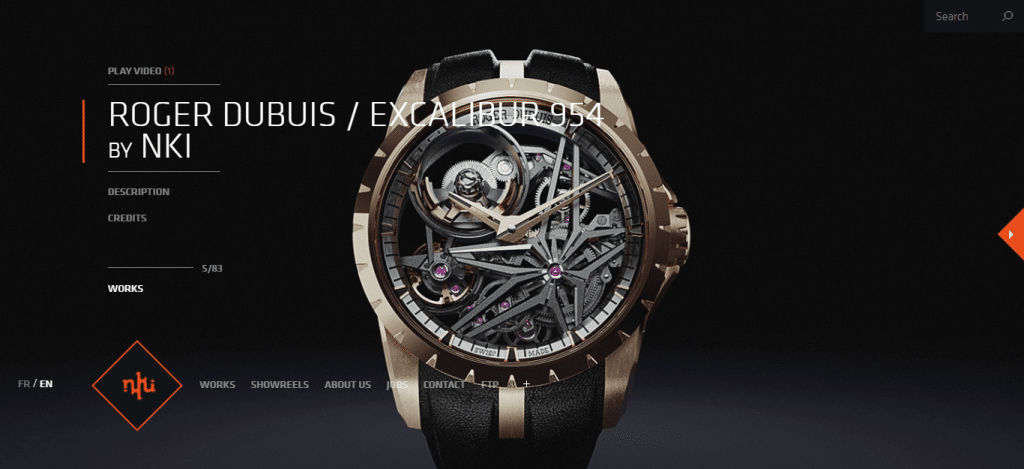
The French studio NKI specializes in animation, CGI, and VFX.
It’s no wonder then that their website showcases exceptional visual content, which is exactly what visitors will be looking for when they arrive.
Yet, while the content is already incredible on the site, the studio put additional thought into the website navigation, making it more game-like in structure.
NKI chose to go with full-screen navigation, with visitors scrolling to change screens.
This approach matches the studio’s personality, providing visitors with a unique experience. It draws them in, creating excitement to continue exploring the site and becoming a fan of the studio itself.
Still, NKI knows that its navigation structure also needs to have a foundation.
For this reason, it located a fixed menu at the lower left, so visitors always have a way to reorient themselves by returning to this menu.
A unique approach not meant for everyone, of course, but for those creative businesses, the full screen navigation type may be the way to go.
2. Edwin Europe
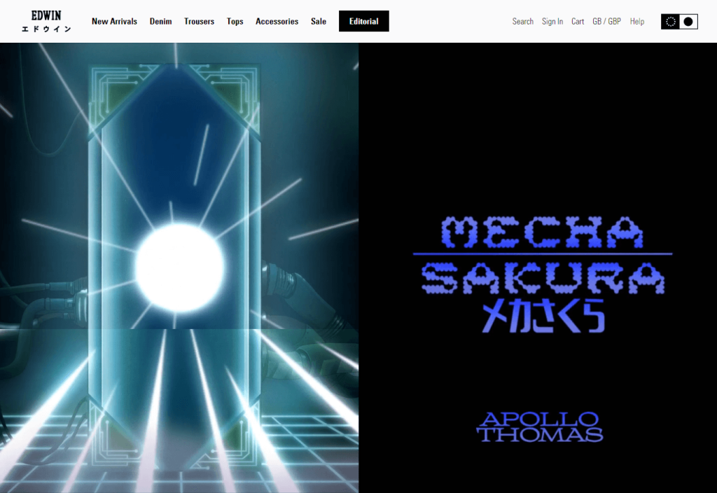
When it comes to clothing items, specifically denim clothing items, the competition can be fierce.
If customers don’t like your website and find it difficult to navigate to your product offerings, they’re not likely to stay for long.
The brand Edwin Europe knows this, and since many of its customers shop on mobile devices, a mobile-optimized website and navigation type became imperative.
So, it went with a combined horizontal and vertical sidebar navigation approach. The visitor hovers over a category on the horizontal bar, and a vertical sidebar appears.
This navigation type works well for the brand, is scalable, and creates an easy way to roam the site for both smartphone and laptop or desktop computer users.
3. Propa Beauty
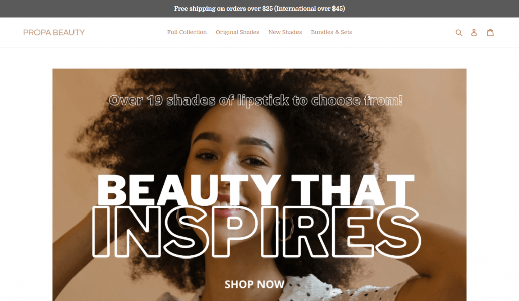
Sometimes a straightforward approach is best. Take Propa Beauty, for instance.
Keeping its horizontal navigation menu rather simple, it focuses on generating conversions and sales as the primary goal.
Visitors can easily and quickly locate what they are searching for every time.
In addition, Propa Beauty uses simple icons located to the far right, providing a way for visitors to easily navigate to other popular areas on the site, including their shopping cart, the member sign-in page, and the search feature.
4. The Shade Room
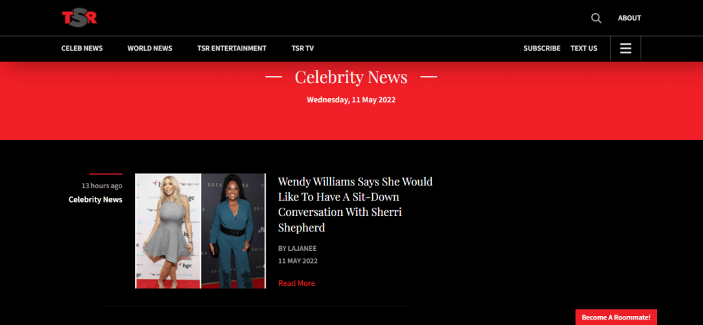
The online news provider, The Shade Room, doesn’t limit itself to just one type of navigation menu.
Instead, it creates a full experience for visitors by providing both a horizontal header and a three-lined hamburger menu option.
When a website visitor clicks on the hamburger menu button, a second navigation menu pops up with links to other parts of the website.
5. Patagonia
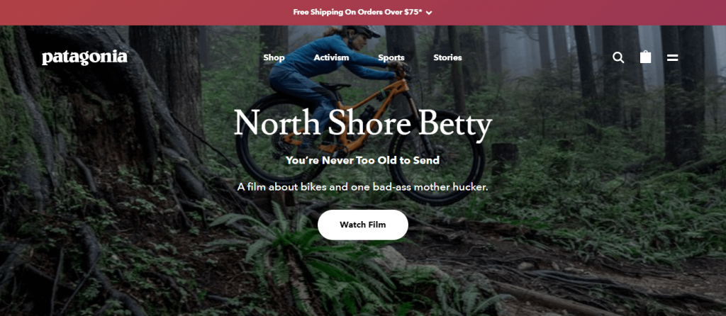
For brands providing an extensive catalog of products or items, such as Patagonia, a mega menu approach is often best.
From the horizontal bar at the top, a visitor can hover over the Shop option and be presented with the in-depth mega menu, which lists numerous links to choose from for browsing.
Hovering over the Sports option, visitors will see a smaller menu broken down by sport type, making it super easy to maneuver to exactly what they are looking for in a different manner.
The horizontal bar across the top also includes other options, like Stories and Activism. These two are not connected to a mega menu but instead can be clicked on to take the visitor to a separate section of the website.
This two-pronged approach works for Patagonia, providing visitors with a better shopping experience and also linking them to important information about the brand.
3 Top Best Practices for Website Navigation
As with everything in marketing, you need a strategy.
Considering how your website is laid out and how your visitors will navigate to the content it offers needs to be an essential part of your digital marketing plan.
To create a good experience for visitors, try incorporating the following three best practices for website navigation.
1. Attribution Reports/Users Flow Reports
If you already have a website, take advantage of attribution reporting if your marketing web analytics software offers this feature.
The report attributes newly created contacts to the interactions taken with your business.
Such information allows your team to better understand what on your website is converting visitors into qualified leads, whether it be the content, functionality, or both.
Are website visitors spending the most time on your product pages or your blog? Which blog posts are garnishing the most attention?
Design your navigation to reflect what you find and prioritize those pages.
If you don’t have access to attribution reports, you can still gain a sense of what is occurring on your website by using Google Analytics and its Users Flow report.
While this is a more limited report, it does provide you with information on how visitors tend to navigate while on your site.
2. Create Visual Separation
Website navigation menus need to stand out in a different way than your overall website content. To accomplish this, you’ll need to create some visual separation.
Ways to accomplish this include the use of:
- White space.
- Color, such as a different background or font color.
- Different fonts.
- Some type of dividing line.
By separating the navigation menu from the other content elements on the webpage, you aid your visitors, alerting them to clickable text to help lead them to other areas on the website.
3. Utilize Buttons for Your Call-To-Action
For all your call-to-action inclusions, utilize a uniquely designed button.
Buttons on a website draw the eye of visitors, alerting them to links for taking some sort of action.
Make the most of these buttons by designing them to stand out, such as with color variations, fonts, or other preferred design tactics.

Wrap Up: Make Website Navigation Design a Priority
Website navigation has one of the biggest impacts on the overall user experience.
By streamlining that experience and making it easy for visitors to find what they want or need on your website, you can also benefit from longer dwell times and higher conversion rates.
For more ways to ensure a positive content experience for your visitors, check out our article and start changing your marketing approach today!
