When we invest in a website’s development, we want it to be very presentable and search engine friendly, with pleasant visual elements, in addition to offering functional, simple, and intuitive navigation.
This is all part of the concern for offering a good user experience that connects SEO and web design.
Although there are several challenges when combining both, this is a very viable mixture.
And since you need to create attractive pages for both people and search engines, and better understand the design errors that affect your optimization, would you like to know more SEO web design?
Then, read below!
- What is SEO Web Design?
- Why Combine SEO and Web Design?
- SEO Web Design: How to Build a Website that Ranks?
- What Web Design Mistakes Affect SEO the Most?
- What Tools Help Check Whether SEO and Web Design are Properly Aligned?
- Wrap Up
What is SEO Web Design?
SEO web design is the practice of developing, improving, and maintaining websites with current best SEO practices in mind.
SEO-friendly websites include features that make it easy for Google bots to crawl, interpret, and index pages. (Think examples like descriptive URLs and a nice, organized site map.)
They’re also quick to load, easy to use, cleanly designed, and mobile-friendly.
These days, web design SEO is about more than simply making sure your site’s content is keyword-optimized and easy to read.
It’s also about making sure everything’s on point from a user experience standpoint.
Should designers learn SEO?
SEO and web design are more closely related than many designers think, especially these days.
So, yes, all web designers who are interested in offering the best possible user experience should learn SEO.
The reason is that web design and SEO can’t help but affect one another, and knowing a bit about SEO makes it easier for web designers and developers to create a functional, streamlined site right out of the gate.
Otherwise, they’ll likely wind up tackling a lot of design revisions, and nobody really wants that.
It’s always easier to do something properly from the get-go than it is to try to fix it after the fact, and SEO web design is no exception.
Why Combine SEO and Web Design?
There are many arguments in favor of considering SEO and web design to be allies when creating an extraordinary website. Let’s see 5 of the main reasons to keep both in balance.
1. Most of the traffic usually comes from organic searches
According to a study by BrightEdge — a company that has a sophisticated search engine optimization platform and other internet marketing solutions — on average, organic search corresponds to 50.1% of website traffic.
This means that, no matter how effective a paid traffic strategy may be, natural searches are the ones that bring more visitors to your website in the end.
Therefore, we must look at SEO as an excellent opportunity to optimize our pages to strengthen this channel with a greater chance of attracting prospects.
If your company has already had a website, blog or eCommerce for some time, check your web analytics tool.
It is very likely that organic traffic is your largest channel for acquiring visitors. That’s why having an SEO-friendly web design is important.
2. Your website’s appearance reflects the company’s commitment
When we access a page and we notice an oversight with the choice of layout, fonts, colors, images and other visual elements, it is common to assume that the brand is not committed to providing a good experience to its visitors.
Therefore, it is essential to invest in a quality website, with a design consistent with the company’s values and in harmony with the persona’s characteristics.
3. Bad design keeps users away
In addition to damaging the brand’s reputation, a website with a bad visual and user experience usually has an immediate consequence on user behavior: people tend to abandon that page.
It is worth remembering that this frustration does not happen only with websites that have a bad design, but also with those that have too many design elements.
Excessive functionality and images with a resolution far above desirable also make navigation difficult and increase the desire to click the back button.
4. Certain technologies do not work well with search engines
When Flash was at its peak, it allowed you to create websites with effects and animations that web standards hardly allowed at the time.
The possibilities in terms of designing and developing were incredible. However, search engine robots cannot track this technology, which makes it (very) difficult to index websites built this way.
Flash is one of the most notable examples, but it shows very well how the use of a technology that values only the design aspect can ruin the brand’s presence on search results pages.
5. Doing SEO during website construction avoids rework
As SEO consists of optimization, it is common for companies to leave this step for later, when the web design or even the entire website development is already done.
It turns out that this requires a series of modifications that could be avoided if SEO were part of the page building process from the beginning.
SEO Web Design: How to Build a Website that Ranks?
Now, let’s learn the fundamentals and essential elements to create an attractive website for both the persona and search engines.
1. Create a smart (and simple) site structure
When we go to the supermarket, we find signs saying Fruits and Vegetables, Drinks, Frozen, Hygiene, among others. If we go to the Hygiene section, for example, we will see the products separated by Deodorant, Soap, Toothpaste, Shampoo, and so on.
It can be said that a website is organized in a similar way.
We separate products or content into categories and subcategories while following a hierarchy. They are available in menus so that the user can browse according to what they are looking for.
In other words, use the departmental signs at the supermarket as a guide to design site navigation, where the store’s division into sections and subsections — and the choice of their respective names — is equivalent to the structure of a website.
Let’s use Amazon as an example.

There is a global navigation menu, with options related to shopping (Stores), Your Account, and Daily Deals. Within the Stores menu, if we go to Books, we see more subcategories (All Books, Books on Sale, Best Sellers, and others).
When we click on All Books, we are directed to a specific page, with offers and a local menu, where the user can access the titles by genre, author, or publisher.

Notice how Amazon was careful not to put all possible options on the same menu. Navigation clearly goes from a broader to a more specific category.
In addition to helping users understand what the site has to offer and allowing them to go where they want, organizing by levels and sub-levels helps search engines understand the context and the degree of importance between its pages.
Therefore, focus on simplicity by avoiding the construction of fancy menus.
Instead, group contents or products with the appropriate division of categories and subcategories. If you face difficulties in this process, the information architecture will be of great help.
2. Build a layout that favors the content
It is already well-known that SEO content quality is one of the most important factors for Google’s algorithm. So, value the information that your site has to offer.
Keep in mind that, on the Web, we compete for the user’s attention, who probably has several other tabs open in addition to your page.
In this context, where each visit to your site can be considered a victory, we must focus on the content and not create additional distractions.
Therefore, always think about helping the reader to find what they want by balancing text, visual elements, and blanks so as not to neglect the content.
3. Make sure your site is responsive
A responsive design — having the ability to adapt to the screen size of the user’s device — is indispensable, especially with the growing use of mobile internet in the world.
To illustrate this, mobile is already the main means of internet access in many countries across the world.
Due to such relevance, Google search already considers the compatibility of pages with mobile devices as one of its search engine ranking factors.
Because of that, make sure to value the freedom of your visitors and always offer a pleasant experience regardless of whether they prefer to visit your website from a desktop or another device.
4. Use images and alt text
The visual appeal of a website is crucial to generate a connection between the visitor and the brand.
In this sense, images are important allies to improve the appearance and complement the text content present on the page.
It turns out that search engines are not (yet) able to interpret what is in the pictures. For this reason, in terms of SEO, you need to include a description with the images you decide to add.
To do this, simply insert an ‘alternative text‘, using the alt text attribute.
Unfortunately, this is not the only concern we should have with images. As we will see below, they are often the source of many mistakes that hinder SEO.
What Web Design Mistakes Affect SEO the Most?
After learning the benefits of combining both elements, and understanding the pillars of this combination, let’s see the 10 web design mistakes that can ruin your brand’s positioning in search rankings.
1. Forgetting to compress images
Quality images are undoubtedly an important part of good design.
However, if they have a very high resolution, they can affect how fast your site loads.
The user will hardly have the patience to wait for a page to open if it takes more than a few seconds, even more if accessing it from a mobile device. Therefore, for Google, a site’s loading speed is a ranking factor.
Due to that, it is important to pay attention to the size (in terms of dimensions and megabytes) of your images so that they do not slow down your web pages.
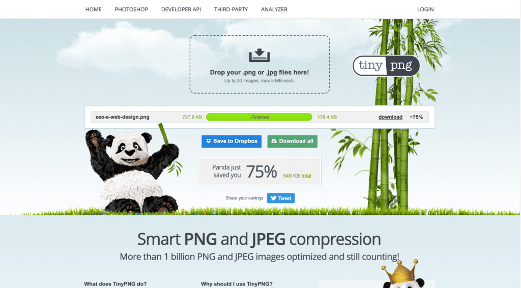
Always try to use an image compression tool before adding them to the website. Check out TinyPNG. In this example, it was able to compress an image by 75%!

2. Publish bad content
As much as the content is not always associated with designing and developing, we must remember that there are aesthetic aspects that can hinder the user’s engagement with it.
Very large paragraphs and sentences, very small font, and a text color that make reading difficult are elements that searchers are able to detect.
Notice in the image below how the words are the same. See how very large blocks of text, whole paragraphs in capital letters, and a color without proper contrast make the experience much worse.

3. Add excessive JavaScript calls
The Web is full of scripts that help to improve websites with more dynamic elements or incorporating media from other services with the embed function.
The problem is that requesting too many external resources can slow loading, which we already know is detrimental to both the user experience and SEO.
With that in mind, when doing web development, use third-party script calls sparingly. Analyze if they are indispensable, or if it is possible to use other solutions.
See the case of this blog: out of the 2.4 megabytes transferred, 654 kilobytes corresponded to JavaScript, which is about 26% of the transfer data when loading this specific page.
4. Build a significant part of the site in Flash
It is true that Flash can create incredible effects on your website, but it is worth remembering that the user needs to have Adobe Flash Player installed on the device to be able to view it.
In addition, search engines do not index content built with this technology very well.
Thus, it is ideal to avoid using Flash for navigation and text content, or, simply, to opt for other alternatives that follow Web standards.
5. Ignore mobile device users
We have already discussed the significant increase in connections via tablets and smartphones, which means that it is very likely that most visitors to your site come from these devices.
If your pages are not prepared for these devices, your visitors will almost certainly abandon your site.
Since search engines consider whether the site is mobile-friendly or not to define its ranking, it is worth investing in a responsive design also from an SEO aspect.
And talking about mobile, do not forget to add some social media share buttons to your page!


6. Replace important HTML elements with images
Creating impressive images and using them in place of important HTML elements like heading tags may be very pleasing to the eye, but it is not going to work for SEO.
The H1, H2 and H3 tags highlight the degree of relevance of each part of your SEO content and allow you to place greater emphasis on that page’s keyword.
7. Add a lot of text to images
We have already explained that search engines cannot interpret images in the same way that they are able to analyze textual content — which is part of the page’s HTML code.
For this reason, it is bad practice to have images consisting primarily of text rather than reproducing it with actual textual elements on the page.
Although the alt text attribute can be useful in these cases, it is ideal to create complementary text or keep a separate image and text. An alternative would be to create an overlay layer with text by using CSS features.
8. Create overly sophisticated menus
We already know how navigation is relevant for users and searchers.
So, there is nothing better than creating simple menus that follow the pattern that is already expected of these elements on the Web — an unorganized list in vertical or horizontal, for example.
Navigation needs to be organized and shouldn’t create confusion for your persona. To avoid this, keep a balance. Work on your menu presentation’s quality, but avoid being too innovative.
Rock Content’s blog is an excellent example, with the list of Categories at the top menu and with the option for the user to access it from the footer as well.

9. Use features that make it difficult to access content
When the user reaches your site through a search tool like Google, the idea is that they find what they are looking for, right?
If we put pop-ups, notices, ads, and other elements in front of the main content, we make that access difficult.
Take the news site in the image below as an example. Notice how, when opening the main page, the space dedicated to the information that the reader really wants to see is very small.
Search engines are smart enough to detect this type of thing, which is why it affects the website’s ranking.

10. Disregard testing and results
The best way to know if web design is negatively influencing search engine optimization is to conduct tests and evaluate the results.
An interesting measure is to include annotations on your analytics platform.
Whenever significant changes in the design of the site go live, record the date, and monitor whether there have been any significant changes in organic traffic.
It is important to remember that a drop in visitor acquisition via organic search can have other reasons, such as server problems or even changes in Google search’s algorithm.
What Tools Help Check Whether SEO and Web Design are Properly Aligned?
Now, let’s see the tools that every web designer who wants to improve their sites from an SEO perspective should know of.
1. Screaming Frog
Screaming Frog is used to crawl a website, as search engine robots do. Once installed on your computer, simply enter the URL and click Start to begin the crawling process.
After the procedure, we can see information such as:
- page response time;
- number of resources (HTML, JavaScript, CSS, images, Flash, PDF and others) loaded internally and externally;
- heading tags;
- title tag;
- meta description;
- number of images.
2. PageSpeed Insights
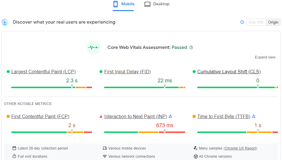
PageSpeed Insights is a Google tool that analyzes your page’s speed and, based on that, gives it a score from 0 to 100.
Then, it offers a report with several suggestions on how to improve load times, both for desktop and mobile.

3. Mobile-Friendly Test
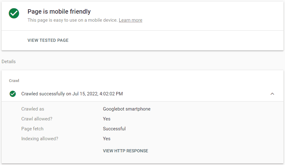
Another useful feature by Google itself is the Mobile-Friendly Test. After entering the website’s URL, the tool examines the content and determines whether it is optimized for these devices or not.
If there are any problems in this regard, the tool shows which aspects need improvement.

You may also be interested in these articles:
- How to Hire a Freelance Designer? 6 Things to Know
- Blog Design: How to Design Posts that Grab Attention
- From Copy To Design: Best Practices To Build Legendary Interactive Pieces
Wrap Up
With all the suggestions you have seen so far, you already have an excellent foundation for ensuring that SEO and web design are well integrated.
Remember that the user must always come first.
When taking care of the technical and visual aspects that give your visitors the best experience, the tendency is that your website’s position in the search engine results will only improve.
Do you want to know how page speed can affect your sales? Download our free infographic and see how you can improve your sales performance!


![[WA] Ultimate Content Marketing Kit](https://rockcontent.com/wp-content/uploads/2022/08/Content-Marketing-Kit-750x200px.jpg)


