The SEO professionals’ concerns with the performance and navigation of websites on mobile devices have always existed.
In 2019, when Google began to prioritize mobile interfaces in its indexing (Google Mobile-First Index), these enhancements became a rule in the market.
Day after day, desktops are more restricted to student and professional tasks, while smartphones are gaining more space in everyday citizens’ routines.
Cell phones have been the main form of Internet access, according to BroadbandSearch. Since 2019, 53% of Internet traffic worldwide came from mobile users.
As you can see, mobile SEO is definitely a prerequisite for having results on the web, no matter the nature or size of your enterprise.
In this article, we bring all the information you need to know about this subject. Continue with us to learn all about this area of Digital Marketing and learn how to get your site ready for the new search phase.
Enjoy your reading!
What is SEO for Mobile?
Mobile SEO is all the best practices, strategies, methodologies and tools used by developers, webmasters and marketing professionals to ensure indexing and improve the ranking of websites in searches performed on mobile devices.
From adjustments in HTML, CSS, and JavaScript codes of pages to new parameters in content planning and production, Mobile SEO proposes a true “revamp” in sites that need to adapt to Internet users’ new behavior patterns.
Unlike what many people think, having a responsive site is not enough, although this is also one of the factors analyzed in a Mobile Marketing strategy.
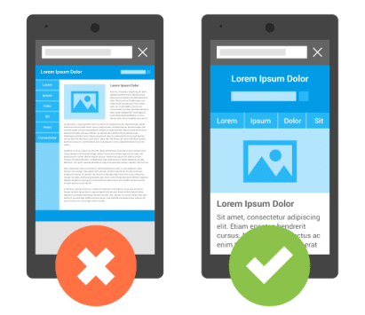
The term “responsiveness” refers only to the automatic adaptation of a site’s layout to different screen formats. However, several other criteria need to be taken into consideration in mobile navigation, such as:
- Speed: loading time of content and page elements;
- Page size: data consumption on limited Internet plans;
- Fidelity: similarity to the desktop version in terms of features and content;
- UX (User Experience): viewing, navigation, agility, and others;
- Usage pattern: frequent accesses, but in short periods of time.
These and several other factors are forcing professionals and companies to rethink the processes of production and availability of content on the Internet.
In this search for optimization of codes and pages, Google acts, once again, as the great leader and diffuser of changes.
Why is SEO for Mobile so Important?
Although the number of active smartphones has grown significantly in recent years, the expectation is that this figure will gradually approach the number of individuals in the country and keep pace with its demographic growth.
There is no longer the need for a person to have more than one device (one personal and one for work, for example).
The current models already allow the use of two or three sim cards and provide functions that help them organize their different routines.
The fact is that the smartphone has become an essential component in people’s daily life, as well as the main window of opportunity for companies to advertise and, mainly, to build a relationship with the public.
This social panorama made many companies adapt their strategies to satisfy this new consumer who is always with a phone in their hands.
However, adopting these measures only gained wide repercussions when Google, the main centralizer of online content today, adopted changes in its indexing and ranking systems.
Among the many updates announced, there are two elements whose understanding is mandatory for those who intend to improve their site: the Mobile-Friendly and the Mobile-First Index.
Google Mobile-Friendly
Often mistaken for the concept of responsiveness, Mobile-Friendly goes far beyond a mere layout adjustment.
Mobile-Friendly sites are those that provide an exclusive version for these devices. This kind of “secondary layout” should be detected by browsers and reproduced automatically.
Although the page elements are the same in both versions, the mobile site’s structure ― codes, pixels, plugins, etc. ― is specifically developed to improve navigation on smartphones and tablets.
Sites can also use subdomains for this type of version ― usually indicated by an “m” (m.yoursite.com).
Google adopted Mobile-Friendly as a criterion for ranking in 2015, and, since then, its absence implies a loss of priority in the SERP for searches performed from mobile devices.
Among the factors analyzed by the search engine, the most relevant are:
- Ease of navigation: from access to directories and pages to the display of pop-ups and ad scaling, for example;
- Loading speed: very heavy sites are slow and consume excess data, which makes them less attractive;
- Touch control: access to all buttons and functions through touchscreen technology;
- Responsiveness: uniform and automatic adaptation to the different types of screens, considering that mobile devices can present significant variations in this sense.

Mobile-First Index
In 2019, Google took a step further in improving SEO for mobile, officially incorporating the Mobile-First Index to indexing its search engine sites.
Basically, this means that including new addresses in the search engine will prioritize mobile versions, either in results for mobile devices or in desktop searches.
According to the company’s guidelines, however, the rule ― for now ― will only apply to the new indexed sites from July 1, 2019 onwards.
For addresses that were already present in searches before this date, monitoring will continue to be done based on the old parameters.
It seems that the great search king is giving a little time for developers to adapt their sites, so it is highly recommended to provide these changes as soon as possible.
In practical terms, the Mobile-First Index requires both desktop and mobile versions of the sites to present:
- Identical content: to reduce the size of the mobile version, many sites remove data and functions from the pages, but now this practice should be avoided;
- Structured data: each version must present a data structure specific to its function (essential to avoid flaws in the indexing of mobile pages);
- Equivalent metadata: titles and meta descriptions should be equivalent in both versions to ensure that both are at the same address.
For sites that use different URLs for their versions, technical adjustments may be necessary, such as updates to Hreflang (a tag indicating that a site has more than one version) and an expansion of server capacity (which will need to deal with the increased tracking rate).
Most configurations, however, are manageable by the Search Console.

How to Check If You Have a Mobile-Friendly Website
Before you can bring your site completely up to speed when it comes to mobile SEO, you need to know how mobile-friendly (or not) it already is.
One way to do this is to simply use your mobile device to browse the site, as you’ll know immediately whether it’s mobile-friendly.
If it’s not, you’ll see issues like blog posts with the edges cut off or pages where you’re forced to scroll back and forth to see the entirety of the content.
There are also a variety of tools out there that take the guesswork out of checking your site for mobile-friendliness.
For instance, you can use Google’s quick mobile-friendly test to assess any URL in seconds.
You can also use Google Search Console to check your site via the “mobile usability” option.
Under the “details” tab, it will show you any errors to be aware of. It will also tell you how many pages are affected and what types of errors you’re looking at, so you know where to start when it comes to fixing things.
How to Optimize your Website or Blog for Mobile SEO in 6 steps?
Below are the main recommendations to achieve good results on mobile device searches according to the new Google criteria!
1. Start with the essentials: Do a basic technical inspection
Before providing page and code adjustments, it is important to perform a basic check on your website’s files, software, and services.
These are the pillars of your SEO strategy and, therefore, cannot be neglected.
Below you will find a checklist of the main factors that can directly influence the speed, performance, stability, and even the ranking of your site in searches:
- Hosting service: make sure the provider has a good reputation in the market and the plan selected meets all the needs of your site;
- Content manager: give preference to robust platforms or software that are already consolidated in the market, such as WordPress;
- SSL certificate: Google understands that HTTPS addresses are used in secure mobile sites and therefore gives them priority in the search ranking;
- Image optimization: remove non-essential files, compress images, configure descriptions, and give preference to lighter file formats;
- Code optimization: use plugins or hire professionals to remove non-essential snippets of CSS, HTML, and JavaScript code from your pages;
- Tags for mobile: ensure the insertion of special HTML tags such as the “viewport” (asks the browser to adjust the screen to the mobile version) and “Hreflang” (informs that the site has different versions).
2. Performance: Optimize your website to ensure the highest possible speed
Speed is the critical factor in mobile navigation, after all, we need to ensure a good navigation experience in naturally unstable connections and with limited services. The solution, however, remains the same: to focus on the essential!
All the measures listed in the previous topic directly impact the agility with which your site loads its information, but other procedures can help improve your results in this regard.
First of all, it is important to check your site’s performance using testing platforms like Google PageSpeed Insights.
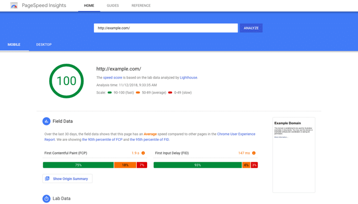
The two main factors analyzed by the tool are the FCP and the FID:
- FCP (First content display): time required for the first element of the page to be displayed on the screen;
- FID (Input Latency): the delay between the user’s first interaction with some element of the page and the browser’s response.
In the first case, we need to understand that the appearance of a single element on the screen is enough for the user to confirm that the page is being loaded.
Therefore, it is interesting to use themes (or build layouts) that “deliver” the page content in separate blocks.
When a site displays only a white screen or a loading icon — so all the pieces of its interface are loaded together afterward — a mere delay in the data exchange can lead people to understand the situation as an error of the site, encouraging them to leave it.
In the second situation, we are faced with a similar consequence when the pages’ response time is very long. The speed with which your site reacts is fundamental for demonstrating agility and responsiveness to the user.
The good news is that besides evaluating your site, PageSpeed also displays specific tips to make your pages faster.
3. UX (User Experience): Focus on the user experience
This is the most important criterion among all SEO practices for mobile because it is at this stage that we deal directly with the interaction between users and the site.
When we think about navigation on smartphones and tablets, the presentation of a pleasant, agile, and intuitive experience is as important as on desktops. Still, some peculiarities need to be considered in the use of these devices.
Unlike desktops and laptops, usually used for many hours in a row in study or work activities, mobile devices are accessed several times throughout the day, but in short or medium intervals of time, often to meet occasional needs such as clearing a doubt, answering a message or accessing social media.
This behavior stimulates users’ anxiety who want to find a quick solution to what they need at each of these moments, be it a post with detailed information or a brief video tutorial (mobile videos).
Besides the speed, which we dealt with in the previous topic, some other suggestions in User Experience should be taken into consideration when building your website.
Visually clean
Fully review the options and data displayed to the user on the pages, leaving only what is necessary.
Choose to use intelligent menus to hide information and settings that are only necessary for specific situations and try to display only what your user needs on each page or section, always keeping the appropriate space between the clickable elements.
Flat Design
Digital interfaces have abandoned once and for all the skeuomorphism, highlighting the use of 3D resources to create realistic surfaces and objects.
The trend now is flat design, a style that adopts simple shapes and solid colors to ensure the greatest possible clarity and harmony on interfaces.

Quick access
Check the number of steps necessary for your user to reach your site’s contents and functions and try to shorten this journey as much as possible.
People want to find what they’re looking for quickly, so avoid intermediate pages between contents and reduce the need for typing.
Appropriate fonts
This item is inserted in the concept of responsiveness: your site should automatically adapt the fonts’ size for the device on which it is being displayed.
However, it is possible to go further by using highlighted features, such as larger-sized sections, and bold or special backgrounds, to make the user experience even more enjoyable and intuitive.
4. Local SEO: Insert your site in local searches
Another factor that should be considered in the behavior of mobile users is the search for local services.
Google is today’s catalog, and it is in it that people search for companies and professionals of all kinds.
According to Think With Google, most searches carried out on smartphones are aimed at professionals and establishments in the region.
Besides, a study revealed that 88% of consumers search for information on the Internet before making purchases online or in physical stores.
The biggest advantage of this type of disclosure is that local results have priority in the search ranking. To be listed, register for free on the Google My Business platform.
In your profile, you can enter photos, contact information, the URL of your site, and much more!
5. Voice searches: Prepare your content for all types of search
Voice searches have been a reality for many years. However, only with the recent improvement and popularization of the famous virtual assistants (Siri, Alexa, and Google Assistant), we are now witnessing a real change in search experiences.
Another important point of this new SEO trend is that voice resources are not restricted to smartphones. They already equip Smart TVs, home appliances, and artificial intelligence devices made available by large technology companies.
It is worth mentioning that if your content gets a featured snippet (zero position in Google), virtual robots can read it aloud!
The point is that voice searches present some peculiarities:
- They are generally interrogative: questions like “what is”, “what does it mean”, “how to do it”, etc.;
- They usually use long-tail keywords: by suggesting a dialogue, people tend to use more specific terms;
- Used to get immediate solutions: the user who does a voice search expects a quick and practical solution to their doubts;
- Refer to everyday issues: the service is often used to solve routine (less complex) problems.
Therefore, when researching new keywords for the production of your content, pay special attention to terms inserted in interrogative phrases, and relate to doubts of your buyer persona‘s everyday life.
There are some specific tools for this work, such as AnswerThePublic.com, a portal that allows you to discover the most searched questions on Google about a particular subject area.
However, traditional Digital Marketing planning platforms such as Google Keyword Planner and SEMrush are still your best options.

6. Use AMP technology
AMP stands for Accelerated Mobile Pages.
It is an open-source project promoted by large content publishers and technology companies (including Google itself) that aims to improve Internet sites’ performance — which, in general, is still very poor.
The AMP pages present three important configurations:
- AMP HTML: which is nothing more than optimized HTML code with restrictions and extensions that improve their overall performance;
- AMP JS: which maintains the rendering of asynchronous page elements so that the loading of any item does not harm or block the display of another;
- Google AMP Cache: an optional function that requests the storage of AMP HTML pages in Google’s own cache, speeding up the display of content from access and search results.
When a user clicks on a search result with a link to a page configured with AMP, it is directed to the page’s simplified version.
Depending on your browser, an option with a link to the original content display is shown at the top of the site.
The easiest way to provide this setting is to use the AMP for WP – Accelerated Mobile Pages plugin (exclusive to WordPress).
With it, you can adjust various elements of the simplified version of your pages, which, when active, can also be accessed by entering “/amp” at the end of their URLs (https://yoursite.com/your-post/amp).
You can do this in the address of this page you are reading to check the result of this feature in our blog (if you’ve come this far by Google and you’re using your smartphone, it’s probably already active).
Mobile SEO Tips and Best Practices
SEO today is increasingly focused less on the nuts and bolts of how your site works and more on whether it delivers the awesome user experience that Google wants to guarantee its users.
Here are some best mobile SEO practices to make sure that happens.
1. Make load speeds a top priority
Today’s mobile users become really frustrated when a site they’re trying to view takes forever to load, so load speeds are a key concern for Google.
In the video below, Google recommends that web admins ensure their site takes no longer than two seconds to load.
However, the ideal load speed for any mobile site is about half a second.
Granted, this isn’t an easy feat to accomplish, but it’s not impossible, either. Google Page Speed Insights can be especially helpful for zeroing in on critical issues plus recommended fixes straight from Google itself.
2. Craft content with mobile readability in mind
Many sites out there are technically mobile-optimized but still have readability issues that should be addressed.
Visitors shouldn’t have to pinch-zoom, squint, or do much of anything else specific just to read your content.
If they do, you can bet most won’t stick around, which is terrible for your mobile SEO.
Some tips for making your content extra readable on various mobile devices include the following.
- Keep paragraphs short so there are plenty of breaks when viewed on mobile.
- Use big, readable fonts — around 14px or thereabouts.
- Ensure lots of contrast between your text and background, making it easier for mobile users to read your content outdoors.
3. Keep header images on the small side
Remember, digital-age information seekers don’t want to wait for the answers they’re looking for.
Not only won’t they wait around for a slow page to load, but they don’t want to scroll very far to get to the meat of your content, either.
Large, splashy header images may add visual appeal to the standard desktop versions of your posts, but they also force mobile users to scroll unnecessarily before they can read your posts.
You can improve your mobile SEO and readability in seconds by either omitting these images for mobile users altogether or making them significantly smaller.
4. Make good use of negative space
A cluttered site is terrible for SEO even when accessed via a traditional desktop setup, but it’s the kiss of death for a mobile site.
Sites that are fully optimized with mobile SEO in mind utilize plenty of negative space — the empty areas between site elements like text, images, buttons, etc.
Remember, issues that make your site hard for visitors to read or use are issues that hurt your Google rankings, as people won’t stick around to figure out a site that’s cluttered or confusing.
Keeping clutter out of the equation, simplifying your layout, and including plenty of plain space between page elements is the way to go.
5. Integrate share buttons into a sidebar
Social sharing is an integral part of both standard and mobile SEO, so the easier you can make it for your visitors to share your content, the better.
Simple buttons are still one of the best ways to encourage sharing.
Not only are users used to seeing them on the sites they visit to the point where they actually look for them, but when utilized properly, they’re fairly non-intrusive.
One great mobile SEO-friendly way to integrate share buttons into your page designs is to put them in a simple sidebar.
This way, they’re right there if someone feels moved to share your post, but they’re not intruding on their experience.
6. Monitor your mobile bounce rates
Google’s mobile-first indexing practice means mobile UX signals are more important than ever when it comes to rankings, which makes sense.
Mobile is now the primary means by which people use the internet, so ensuring those users have a smooth experience is critical.
If mobile users aren’t spending much time on your site or are bouncing like crazy once they arrive, it will definitely affect your mobile SEO quotient.
Consider using Google Analytics to periodically check your mobile bounce stats and compare them to your desktop stats so you’re always aware of any potential mobile issues.
7. Focus on your mobile clickthrough rate
You’re likely already aware that click-through rates are major when it comes to your Google rank, and this is just as much the case with mobile SEO.
Achieving a great SERP ranking isn’t the type of thing you do just once, and then you’re set.
If you want to maintain that ranking, Google needs to see that users are actually clicking on your result when a search serves it up.
Mobile CTR is another thing you can check in Google Search Console, so do this periodically. Address any issues promptly.
8. Optimize title tags for mobile SEO
If your site sees a lot of traffic from mobile devices, then it’s worth optimizing metadata like title tags and meta descriptions with mobile users in mind.
Google allows a certain number of characters regarding these details on both desktop and mobile.
- Desktop limits are about 70 characters for titles and 155 characters for descriptions.
- Mobile limits are about 78 characters for titles and 155 characters for descriptions.
If you get a lot of desktop traffic in addition to mobile, then optimizing for both desktop and mobile makes sense.
But if most of your traffic comes in via mobile devices like smartphones, it might be worth utilizing those extra eight characters if it means a more clickable title.
Wrap Up
All the mobile SEO techniques, tools, and settings we discussed here are important to the outcome of your Content Marketing strategy.
Still, they don’t forget that Google’s main purpose is to bring quality information to its users, so your site’s content must be amazing!
Elevate Your Mobile SEO Strategy with WriterAccess
Optimizing for mobile SEO is essential in today’s digital landscape, where more users are accessing content on their mobile devices. To achieve the best results, you need a team of skilled professionals. WriterAccess connects you with over 15,000 experts, including writers, designers, and strategists, who can help you create compelling and optimized content for mobile users.
WriterAccess provides advanced AI tools and seamless integration with image banks, ensuring your content is not only high-quality but also visually engaging. With the new WriterAccess Humanizer service, you can enhance AI-generated content with the authenticity and creativity of human touch, ensuring your content resonates with readers and complies with search engine guidelines.
Ready to take your mobile SEO to the next level? Try WriterAccess for free for 14 days and experience the difference it can make for your mobile content strategy.


